Houzz Logo Print
orangekey

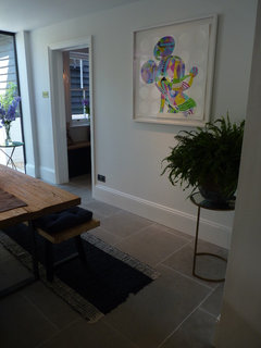
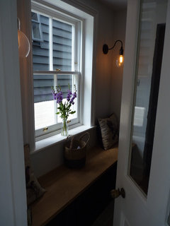
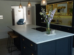
Victorian House Re-design - Kitchen

Before

After

Comentarios (39)

  • PRO
    Linear London | Kitchens, Bathrooms & Tiles
    hace 6 años

    Wow, what a transformation! Great job! Dark kitchens are the upcoming trend by the way :)

  • PRO
    Orange Key Design Studios
    Autor original
    hace 6 años
    Thank you, our client was delighted with the entire project, as were we!
  • PRO
    Kia Designs
    hace 6 años

    Lovely. And the new floor really sets it off

  • jacol68
    hace 6 años

    Fantastic job! Well done. Thought the original was rather quaint, but your transformation deserves a massive round of applause :)

  • PRO
    Orange Key Design Studios
    Autor original
    hace 6 años
    Thank you for your nice comment. The client's house was indeed homely in it's original state; our brief was to turn it into something more contemporary, open-plan, light-filled, and better suited to their needs.
  • Cath Sheehan
    hace 6 años
    Love this kitchen. Very stylish and I love the brass gold highlights and cupboard door furniture.
    I'm planning my own kitchen refurb with a similar style of cabinets. Planning to go with a light blue / grey color though. Just wanted to know other people's thoughts on mixing brass handles and knobs with other chrome features e.g. Sockets, extractor and I have an existing steel splash back I'm thinking of recycling. Love brass but should I just stick to chrome to tie it all together?
  • Shahid Arshad
    hace 6 años
    very nice
  • PRO
    Timothy Mather Design
    hace 6 años

    Great job!!

  • PRO
    Persona Abode
    hace 6 años
    Fabulous transformation.
  • PRO
    Orange Key Design Studios
    Autor original
    hace 6 años

    Thank you all for your complimentary comments.

  • Carol Weston
    hace 6 años
    Ooooooooh that's lovely, although to be fair the old kitchen was nice too. How did you get the client to change from maximalist to minimalist and where has all their 'stuff' gone???
  • PRO
    Orange Key Design Studios
    Autor original
    hace 6 años

    Thank you! We took our lead from the clients who asked for a contemporary open-plan kitchen/dining/living space.

    We also designed a new cloak room and utility room for them (as part of a 2-story side-extension), which has additional storage space for all the clutter associated with kitchens, and now houses the washing machine, tumble dryer and a second freezer.


  • PRO
    Abitare UK
    hace 6 años

    This really shows less is more. What a fantastic transformation, good job!

  • PRO
    Orange Key Design Studios
    Autor original
    hace 6 años

    Thank you! We listened very carefully to our client's brief and were delighted that they were totally on board with the concept. Full credit to them for taking our entire design and executing the internal finish so beautifully.

  • PRO
    Bisque Radiators
    hace 6 años

    Gorgeous down to the last detail!

  • vv0123
    hace 6 años

    I like both the old and the new kitchen. The designers did a great job. The only thing that slightly annoys me is the "cheating" while taking pictures. I bet that if the old kitchen has been tidier, it would look better than what we see on the picture. Then the comparison between old and new would be fairer. Have to admit though I've seen worse "before" pictures, very obviously photoshopped to look dark and dingy.

  • Carol Weston
    hace 6 años
    It really is a handsome kitchen, the burnished metals against the dark cupboards are giving me serious kitchen envy. However a good declutter would make mine look a million times better in the short term.
  • PRO
    Orange Key Design Studios
    Autor original
    hace 6 años
    Thanks for the comments. No 'cheating'; the before shot was how the client's house was on the day we photographed it, as was the 'after' shot - it was just tidy, not staged. Most of the 'clutter' is now in the utility room and in cupboards.
  • vv0123
    hace 6 años
    Última modificación: hace 6 años

    That's why I put "cheating" in quotation marks. I didn't mean that you actually cheat, asking your clients to clutter their kitchens :)

  • Christina Sharp
    hace 6 años
    Preferred the 'before' with the Belfast sink & lovely wooden worktops, much more in keeping with a period property. The dark blue will soon look dated.
  • leahyem
    hace 6 años
    Beautiful kitchen! Can I ask what worktop you used in this project?
    We are currently looking at something similar and also continuing it onto the splash back.
  • PRO
    Orange Key Design Studios
    Autor original
    hace 6 años

    Thank you for the comments. The house was lovely in its original state, however, the brief from the client was to design something contemporary (which, we know, is not to everyone's taste) but our clients love it.

    In answer to your question Leah, the worktops are Italian White Marble sourced by the client. Hope this helps...

  • Helen
    hace 6 años
    Fab! It Looks great and I love the colour
  • sam irwin
    hace 6 años
    Kitchen fab and love the floor. Of course it will date but the cream kitchen I put in 7 years ago has dated ... would love to be brave and change the colour
  • PRO
    Orange Key Design Studios
    Autor original
    hace 6 años

    Thank you for the comment, our advice...always be brave!

  • angelalsmith42
    hace 6 años

    I really dislike the second kitchen. I would never feel relaxed while dropping in for a cup of tea. Destroys the inviting, friendly atmosphere of the first kitchen.

  • PRO
    Orange Key Design Studios
    Autor original
    hace 6 años

    Hi Angela, design is a bit like Marmite - always divisive! We redesigned the internal layout and created this new kitchen space for our clients as they wanted a more minimalist feel. They have achieved this with their choice of fittings and furniture, and with the way they utilize the space. They are happy with the end result, but of course, it's not to everyone's taste.

  • jc3135rc
    hace 6 años

    When a before and after photograph are supplied I really wish that they showed the same area from the same angle to get a true before and after interpretation.

  • bagpuss2
    hace 6 años
    The first is lived in and indicates the personality of the owner. The second is a blank canvas. Come back once the place is in use and the character will return
  • PRO
    Orange Key Design Studios
    Autor original
    hace 6 años
    Última modificación: hace 6 años

    Thanks for the comments. Unfortunately the photos weren't planned with a 'before' and 'after' shoot in mind, so the angle of the 'after' shots are not exactly the same - but very similar. The room configuration has also changed due to an internal remodel. The photo below is probably a better angle.

  • ninder Billing
    hace 6 años
    hi. I'm a bit late to this so hope someone's still replying. How wide is the worktop, and where is the extraction on the hob?? I love the idea of the island hob but we cook lots of spicy food and NEED extraction. is there a solution?
  • PRO
    Orange Key Design Studios
    Autor original
    hace 6 años

    Not a problem being late.... and totally understand the spicy food extraction need!! We designed the internal refurbishment and our client sourced the kitchen and had it fitted. You could try contacting the supplier; Devol Kitchens for more information (quote Station Road, Kintbury project). Sorry we can't be more helpful... Regards, Jo, Orange Key

  • Glenn Barnes
    hace 6 años

    Did you block a window?

  • andrea_tennant
    hace 5 años

    Wow, it's a knock out!

  • PRO
    Zeta Interiors
    hace 5 años

    Beautiful colours!

  • PRO
    Marble & Quartz
    hace 5 años

    Great space!

  • PRO
    Field & Co Interior Design Ltd
    hace 5 años

    What a fantastic transformation, well done - a lovely space!

  • PRO
    Seasons in Colour
    hace 5 años

    Truly beautiful work but I feel that the two large pendants over the table where not necessary. Too many pendants now and the ceiling is not high enough for them. It would have been different with smaller shades possibly.

    An alternative would have been to use the pendant you have over the island over the table and used something like this over the island instead. This is the Long John brass spotlights fixture available on @hollowaysofludlow and you can find it in a variety of lengths from 1m to 2.6m depending on the length of your island. It would match the brassware on the cabinetry too.

España
Personalizar mi experiencia con el uso de cookies

Houzz utiliza cookies y tecnologías similares para personalizar mi experiencia, ofrecerme contenido relevante y mejorar los productos y servicios de Houzz. Al hacer clic en 'Aceptar' confirmo que estoy de acuerdo con lo antes expuesto, como se describe con más detalle en la Política de cookies de Houzz. Puedo rechazar las cookies no esenciales haciendo clic en 'Gestionar preferencias'.