3 Kitchen Makeovers Where Walls Came Down
Before-and-after photos show how these kitchens brightened up and became more functional

Whether it’s a new layout, improved seating or clever storage, there are lots of way to make your kitchen work better. But sometimes you have to tear something down to help your kitchen reach its full potential. Check out the before-and-after photos of these three kitchen remodels where walls came down — and let us know if you see a sledgehammer in your own kitchen’s future.
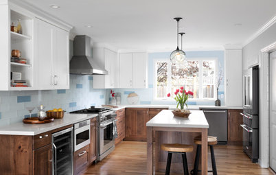
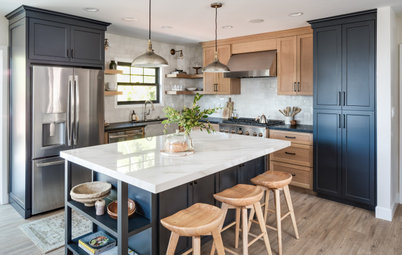
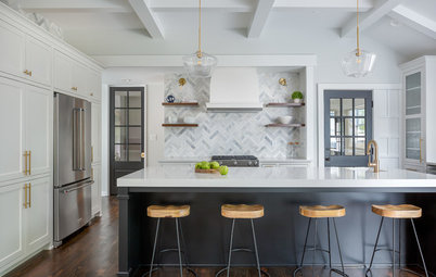
After: Koltun chose a palette of white and wood with black accents, gleaning inspiration from Scandinavian modern and California coastal cool designs.
The eat-in area remained in the same spot in front of the picture window. Koltun replaced the existing window with an energy-efficient, double-paned window with low-E glass.
She flipped the sink and range locations, placing the range along the exterior wall and the sink and dishwasher in the island. The island also contains trash and recycling pullouts, as well as additional storage.
Not sure where to start on your home project? Click here to learn the basics
Koltun removed an existing window to make space for a range with a vent hood trimmed in wood. Removing the window also created room for a handsome herringbone range backsplash. “I wanted to use a neutral color in here. This gray tile has a lot of variation in color and texture,” Koltun says. “And using a double herringbone pattern gave it a custom look.”
Koltun specified engineered white oak hardwood floors to be installed throughout the first floor. She stained the raw white oak island a shade darker than the floors to make it stand out.
See more of this kitchen remodel
Koltun specified engineered white oak hardwood floors to be installed throughout the first floor. She stained the raw white oak island a shade darker than the floors to make it stand out.
See more of this kitchen remodel
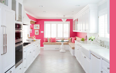
2. Bright White and Bronze
Kitchen at a Glance
Who lives here: A recent retiree and her boyfriend
Location: Plymouth, Minnesota
Size: 94 square feet (8.7 square meters)
Designer: Jolynn Johnson, owner of Crystal Kitchen + Bath
Before: A shell-like structure that didn’t extend to the ceiling surrounded the former kitchen, cutting it off from the dining room and living room. The homeowner disliked almost everything inside the kitchen as well — dark oak cabinets, laminate countertops, mirrored accent wall, worn-out vinyl tile floors.
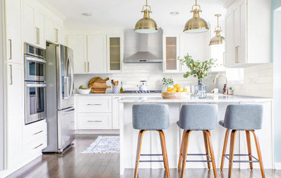
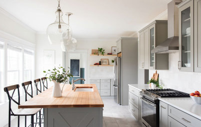
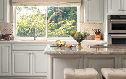
After: Designer Jolynn Johnson removed the two walls around the kitchen and extended the peninsula to add more work surface, room for counter seating and a spot for a dishwasher.
She added white cabinets, countertops and appliances to give the compact space a light and airy feel. She extended the cabinetry a foot higher than before, to 8 feet, for more storage and a loftier look. The faucet and the cabinet and appliance hardware have a honey bronze finish that adds a warm shine.
Shop for a kitchen faucet
Johnson kept the range and microwave in the same location to keep costs down. White quartz countertops feature gray veining that coordinates with the warm greige wall color above the cabinets (Accessible Beige by Sherwin-Williams). The backsplash is a mosaic of white marble, glass and pearly shell tile. “It just ties everything together,” Johnson says. “It also brought in texture and pattern.”
The floors are 5-inch-wide planks of luxury vinyl tile that look like wood.
See more of this kitchen remodel
The floors are 5-inch-wide planks of luxury vinyl tile that look like wood.
See more of this kitchen remodel
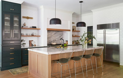
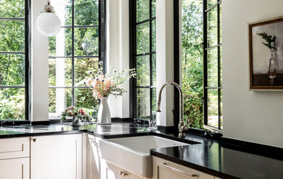
3. Wow-Worthy Wood
Kitchen at a Glance
Who lives here: A couple
Location: New York City
Size: 87 square feet (8.1 square meters)
Architect: Andrew Mikhael
Contractor: Famurat Builders
Before: This homeowner wanted to add architectural significance and a nod to midcentury design to his generic one-bedroom Upper East Side apartment, so he reached out to architect Andrew Mikhael. A plan was made to open up the former galley kitchen and turn it into a functional work of art with midcentury-inspired wood cabinetry.
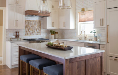
After: Mikhael had the walls between the kitchen and living room removed to combine the spaces. On the right, he extended the kitchen into the entryway space. This expanded it from 56 to 87 square feet. He installed an angled walnut wall that recalls a partially pulled-back curtain, dramatically revealing the sculptural kitchen.
Because the ceilings are concrete, lighting couldn’t be recessed into them. Instead, Mikhael came up with a beautiful way to conceal the lack of recessing. He used LED tape lights mounted in long, narrow channels that hang down less than an inch from the ceiling. “Then we used wood slats to give them a home. The ceiling slats shield the lighting,” he says.
To keep the look minimalist, Mikhael specified frameless cabinetry with simple finger pulls instead of hardware. The cabinetry is flush with the fridge column surround. All of the walnut is bookmatched, which enhances the continuous look.
See more of this kitchen remodel
More on Houzz
Before and After: 4 Dreamy White-and-Wood Kitchens
Find a kitchen designer near you
Shop for kitchen appliances

Patrocinado
Volver a cargar la página para no volver a ver este anuncio en concreto
Kitchen at a Glance
Who lives here: A young couple
Location: Dallas
Size: 200 square feet (19 square meters)
Designer: Jessica Koltun
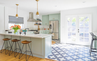
Before: Interior designer Jessica Koltun was tasked with transforming the former closed-in galley kitchen by knocking down the wall between it and the living room. The extra space allowed the designer to add an island with seating for three.
Find a kitchen designer on Houzz