Before and After: 3 Kitchens Ditch Upper Cabinets and Lighten Up
Pros replace cabinetry with tiled walls, striking focal points and expansive windows

A current kitchen trend that looks like it has staying power is replacing upper cabinets with a beautiful backsplash, display shelves or expansive windows. Kitchens gain a more open, airier feeling and opportunities to bring in views and natural light. Concentrated walls of storage, pantries and smartly outfitted lower cabinets make up for the lost storage. Here’s a look at three featured kitchens’ before-and-after renovations that reconsidered traditional cabinet layouts.
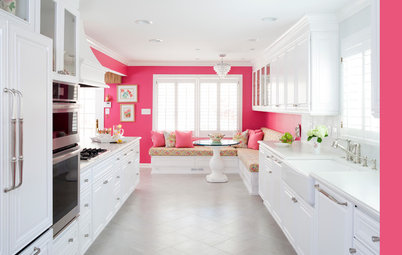
After: Ryder removed the wall that separated the kitchen from the rest of the first floor. An attic over the kitchen enabled him to raise the ceiling height to 12 feet.
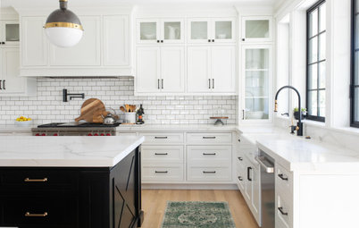
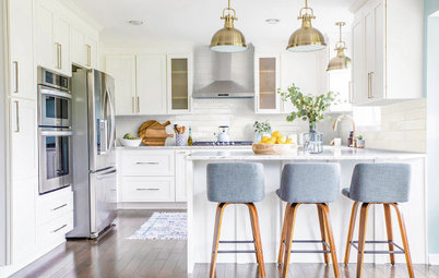
By sacrificing upper cabinets on this wall, the family gained a range wall that serves as a focal point. Instead of upper cabinets, there’s a beautiful herringbone marble backsplash and custom vent hood. Now that the kitchen is open to other first-floor spaces, creating a pretty view here was important.
Shop for backsplash tile
Shop for backsplash tile
Before: The existing eat-in area of the kitchen looked out to the backyard. But the homeowners weren’t fond of the view of the air-conditioning unit.
After: The family gained another beautiful tiled wall and enjoys the view of the backyard through the large window over the sink. Ryder sized this new window to eliminate the view of the air conditioner. He also added new glass doors that provide additional views and access to the yard. Both sets of sliding doors seen here open to a new deck.
Island paint: Tricorn Black, Sherwin-Williams; cabinets: MasterWorks Custom Cabinets
Hire a local cabinet pro
Island paint: Tricorn Black, Sherwin-Williams; cabinets: MasterWorks Custom Cabinets
Hire a local cabinet pro
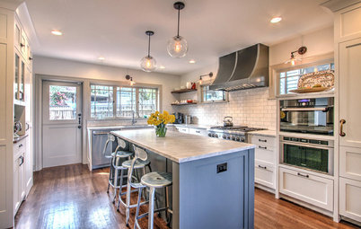
They made up for the loss of cabinets in several ways. The kitchen’s new island measures 9¼-by-3¾ feet and contains a mix of cabinets and drawers for storage, including deep drawers for pots and pans. Just past the island, Ryder packed an interior wall with more storage.
Because refrigerators are tall, designers treat them in the same way they treat upper cabinets in these scenarios. Here, Ryder recessed the full-depth fridge to make it flush with the surrounding cabinetry. This concentrated approach to storage also made room for a coffee bar on the left, with another elegant tiled expanse behind it.
Learn more about this kitchen
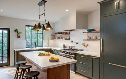
2. Celebrating Leafy Views
Kitchen at a Glance
Who lives here: A couple and their dog
Location: Redmond, Washington
Size: 168 square feet (16 square meters); 10½ by 16 feet
Designer: Tamar Kestenbaum of Sienna & Sage Interior Design
Before: “This home is nestled into the trees and was already gorgeous, except for the kitchen. It was this dark corner of the house,” interior designer Tamar Kestenbaum says. While the layout was functional and the size was adequate, extensive upper cabinets blocked any chance of maximizing the leafy views. Kestenbaum removed the cabinets to make room for expansive windows, which opened up the kitchen to beautiful views of the trees.
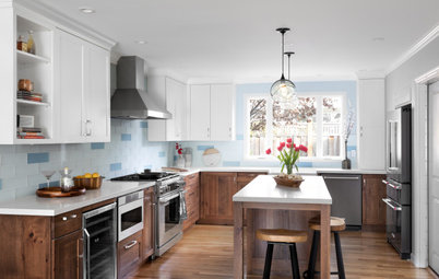
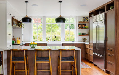
After: Now this kitchen is a tree hugger. This view from the front entry reveals the leafy backyard from the moment someone steps through the front door. The materials used are a wonderful complement to the vistas.
“These clients wanted to use as many natural elements and details as possible,” Kestenbaum says. This included wood details and solid wood cabinets. And the countertops are soapstone, one of the homeowners’ favorite materials.
“These clients wanted to use as many natural elements and details as possible,” Kestenbaum says. This included wood details and solid wood cabinets. And the countertops are soapstone, one of the homeowners’ favorite materials.
With the upper cabinets gone, Kestenbaum had plenty of room to line up beautiful casement windows around the room. Casement windows are easy to crank open when reaching across a countertop. So in addition to the views and the natural light, the windows let in the cool Pacific Northwest breezes. The neutral color palette and wood accents the designer suggested for the remodel complement the colors of nature.
Windows: Kolbe Windows & Doors
Windows: Kolbe Windows & Doors
Kestenbaum already had a head start on the storage issue. “My clients are minimalists who didn’t need a ton of storage. Plus they already had a walk-in pantry,” she says. This left them plenty of storage space after she eliminated the upper cabinets to make room for the windows.
In the lower cabinets, she installed recycling, trash and compost pullouts near the sink. The dishwasher is to the right of the sink and its paneled front lends a seamless look. Kestenbaum also mixed in drawers for better and more ergonomic storage. And she used pullout inserts on arms to take full advantage of the space in the corner cabinets.
Browse pendant lights in the Houzz Shop
After: Because the kitchen was open to the dining room, Kestenbaum designed a bar for the unused niche. “He is very passionate about coffee and she wanted to keep the countertops clear of small appliances,” the designer says. “It was a really convenient spot for a coffee-wine bar, and he already had a beautiful espresso maker.”
The bar includes a wine fridge and storage space for glassware, and the cabinets hide the microwave. Because coffee grounds are great for composting, Kestenbaum added a second composting pullout as well as a trash pullout in the lower cabinetry of the bar. LED lighting under the upper cabinets illuminates the space. “The underlighting provides a beautiful glow at night,” Kestenbaum says.
Learn more about this kitchen
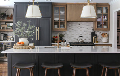
3. Expansive Counter Space With Big Views
Kitchen at a Glance
Who uses it: A chef and a baker
Location: Woodacre, California
Size: 330 square feet (31 square meters), including the dining space
Architect: Craig O’Connell Architecture
Before: This Northern California kitchen had low ceilings, little natural light and limited counter space. This was an issue, as the owners both need a lot of room to spread out and work, and they like to work in the kitchen at the same time. Nick Giusto is a fourth-generation miller and baker and helps run the family business, which provides restaurants and bakeries with premium-quality flour and grains. “Nick needs a lot of room for rolling dough and flour and baking in general,” says the couple’s architect, Craig O’Connell. Nick’s wife, Arielle Giusto, is a talented chef who caters and has helped open several popular restaurant kitchens in the area.
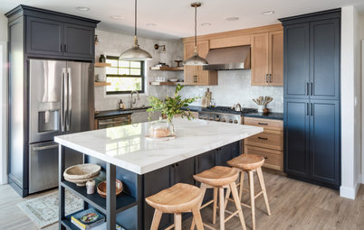
After: O’Connell designed a light-filled, airy space that connects to the outdoors and the region, reflects the couple’s tastes and gives them all the room they need to prepare delicious food together and entertain.
To achieve this, the architect expanded the kitchen’s footprint by taking over an adjacent office space and removed the 8-foot drop ceiling to allow for a cathedral ceiling with reclaimed-wood beams. By expanding the space, he was able to add plenty of cabinet and countertop space. The couple also opted for floating shelves on the right to accommodate their everyday dishes and glassware.
It was important to the couple that the design be “of the place.” So the architect used meaningful local materials and expert craftspeople. For example, the ceiling beams were milled from old piers that had been buried in San Francisco Bay. The reclaimed piers, the cypress countertops and shelves and the sycamore live-edge peninsula counter and cabinet wood came from a local reclaimed-wood dealer. “This was definitely a site to visit with the clients. We looked at all kinds of wood, and the homeowners found the ones that spoke to them,” O’Connell says.
By forgoing upper cabinets on two sides of the kitchen, O’Connell was able to install three 6-foot-wide windows. They provide picture-perfect views. And the colors in the landscape seen through the windows inspired the kitchen’s material and color palettes. The concrete counters, copper faucet and wood cabinetry and trim complement the garden. San Francisco company [RE] Union Creative fabricated the custom stained concrete countertop and integrated sink.
Because the home is on a hill, the 6-foot-wide awning windows that flank the range provide views of the tree canopy. With the kitchen expanded, there was also room for a 48-inch red range from BlueStar.
Because they had expanded the kitchen’s footprint, the amount of lower cabinets in the room made up for the loss of upper cabinets. Petaluma craftsman Cemil Hope made the sycamore cabinetry. Also, O’Connell devoted this interior wall to cabinetry and the fridge. There’s an appliance garage for the coffeemaker and stand mixer next to the countertop.
One detail to note is how the fridge appears to float. O’Connell used 8-inch-high toe kicks (standard height is 4 inches) around the room to give everything a lighter, floating look. He warns that a high toe kick can cut into storage capacity, but he says that in this kitchen, the copious amount of storage accommodated the choice.
Learn more about this kitchen
The floating shelves also serve as an upper cabinet substitute.
Reasons to forgo some upper cabinets:
Read more kitchen stories
Browse kitchen photos
Hire a kitchen remodeler
Shop for kitchen products
Reasons to forgo some upper cabinets:
- To create a focal wall
- To extend a beautiful backsplash up to the ceiling
- To make room for windows
- To provide a more open and airy feel
- Outfitting the kitchen with hardworking lower cabinet inserts
- Concentrating storage and some larger appliances on one wall
- Installing open shelves
- Moving areas like a coffee or wine bar into an adjacent room
- Working a pantry into the kitchen footprint
- Doing a thorough kitchen cleanout and purge. Seldom-used or seasonal items can be moved to other storage areas in the house.
Read more kitchen stories
Browse kitchen photos
Hire a kitchen remodeler
Shop for kitchen products


Patrocinado
Volver a cargar la página para no volver a ver este anuncio en concreto

Patrocinado
Volver a cargar la página para no volver a ver este anuncio en concreto
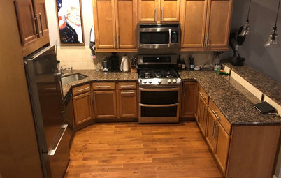
Kitchen at a Glance
Who lives here: A young couple with a child
Location: Raleigh, North Carolina
Size: 300 square feet (28 square meters), including the walk-in pantry
Designer: Richard Ryder of Clearcut Construction
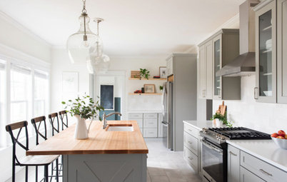
Before: This North Carolina couple wanted a bigger, airier, more functional kitchen suitable for raising a family and hosting large gatherings. And they disliked the 8-foot ceilings so much that they considered moving. Instead, they found Richard Ryder and his design-build firm, Clearcut Construction, on Houzz and hired them to design and carry out their renovation.
Ryder opened up the floor plan, relocated the dining room, raised the kitchen ceiling and created more storage and prep space with a large kitchen island. He also improved the family’s access to a redesigned backyard to ease the flow between indoors and out.
Find a local design-build firm on Houzz