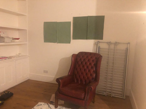
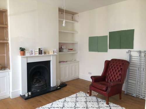
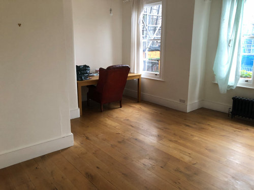
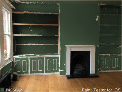
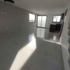
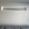
Help choosing a F&B green for the living room
Usuario de Houzz-332680634
hace 3 años
última modificación:hace 3 años

Respuesta destacada
Ordenar por:Más antigua
Comentarios (23)

minnie101
hace 3 añosMarylee H
hace 3 añosÚltima modificación: hace 3 añosUsuario de Houzz-332680634 agradeció a Marylee HUsuario de Houzz-332680634
hace 3 añosUsuario de Houzz-332680634
hace 3 años
Juliet Docherty
hace 3 años056114
hace 3 años056114
hace 3 añosJez Phillips
hace 3 añosÚltima modificación: hace 3 añosAileen Madlin
hace 3 años


Patrocinado
Volver a cargar la página para no volver a ver este anuncio en concreto

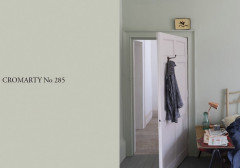
Farrow & Ball