Fast food restaurant
Prajina Thakur / Ataraxia Designs
hace 4 años
Ordenar por:Más antigua
Comentarios (4)

Patrocinado
Volver a cargar la página para no volver a ver este anuncio en concreto
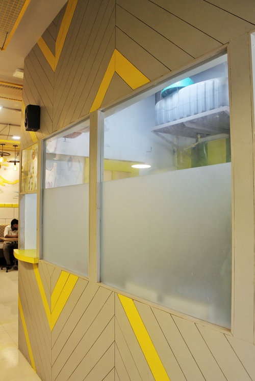
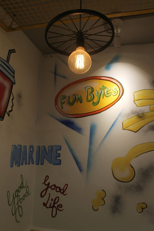
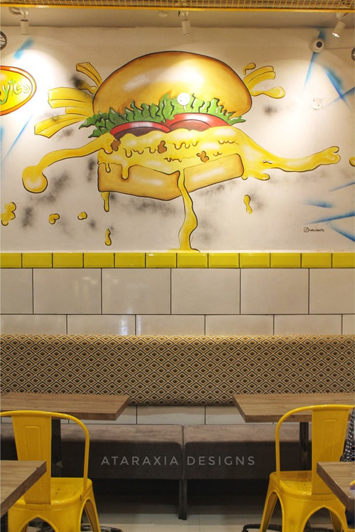
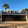
Fun bytes - I wanted the place to resonate with its name, so I planned around it. Varied patterns, quirky artwork and bold colours in this restaurant make a perfect amalgam for customers to take a second look. Whereas, ambient lighting and comfortable seating to make the customer never want to leave.


Volver a cargar la página para no volver a ver este anuncio en concreto
Houzz utiliza cookies y tecnologías similares para personalizar mi experiencia, ofrecerme contenido relevante y mejorar los productos y servicios de Houzz. Al hacer clic en 'Aceptar' confirmo que estoy de acuerdo con lo antes expuesto, como se describe con más detalle en la Política de cookies de Houzz. Puedo rechazar las cookies no esenciales haciendo clic en 'Gestionar preferencias'.

SAB design studio
CHERRY GARDEN AND LANDSCAPERS
Prajina Thakur / Ataraxia DesignsAutor original
Interior Hues