Houzz Logo Print
brian_hendricks1

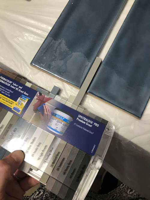
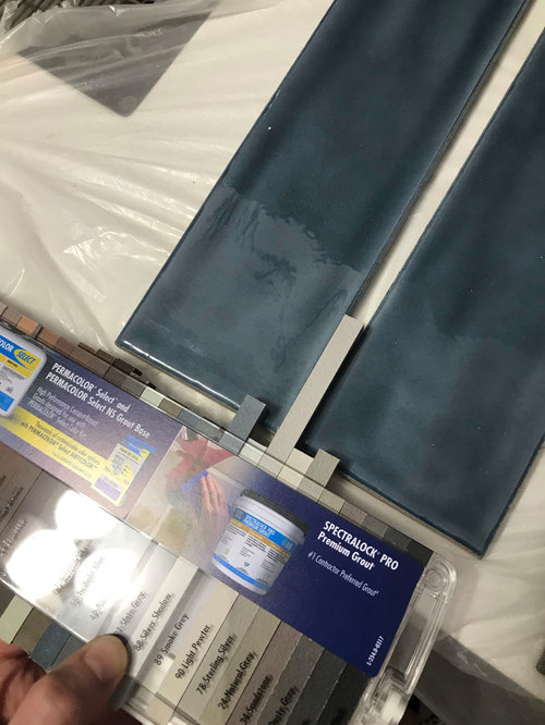
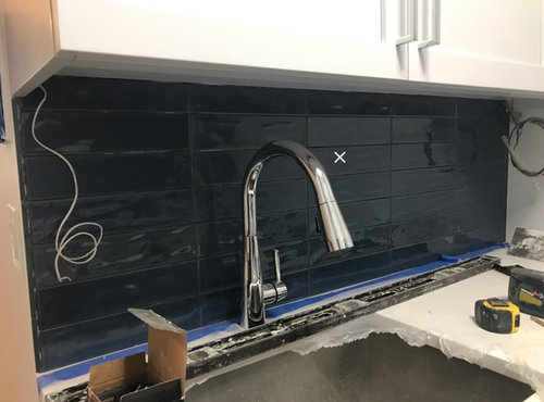
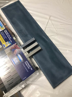
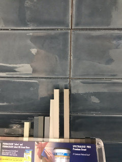
Help with grout color selection for backsplash

Brian Hendricks
hace 4 años
última modificación:hace 4 años

Hi all, Houzz community has been so helpful the past couple days. Our last decision for the project!

Please let me know which grout color you think works best for the space and tile. These are our final options. Either go light and create some contrast or dark and blend in. Not sure what works best. We like the Twilight Blue grout but could see a good case for the grays to highlight the tile a bit.


EDIT: Added Slate Gray, forgot about that one. It's a lighter blue-gray and added pics of the tile on the wall.


Sterling Silver


Smoke Gray


Twilight Blue


SLATE GRAY


Note: our cabinets are actually blue-gray, not white!


Comentarios (25)

  • PRO
    Sativa McGee Designs
    hace 4 años

    Smoke Grey looks the best of these selections.

  • skmom
    hace 4 años

    I usually prefer a matching grout... but I think the smoke grey looks best here too. Ps, I ADORE your tiles!

  • Pam A
    hace 4 años

    Is this DIY or with tile pros? I ask because dark grout can be hard to have a consistent color, if they use too much water in the sponge when they wipe it clean they can accidentally pull the color from the top layer of grout. OTOH, if it's a pro and it winds up splotchy they will probably re-do the problem areas without question. Even with a light grout I had some areas that looked noticeably off in color & they redid those areas for me.

  • PRO
    Mandeville Canyon Designs
    hace 4 años

    I agree with Pam, it's harder for a DIYer to get the saturated color consistent. If it's a pro, I say go with the darker. It's a little more unusual and will allow the tile to stand as an entire design. It's also a little easier to clean behind the stove. Good luck!

  • Brian Hendricks
    Autor original
    hace 4 años

    Added one more option: Slate Gray, which is more bluish-gray, in between Smoke Gray and Twilight Blue.


    This will be professionally applied.

  • parkerc01
    hace 4 años

    Looks like you're using Laticrete epoxy grout. The color should be very consistent. I used one of the darker taupes on my bathroom floor and there were zero issues. I do like the slate gray, but it just depends on how much contrast you want.

  • PRO
    Mandeville Canyon Designs
    hace 4 años

    Hi Brian,

    From the photo, the slate looks to have a little purple in it and your tile feels a bit more green blue. If the Slate has more brown undertones than that looks that would be fine. A cross between the two :)

  • skmom
    hace 4 años

    Ok, I changed my mind, I like the slate grey! We’ve done a lot of DIY tile jobs and have used a lot of dark colored grout, and we’ve dealt with the issues mentioned when too much water was added (and a grout pen saved the job!) but we’ve since found it’s worth it to use a grout additive to mix the grout instead of water. It gave us the consistent color, and apparently it’s supposed to help with any staining... so far I’ve been pleased with that aspect in the several years we’ve been using grout additives in lieu of water for mixing the grout.

  • Brian Hendricks
    Autor original
    hace 4 años

    Hm. Ok. I think the lighting might be causing differences. Here’s some all together. The Slate Gray just seems like too light but not a different enough color either.

    Would like the tile to just blend in more than have lines so I think it’s between Slate Gray and Twilight Blue. The tiles are a dark navy blue, they aren’t green. That’s just the lighting I think.

  • herbflavor
    hace 4 años
    Última modificación: hace 4 años

    Like the far right 2 dark browns in the package. Rich and interesting. Grays and light off whites? no. It's a warmer blue tile . 2nd brown from end .

  • J J
    hace 4 años

    following

  • cpartist
    hace 4 años

    Second to last pic, far left grout

  • Brian Hendricks
    Autor original
    hace 4 años

    The variation in answers is fascinating :)


    I'm concerned no one has said the dark blue option (Twilight Blue) :) The grout spacing is minimized (1/16") so very small amount of grout. Prefer not to see lines and keep the focus on the tile texture/color as there's no pattern, just stacked.


  • herbflavor
    hace 4 años
    Última modificación: hace 4 años

    No matter...the tile shading holds some brown in the blue.even better w .small grout line?..put a dark cocoa or earth brown of some sort. You have the sample package in your hand why don't you pull out the better shades. And it's not gray.

  • D Broder
    hace 4 años

    Twilight is stunning looking makes the tile color take center stage and be the star!!!

    The contrast colors make it look busy.

  • chicagopa
    hace 4 años

    Another vote for twilight blue

  • Bri Bosh
    hace 4 años

    Yup I’d go twilight blue as well.

  • PRO
    Sativa McGee Designs
    hace 4 años

    The problem with twilight blue is that it will make it look like a painted blue wall. And it will be just slightly a different shade than the tile.

    Make a section in the brown tones, preferably light brown tones or even white since you cabinets and countertop are bright white.

  • PRO
    Mandeville Canyon Designs
    hace 4 años

    Hi Brian I actually said go for the dark blue as long as a pro is installing. With the thin grout lines, it should be great!

  • felizlady
    hace 4 años

    Slate gray if you want to make the tile jump out.
    As close to the blue tile color as you can get if you want the tile to look almost solid.

  • seregiel
    hace 4 años

    Yes to slate gray or twilight blue.

  • PRO
    Sativa McGee Designs
    hace 4 años

    Twilight Blue sounds good as long as you want the simple look.

  • Yoyo Chan
    hace 2 años

    Hello! I’m deciding on my blue / green tile also and was just wondering what you picked in the end? Would love to see the end result :)

  • D Winstead
    el último año

    Hi Brian - Realized this is 3 years ago, but I'm in the midst of grout crises with some patterned denim/dark blue Spanish tile (with similar hue to yours) for my kitchen backsplash. Did you end up using the Twilight Blue? Would LOVE to see a pic of how it looked finished. Thanks!

Patrocinado

Volver a cargar la página para no volver a ver este anuncio en concreto

España
Personalizar mi experiencia con el uso de cookies

Houzz utiliza cookies y tecnologías similares para personalizar mi experiencia, ofrecerme contenido relevante y mejorar los productos y servicios de Houzz. Al hacer clic en 'Aceptar' confirmo que estoy de acuerdo con lo antes expuesto, como se describe con más detalle en la Política de cookies de Houzz. Puedo rechazar las cookies no esenciales haciendo clic en 'Gestionar preferencias'.