Need color advice please!
Judy X
hace 9 años
This is the quilt for my bed-- I am hoping for wall color suggestions!
Respuesta destacada
Ordenar por:Más antigua
Comentarios (169)

Judy X
Autor originalhace 9 añosYes-- I said no blue-- but I am reconsidering and thinking blue-green? The cream color was just not setting right with me, the darker putty tones are too close to what I have throughout the condo and while I love the darker green-grays ( like Salisbury green) I don't think I want the whole room in that color. I love the quilt but am having such a tough time with the wall color!!!
Laurie
hace 9 añosHow about Pebble Beach by Ralph Lauren? It's a colour in the River Pock texture paint.
http://eaglepaintandwallpaper.com/store/index.php?main_page=product_info&cPath=60&products_id=830&zenid=42919a20c6e705ecfdc3d5fb1bc7589d
It's the colour of the accent wall in this photo.

adagio91
hace 9 añoscp1005 - I think you will be SPOT ON with Benjamin Moore's 2122-50 Iceberg, as suggested by Karen Paul Interiors!! That looks a bit lighter than what I have on the walls I shared with you, but I've found over the years that paint ALWAYS looks DARKER on the walls than on the paint chip. GO for it!! And come back with photos of your new room after you've finished decorating it!!!User
hace 9 añoscp
Look again at Salisbury Green, it is the lighter shade of green. I won't paint any of my walls medium or dark colors. I would go with the designer's choices. Good Luck. I just thought you may have looked @ the wrong shade of green. Blues are my favorite but I do love this shade of green. I have lived with it almost as long as my ivory or cream walls in our other house. PRO
PROSandy G. ltd.
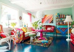
hace 9 añosÚltima modificación: hace 9 añosDo not want to belabor the point, but here are some pix of colorful quilts that have a wall color that is on the cream/off white side. This is the simplest solution. It would set up your quilt to be the star in the room because the colors of it wound not be in competition with a lot of wall color.
I know . . there is something wrong about featuring a gun over your headboard!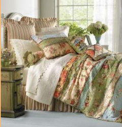


jillbertsch
hace 9 añosCP, there are so many ideas here and I see three basic trends: blue, green and beige/off white. Yet, to help you decide it's time to get sample patches painted on the walls. Home improvement stores have samples that cover approximately 2sqft. It's awesome for choosing paint color. You will want to see the colors in all the light phases of the day and then you will know. Remember to apply sample colors in large enough area to get a true feel for the color interplay with your quilt. Remember you are the one who has to live with it. Have fun!jillbertsch
hace 9 añosAlso, ask yourself (if you haven't already) if you want the quilt to pop in the room which is what will result with a light wall color, or do you want the entire room to cacoon you which will happen if a dark color is applied?adagio91
hace 9 añoscp1005 - I agree with jillbertsch above about choosing your color. DO get samples to try out. If you remember, I went along with Karen Paul Interiors about using Benjamin Moore "Iceberg," although I personally like "Summer Showers," that you also picked out better, I think. I always go lighter in my home, because we live with lots of woods close to us and because I like the colors of the sea (we live close to the Mississippi gulf coast). The main reason I use light colors is because they are soothing and make small spaces look bigger. Plus, I am very claustrophobic and it doesn't take much for me to feel like I'm being suffocated in dark rooms & houses.
Our best friend, who decorates and redecorates her house continually (!! - really!!), plus does other peoples' homes, uses predominately really dark colors, and neither my husband or I like her choices because they really close in on you. I think light colors are much easier to decorate with because if you get a fairly neutral background, you can go several directions in your choices for pops of color. Your quilt is beautiful and will allow YOU LOTS of choices to make with the light blue/greenish walls . . . you can go with reds (I love deep reds with light blue/green here in my house!! As you can see in my guest bedroom!!), greens, darker blues (but lighter than navy, I think).
Awwwhhhhh . . . I'm excited for you cp1005!!! You go, Girl!!
Dee (my name is Dee)
makaloco
hace 9 añosI'd be concerned that pale, watery shades of blue or green would mute the warm colors of the quilt rather than enhancing them. As others have mentioned, samples should help you decide. Are you leaning toward a single color for all the walls, or have you considered an accent wall in a deep color with the rest in (say) cream? It might be a good compromise if you're reluctant to do the whole room in cream, or in a rich color.Judy X
Autor originalhace 9 añosSo.....I got a sample of iceberg-- i looks to white and too bride on my walls. So I got samples of smoke and wythe blue (all benj. Moore colors). Both look green in my bedroom but very blue green in my adjoining bathroom. I am not sold on either. So I am back to cream. What do you all think of brandy cream from benjamin Moore? PRO
PRO- PRO
Sandy G. ltd.
hace 9 añosÚltima modificación: hace 9 añosTrust your eye! Your space is unique for many reasons, and paint colors show different room to room depending on so many factors. This is why you need to shop for your room's paint on your own after deciding on a direction to go.
You have so many suggestions in your thread and I can guarantee you that the colors recommended worked out well for every single one. That doesn't mean that it will work in your room. It takes leg work but it is so worth the hassle. The right color makes all the difference. Again, trust that you will find the right hue for your space. It is out there!
So, here is Brandy Crème and on my screen, it looks lavenderish. Is that what you see on the wall or sample chip?

- PRO
Sandy G. ltd.
hace 9 añosÚltima modificación: hace 9 añosHere is ice berg in rooms. See how different they are! No wonder choosing the right color is a challenge! And these rooms are almost all white so no other colors are influencing the paint color.

- PRO
karen paul interiors
hace 9 añoscp, that is not an ultra-light color so I'm mystified. Perhaps you need to take a stick and stir well to insure the machine did it job. I can't tell you the number of times that the paint was not totally and completely finished "blending" all the pigments. The best wall to paint is the window wall and it is not affected by the light that comes through the window. Also remember the paint hues around the room combine into one single color when all is said and done. Laurie
hace 9 añosHow about an orangey colour like this one?
http://www.benjaminmoore.com/en-us/paint-color/honeymoonJudy X
Autor originalhace 9 añosKaren paul interiors-- I too was surprised how light it was on the wall-- unfortunately, the window wall is a sliding glass door so there isn't any wall space there to paint. I was excited by the iceberg-- but it is really too light in my room. Back to the ha dwarf store I go this weekend for more samples! (How I wish benjamin Moore didn't discontinue their little jars!)- PRO
karen paul interiors
hace 9 añoscp, I am so very sorry to have mislead you. Next question, was the color in the correct camp? Was it green enough or too blue? You know these monitors are so wanting. I really don't want you to do the creme route. Can we just hone this hue and take it down (darker) a few? Judy X
Autor originalhace 9 añosKaren paul interiors-- I am not sure it is in the right direction-- I tried " smoke" ( I think it is the next darker choice from iceberg)-- in my bedroom it looks green but when I tried it on my adjoining bathroom wall it is too blue. I tried wythe blue-- in the bedroom it looks like a darker sage green but in the bathroom it is a horrible blue green. I think these are. Maybe too harsh?Judy X
Autor originalhace 9 añosKaren paul interiors-- don't feel like you mislead me-- I appreciate your help!- PRO
karen paul interiors
hace 9 añosSo you are planning to use the same color in the bathroom? The lighting in there will be completely different. Judy X
Autor originalhace 9 añosI am not sure yet about the bathroom-- I am replacing the vanity and am waiting for the countertop to be installed before I decide.Patricia Dowd
hace 9 añosTo go with your beautiful quilt, I recommend a butterscotch color. Try the one attached. It's called Surprise Amber by Sherwin Williams.
Laurie
hace 9 añosThat is similar to the orangey colour I suggested. I think it will make everything pop.jillbertsch
hace 9 añosHer are a few of the suggestions in this thread. Perhaps three neutral walls and an accent wall? Keep us posted.


janroze
hace 9 añosany of the colore look more rich than the white. I read that accent walls were on their way out. I still want one in my living room.makaloco
hace 9 añosGo for it, Janroze. I have accent walls in every room, even the bathroom, and couldn't care less if they're "in" or "out". I enjoy the contrast between vibrant colors and creamy off-white.Judy X
Autor originalhace 9 añosThank you all for your suggestions. After trying 8 different colors( many of which were suggested here) on my walls, I decided that choosing a color should not be this hard! I decided to return the quilt-- in all honesty, it's not the colors I thought I was buying and while I do like it, I am not inspired by it. I have ordered some fabric samples and hope to be inspired. I will post my final reveal!jillbertsch
hace 9 añosCongratulations I your resolution. Hope you find the perfect bedding & wall color!!- PRO
Sandy G. ltd.
hace 9 añosGood! I love how you stated the reason for returning the quilt -- that you were not inspired by it! Terrific insight that we can all learn from! Please post your next selection? makaloco
hace 9 añosProbably the right decision. You're right, choosing a color should not be so hard! I loved the quilt and many of the colors suggested, but I'm not looking at in it your room in your house. It's always best to follow your gut. Look forward to seeing whatever you select.adagio91
hace 9 añosI AGREE!!! Can't WAIT to see your new bedspread & walls!!!!!! You ABSOLUTELY MUST share with us. I feel like I have a vested interest in your bedroom now, which should be the most relaxing, peaceful room in the house!!!!!!!!! God Bless!
Geneviève
hace 9 añosÚltima modificación: hace 9 añosOh my ! this isn't done yet? We will be all old and grey by the time we paint this lovely country room , I'm sticking with my previous colours .....L'Oreal wait for me !!!!
Margo where are you ?User
hace 9 añosÚltima modificación: hace 9 añosLOL- I am in no rush Genevieve, I am already old and gray;) Not to mention that my teeth have failed! See avatar')User
hace 9 añosThis dilemma confirms MY reasoning why I like to find a paint that I love FIRST and then find the bedspread;))))))Geneviève
hace 9 añosHi Margo!! too much caffeine will do that or did you run out of Colgate or forgot to soak your denture ?:)) I trust L'Oreal to hide my grey :))
About going shopping with a paint chip and then find a fabric , I did that and it works great.
I would take the quilt to a paint store and have them computer match one of those colours .Judy X
Autor originalhace 9 añosDrum roll .......for those of you still following.... Here is what i ended up,with..... Walls are harbor haze by Benjamin Moore. I still need to put something over the head of the bed ( I plan on doing black and white photos or a tryptich). Thank you all for all your help!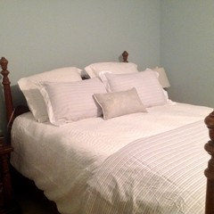
adagio91
hace 9 añoscp1005 -
Wow - what changes!! And I LIKE them! That was what I was talking about that your bedroom "should be the most relaxing, peaceful room in the house." And I think you've definitely accomplished that. Beautiful.
Are those two front shams pink, or do they have a touch of pink to them? It looks like it, which I really like as well. But, as well as we love black & white, having more than one Ansel Adams photographs hanging in our home, I'm thinking that a large Monet print or poster would be beautiful over your bed.
I have a really pretty one hanging over my big old desk here from the Monet: Late paintings of Giverny from the Musee Marmottan (in France) that were in a big exhibition at the New Orleans Museum of Art, January 7, 1995 -March 12, 1995. There were dozens of Monets, most of which were water lilies behind the estate where he was living and they were each one more beautiful than the one before. Mine is a poster from the Exhibition and is a 22'x28" vertical. I'll take a picture of it in a few minutes & post it here for you to see, although photos don't do it justice.
Mine has a lot of lavender blues in it and muted greens & pinks, that would bring out the pink tones of your front shams and really make your room pop. Mine was hanging in our bedroom for a long time because it is soothing. If you can find a Monet print or poster that you can buy in a store or online, you can pick out one of the colors in it to use to buy a small pillow that color the size of the one you already have on your bed. That would really be awesome!!
I'll be back. Thanks SO much for sharing your (nearly) finished bedroom. Five stars from me!! Deeadagio91
hace 9 añosP. S. In looking more closely at the enlarged photo of your bedding I see that the shams actually match the throw across the end of the bed. But, I think you might bring some soft pinks into your room in a pillow/pillows and still use a Monet, Renoir or other Impressionistic artist. I'll try to look online real quick to see what I can find. Any of them would be beautiful with your wall color & neutral bedding.Judy X
Autor originalhace 9 añosThe shams and the quilt at the end of the bed actually have a soft green in them. I like the idea of a Monet print above the bed-- I have some antique watercolors (blues, pinks and greens) hanging on the wall opposite the foot of the bed, so I am concerned about having too much of that going on. Also, I enjoy photography and hope to put some of my own prints there.
I am thinking of replacing the nightstand on the right with a round table with a cloth on it but that will depend on finding the right fabric!
I returned the quilt-- I had purchased it online from the company store. ( Joelle quilt if you are looking for it). I am very happy that I did! The room is now very calm and serene. ( and not grandmotherly!).adagio91
hace 9 añoscp1005 - Here is the Monet I have that I love and have used a variety of places around the house. Mine is not big enough to be the sole focus over a bed, but would need to be hung to one side with some smaller prints or photos with it. I have some small color photos (that have won contests) that would be lovely hung vertically next to a Monet, so maybe you do too. That would be great!
Here's my Monet:
adagio91
hace 9 añosÚltima modificación: hace 9 añosP. S. Apparently, you have to put your mouse over the print to see it in full & to be able to fully appreciate it, cp1005. Also, to "modernize" your room, I suggest (as mine is) a poster of a Monet, etc, rather than just a print. Makes it more savvy looking!
Sylvia Annette Bergman
hace 4 añosI would use the background color of the center stripe. Paint all 4 walls and then go back to the main wall and paint 3 inch stripes. Measure the wall and divide by 3 inches. Mark lines in lead pencil and tape off stripes with frog tape so lead marks will be painted over. It is a stunning look and I would personally pick the background color of the far right stripe. You need to look around your room and decide for yourself which color you would be comfortable with.
Good luck with your project.
Annette Bergman
The Accidental Author


Patrocinado
Volver a cargar la página para no volver a ver este anuncio en concreto


Kris G