Room Tour: A Streamlined Bathroom With a Soothing Spa Feel
Simplifying the layout and furniture has transformed this formerly disjointed bathroom into a fresh, calm haven

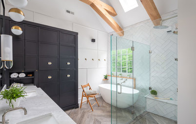
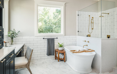
The bathroom in Ken and Nikki Gill’s suburban Dallas home was complicated. The dark and dated 22 sq m space had a busy layout, with two single-basin vanity units on different walls, a jetted bath with jets that no longer worked, a separate shower, a badly positioned toilet and two large cabinets that took up valuable floor space. “We knew overall the footprint was a good size, but the layout was not the best use of space,” Nikki says.
The busy parents of school-age twins wanted better function with a brighter look and a soothing, spa-like feel. They looked at Houzz photos and other online sources for inspiration and hired designer Tara Lenney to help them create a layout that uses the space in a more efficient way. Tara eliminated the bath, separate vanity units and cabinets, then repositioned the toilet, created an open shower and added a bespoke double vanity unit with plenty of storage. The result is a modern-day, easy-to-use retreat.
The busy parents of school-age twins wanted better function with a brighter look and a soothing, spa-like feel. They looked at Houzz photos and other online sources for inspiration and hired designer Tara Lenney to help them create a layout that uses the space in a more efficient way. Tara eliminated the bath, separate vanity units and cabinets, then repositioned the toilet, created an open shower and added a bespoke double vanity unit with plenty of storage. The result is a modern-day, easy-to-use retreat.
Tara took the bathroom down to the studs and got rid of the vanity units, cabinets, shower and jetted bath. She then designed a spacious walk-in shower in the former location of the bath.
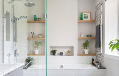
Ceramic tiles in white and grey tones wrap the walls and bench. “We ran them vertically because we wanted something to lift the eye up,” Tara says. “This space has a standard 8ft [2.4m] ceiling that couldn’t be moved. We selected a busier floor, so we needed tiles on the shower walls that wouldn’t compete, but would be visually interesting.”
The floor is white and putty-grey polished decorative marble tiles laser-cut into a diamond pattern. “This floor is a happy medium between modern and classic,” Tara says.
A satin etched glass window replaced the glass blocks. “Having the [natural] light in there is really important,” Nikki says. “The old shower seemed very dark.”
Tara installed the matt black shower head higher than standard to make it more user-friendly for Ken, who’s tall. “We had Ken get in there and we measured everything to make sure it would work for him,” she says.
A large niche with four quartz shelves sits between the wall studs. Small, hand-glazed tiles in an aloe green colour accent the back of the niche. “I’m a huge fan of a vertical shower niche,” Tara says. “We used slightly more expensive tiles for this area and wanted to keep the colour palette really neutral. They wanted this space to be modern but fresh – and also serene.”
A large niche with four quartz shelves sits between the wall studs. Small, hand-glazed tiles in an aloe green colour accent the back of the niche. “I’m a huge fan of a vertical shower niche,” Tara says. “We used slightly more expensive tiles for this area and wanted to keep the colour palette really neutral. They wanted this space to be modern but fresh – and also serene.”
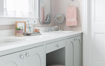
Consolidating the two cabinets into one large cupboard allowed Tara to create a roughly 4m-long bespoke, rift-cut white oak vanity unit. “I pushed for wood because I wanted the warmth,” Tara says. “By making it appear as if it’s floating and giving it some negative space, it’s not as oppressive and has room to breathe.”
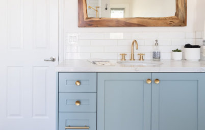
Matt black drawer handles, taps and mirror frames coordinate with the shower fixtures. The sconces feature black and brass finishes. “I love mixing metals so things feel layered,” Tara says.
Walls painted in Snowbound, Sherwin-Williams.
Matt black drawer handles, taps and mirror frames coordinate with the shower fixtures. The sconces feature black and brass finishes. “I love mixing metals so things feel layered,” Tara says.
Walls painted in Snowbound, Sherwin-Williams.
Rectangular undermounted basins and wall-mounted taps add a modern vibe. The same rift-cut white oak used for the vanity unit was chosen for a long shelf above it. “We wanted a way to terminate the [splashback], and it helps top off the vanity basin area,” Tara says. “It’s a sweet spot for display storage, and they have another surface to spread things out on and not have them on the countertop.”
The white quartz counter has a mitred edge for a thicker appearance. The same quartz forms the short splashback. “It’s one of the elements that makes this bathroom feel modern and luxurious,” Tara says.
Verticyl basins; Purist wall-mounted taps, all Kohler.
The white quartz counter has a mitred edge for a thicker appearance. The same quartz forms the short splashback. “It’s one of the elements that makes this bathroom feel modern and luxurious,” Tara says.
Verticyl basins; Purist wall-mounted taps, all Kohler.
An ivory, hand-braided, wool-and-cotton rug with a non-porous mat underneath adds a touch of texture and softness to the bathroom floor, which is covered in the same marble tiles used for the shower floor.
You might also like How to Plan for a Bathroom Renovation.
You might also like How to Plan for a Bathroom Renovation.
This bespoke storage tower is an extension of the vanity unit, made from the same rift-cut white oak. Its bottom cabinet features two pull-out laundry hampers. “Previously, we just had laundry baskets sitting out in our closets,” Nikki says.
The white panelled door connects to the couple’s bedroom. Tara widened the door to make it easier for Ken and Nikki to navigate between spaces. “If I was walking out of my closet with the laundry basket on my hip, I couldn’t get through that door easily,” Nikki says. “That’s why we asked them to widen it.”
Two matt black towel rails keep fresh towels close to the shower. This photo also highlights the well-placed LED ceiling lights added to improve overall lighting in the space. The extractor fan was also relocated, and a new model installed for proper ventilation.
Two matt black towel rails keep fresh towels close to the shower. This photo also highlights the well-placed LED ceiling lights added to improve overall lighting in the space. The extractor fan was also relocated, and a new model installed for proper ventilation.

¿Estás buscando a un profesional para tu próxima reforma en casa?
Encuentra en Houzz al mejor profesional para tu proyecto
Encuentra en Houzz al mejor profesional para tu proyecto
Looking in the opposite direction, this view shows the white panelled door on the left that leads to the new toilet and the opening at the far end to the expanded cupboard. “We sacrificed a window to get a more functional closet space,” Tara says.
Tara rotated the location of the loo 90 degrees (see the before and after floorplans below), so it now sits by the relocated shower. This design move also allowed her to create the spacious new closet. “The toilet almost stayed in the same place,” Tara says. “If you’re mindful in keeping the plumbing in the same locations, you can save money. We didn’t try to move the shower to where the closets were, because that would have been expensive.”
The colour of the storage cabinet added above the toilet coordinates with the tiles used for the large shower niche. “It also repeats in the artwork and greenery,” Tara says.
The colour of the storage cabinet added above the toilet coordinates with the tiles used for the large shower niche. “It also repeats in the artwork and greenery,” Tara says.
The ‘before’ floorplan on the left shows how the unused bath (bottom left) two basins (middle bottom and bottom right corner) and two separate cupboards (top left and top right corners) created a disjointed layout. The small shower stood in the middle of the room.
The ‘after’ floorplan illustrates the new, more open layout. The spacious new shower stands in place of the former bath (bottom left) and the long double vanity unit fills the far right side. Ditching a cupboard and the former shower and rotating the toilet allowed for a larger single cabinet (top left).
“The layout is so much more user-friendly for us, using every square inch of the bathroom we had,” Nikki says. “Now everything is cohesive.”
Tell us..
What do you like about this calm, practical bathroom? Share your thoughts in the Comments.
Patrocinado
Volver a cargar la página para no volver a ver este anuncio en concreto

Patrocinado
Volver a cargar la página para no volver a ver este anuncio en concreto
Who lives here? Ken and Nikki Gill and their school-age twins
Location Dallas, USA
Room dimensions 240 sq ft (22 sq m)
Designer Tara Lenney Design
Photos by Tara Lenney Design
Prior to the renovation, the bathroom was heavy on beige walls and terracotta tiles. A soffit brought the ceiling lower, making the space feel tight. On the left in this ‘before’ shot is what was one of two basic vanity units with cultured marble tops. The other sat against a different wall, awkwardly splitting up the layout. (See the before-and-after floorplans below.)
The jetted bath was broken and rarely used by the couple anyway. The glass-block window dated the look. “The function and layout was driving them crazy,” Tara says. “They had lots of space where they didn’t want it and not enough in other areas.”