New This Week: 6 Kitchens With Industrial-Style Elements
Designers blend vintage brick, steel, glass and concrete with contemporary features to create a welcoming style

We recently highlighted farmhouse-style kitchens that channel a rural old-world look, with either a classic interpretation or a modern twist. Here we look at a kitchen style that mixes past and present.
Industrial style blends modern-day features with elements you’d typically find in early 20th-century factories, warehouses or other buildings tied to manufacturing. This style generally works best in lofts, apartments and other urban homes created by converting former commercial spaces, while retaining some of the original building materials, such as brick, concrete and metal, as well as other elements like exposed ductwork and electrical conduit. You’ll find some combination of all these features in the following six industrial-style kitchens.
Industrial style blends modern-day features with elements you’d typically find in early 20th-century factories, warehouses or other buildings tied to manufacturing. This style generally works best in lofts, apartments and other urban homes created by converting former commercial spaces, while retaining some of the original building materials, such as brick, concrete and metal, as well as other elements like exposed ductwork and electrical conduit. You’ll find some combination of all these features in the following six industrial-style kitchens.
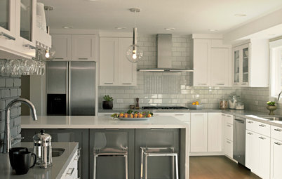
2. Cool and Contemporary
Designer: Kimberly Peck Architect
Location: Chelsea neighborhood of Manhattan
Homeowners’ request. The homeowners wanted to keep the industrial look of this former commercial space while making it feel like a home with lots of art and rugs. “The architectural goal for the space was to keep, and in some cases to emphasize, the industrial feel in order to contrast with the owner’s collection of rugs and furnishings, which would serve to create the warmth in the space,” architect Kimberly Peck says. “All finishes were removed from the floor and ceilings to expose the existing concrete structure. The concrete floors were polished and the ceiling painted.”
Industrial-style details. “When I think of industrial style, I think of black, metal, glass and concrete,” Peck says. The compact kitchen features black linoleum cabinets with black countertops made of Richlite, a compressed recycled-paper product. Other black details include the hardware, pendants and range, all contrasted against stark white walls and exposed white sprinkler pipes. Raw blackened steel forms the baseboard between the concrete floor and walls. Clerestory windows above the range wall connect to a walk-in pantry and secondary prep kitchen. An industrial-style floor lamp stands near the island.
Other special features. The island sits on casters, allowing it to be moved around as needed. The hood and backsplash are clad in white porcelain slabs.
Designer tip. “Cladding the hood in the same material as the backsplash simplifies the kitchen, keeping the lines very clean,” Peck says.
Shop for kitchen island lighting
3. Rustic and Refined
Designer: Nathan Arnold of Millennial
Location: Near Burley, Idaho
Size: 270 square feet (25 square meters)
Homeowners’ request. A sleek up-to-date kitchen that would complement the rural setting of their new-build home, with a custom cabinet design. “They didn’t want any visible hardware or trim to distract from the goal of ‘less is more,’” designer Nathan Arnold says. “Special push-to-open hardware was used for all the cabinet drawers and doors to accomplish this. They also wanted to use some repurposed and reclaimed items to help build a story with authentic vintage charm mixed with all the modern conveniences present in their new home.”
Industrial-style details. “The open-rafter ceiling with visible electrical conduit connecting the repurposed pendant lights lends to the industrial vibe,” Arnold says. “The repurposed-wood floating shelves give a warm complement to this industrial-style space, while the minimalist window treatment frames the wide-open country view.”
Ceiling-mounted cage lights, a wall-mounted bulb light over the sink and a restaurant-style faucet also nod to industrial style.
Other special features. The cabinetry is black walnut with a natural clear-coat finish. The countertops are Fumaca soapstone in a honed finish. “The countertops work to bring the rustic and industrial details in line by wrapping the range stove in the island and undermount stainless steel sink centered in the window,” Arnold says. “The natural tones complement the style and yet provide a modern contrast. Because there is plenty of natural light streaming into this space from every direction, we really didn’t have to worry about using tones that were just a bit darker and richer.”
Designer tip. When using repurposed or reclaimed pieces, try not to use them all in one room. “You don’t want to try to cram every neat little item into one space,” Arnold says. “Spread the love and the charm by using those special finds in several different rooms.”
10 Kitchen Island Features Pros Always Recommend
4. Warm and Welcoming
Designers: Ellen Z. Wright of Apartment Rehab NYC (interior design) and Audra Manzano Architect (architecture)
Contractor: NY Construction & Stone
Location: Harlem neighborhood of Manhattan
Homeowners’ request. “When my wife and I purchased this fixer-upper studio in Harlem, it hadn’t been updated since 1977, and still had the original kitchen from the late ’50s,” designer Ellen Z. Wright says. “It needed a complete overhaul, so we tore everything down to the studs and started over.”
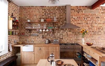
Industrial-style details. During the renovation, the back wall in the kitchen posed many challenges for Wright. “It was uneven, [and] there were exposed heating pipes, electrical boxes that couldn’t be covered by upper cabinets and a full wall indent that served no purpose,” she says. “I decided to lean into the roadblock and let the flaws do the talking by incorporating an industrial vibe. Since a standard backsplash was out of the question, I went with a reclaimed-brick-veneer wall that matched the aged brick exterior of the building. We built out over the exposed pipes and crooked wall indent to create a niche for two reclaimed-wood shelves above a wraparound countertop. I kept the cabinet design a simple Shaker style so the brick veneer could be the star of the show, turning the space’s biggest flaw into its key feature.
“Industrial style is so grounding and elemental, featuring materials like metal, stone, leather and wood. It’s all about leaning into flaws and allowing them to shine. I incorporated iron into the cabinet pulls, custom shelf brackets and pendant cages, and stained the wood elements a rustic shade for a nod to leather.”
The countertops are concrete-look quartz.
Designer tip. “Don’t be afraid to work with what you have, in a way that means something to you,” Wright says. “Instead of fighting flaws in the bones of a space, try working with them to create something completely new. The end result will be a unique space that is one of a kind and all yours. This method is also a great way to save a lot of money.”
“Uh-oh” moment. “Because the ceilings were solid cement, all the lighting hardware had to be mounted externally,” Wright says. “We worked around this roadblock by hiding the cords with covers painted the same color as the ceiling. There was also an awkward dropped ceiling outcrop over the kitchen window that we couldn’t demo because of a surprise wall pipe. We took advantage of the flaw by adding in some recessed lights, and gave the exterior sharper corners to match the other outcrops in the apartment.”
New to home remodeling? Learn the basics
Designers: Ellen Z. Wright of Apartment Rehab NYC (interior design) and Audra Manzano Architect (architecture)
Contractor: NY Construction & Stone
Location: Harlem neighborhood of Manhattan
Homeowners’ request. “When my wife and I purchased this fixer-upper studio in Harlem, it hadn’t been updated since 1977, and still had the original kitchen from the late ’50s,” designer Ellen Z. Wright says. “It needed a complete overhaul, so we tore everything down to the studs and started over.”
Industrial-style details. During the renovation, the back wall in the kitchen posed many challenges for Wright. “It was uneven, [and] there were exposed heating pipes, electrical boxes that couldn’t be covered by upper cabinets and a full wall indent that served no purpose,” she says. “I decided to lean into the roadblock and let the flaws do the talking by incorporating an industrial vibe. Since a standard backsplash was out of the question, I went with a reclaimed-brick-veneer wall that matched the aged brick exterior of the building. We built out over the exposed pipes and crooked wall indent to create a niche for two reclaimed-wood shelves above a wraparound countertop. I kept the cabinet design a simple Shaker style so the brick veneer could be the star of the show, turning the space’s biggest flaw into its key feature.
“Industrial style is so grounding and elemental, featuring materials like metal, stone, leather and wood. It’s all about leaning into flaws and allowing them to shine. I incorporated iron into the cabinet pulls, custom shelf brackets and pendant cages, and stained the wood elements a rustic shade for a nod to leather.”
The countertops are concrete-look quartz.
Designer tip. “Don’t be afraid to work with what you have, in a way that means something to you,” Wright says. “Instead of fighting flaws in the bones of a space, try working with them to create something completely new. The end result will be a unique space that is one of a kind and all yours. This method is also a great way to save a lot of money.”
“Uh-oh” moment. “Because the ceilings were solid cement, all the lighting hardware had to be mounted externally,” Wright says. “We worked around this roadblock by hiding the cords with covers painted the same color as the ceiling. There was also an awkward dropped ceiling outcrop over the kitchen window that we couldn’t demo because of a surprise wall pipe. We took advantage of the flaw by adding in some recessed lights, and gave the exterior sharper corners to match the other outcrops in the apartment.”
New to home remodeling? Learn the basics

¿Necesitas un profesional para tu proyecto de reformas de cocinas?
Encuentra en Houzz al mejor profesional para tu proyecto
Encuentra en Houzz al mejor profesional para tu proyecto
5. Rough and Radical
Designer: Coby Linton of Linton Architects
Location: Durham, North Carolina
Size: 235 square feet (22 square meters)
Homeowners’ request. “The owner completely embraced the innate industrial aesthetic of the structure: the masonry shell of a 1920s neighborhood grocery store, with its weathered brick and deeply worn concrete floor,” architect Coby Linton says. “To meet zoning requirements, the entire finished structure had to stay within the constraints of the original exterior volume, and the newly created upper floor left us with relatively low ceilings in the kitchen area. By keeping the space wide open to the adjacent living and dining spaces, and installing plenty of glass on the street front, we found a perfect parking space for the owner’s custom motorcycle, and the space feels gracious and bright and open.”
Industrial-style details. “Industrial spaces are all about the bones,” Linton says. “Rather than layering finishes to conceal the underlying structure, the bones are left exposed and define the character of the space. All the better if this underlying structure happens to be steel and concrete.
“In this case we salvaged the original steel roof beam, cutting it into shorter segments to be used as exposed steel columns flanking the kitchen. They have the beautiful 100-year-old patina of old steel that’s very difficult to replicate. A hundred years of wear shows on the concrete slab, which we simply cleaned and sealed. The 100-year-old patina of the old steel and the worn concrete floor sets the tone for the space. The dark tone of the quartz waterfall island and the flush gray cabinetry echo the color of the steel perfectly, while simultaneously contrasting its historic texture with clean modern lines and pops of warmth from the brass pulls.”
Designer tip. “The only trick we can offer is to avoid tricks,” Linton says. “Our whole focus is on getting the basics right, and when it works, you can feel a sort of timelessness in the space that’s only degraded by the kind of stylistic touches that quickly become dated.”
“Uh-oh” moment. “The front facade sits right on the sidewalk of a street that gets a good bit of pedestrian traffic, and so we were confronted with the age-old urban challenge of maximizing the light and views for the occupants while also maintaining some degree of privacy,” Linton says. “We must have studied a couple dozen different glass samples for the front windows, and finally found a glass with the perfect amount of reflectivity on the exterior. You can only really see into the space from the outside if you put your face to the window, but the light pours in beautifully and the views are perfectly clear from the inside looking out. We used the same glass at the overhead door, which allows the owner to throw the space wide open to the exterior on the many beautiful days we get here in North Carolina.”
See more of this home
6. Light and Lofty
Designer: Ivana Stojanovska of Arete Renovators
Location: Chicago
Homeowners’ request. “This homeowner came to us for reconstruction after the unit flooded,” designer Ivana Stojanovska says. “The water predominantly affected the kitchen area and flooring. Their previous space functioned well for them, so we did not do any layout changes here. The immediate need was to make the space livable again and maintain a reasonable budget.”
Industrial-style details. “High ceilings, exposed brick and ventilation, concrete and beams all give way to industrial style,” Stojanovska says. “Industrial style lacks a lot of bright color. For this kitchen we kept with that style to ensure the rebuild matched the period of the home. We incorporated matte black fixtures and hardware to complement the brighter white cabinetry and lighter tones in the countertops.
“The engineered hardwood flooring was a great addition to tie the space together and add a little bit of rustic warmth, but the stainless steel accents through the appliances, counter stools and pendant lights bring you back to the industrial style and feel.”
Designer tip. “For any industrial design, my tip is to keep it neutral and warm,” Stojanovska says. “Industrial spaces tend to be very cold. You can add warmth through the shade of white cabinetry you select or by adding natural elements like wood flooring.”
Wall paint: Repose Gray, Sherwin-Williams
More on Houzz
Browse industrial-style kitchens
Hire a kitchen remodeler
Shop for kitchen products

Patrocinado
Volver a cargar la página para no volver a ver este anuncio en concreto
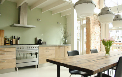
Designer: Laetitia Wajnape of Cinquieme Gauche
Location: Los Angeles
Size: 450 square feet (42 square meters)
Homeowner’s request. A sophisticated modern kitchen with a hotel-like quality.
Industrial-style details. Ebonized oak cabinets. Black range, hood and ductwork. “We didn’t actually design this kitchen with an industrial style in mind, but rather in reaction to the industrial backdrop of the space,” designer Laetitia Wajnape says. “As it is a loft, there are lots of pipes and soffits to work around, and we wanted to both integrate and elevate those features. For example, we designed the dining table and island to wrap around one of the structural pillars in order to make the pillar disappear, and also allow for entertaining space from which you can also survey the entire loft. We painted the AC duct black to blend in with the rest of the space. The idea was to restore some balance between raw, industrial elements and refined, sophisticated pieces.”
Other special features. Green quartzite countertops and slab backsplash. White oak shelves and dining island. The off-white wall paint is Moonlight by Backdrop.
Designer tip. “Instead of feeling discouraged by structural ‘obstacles’ to your kitchen design, try to think about creative solutions to integrate them and enhance the features of the space,” Wajnape says.
“Uh-oh” moment. “The backsplash stone slab was damaged when installing the vintage brass sconces, so we thought we’d have to change the whole design,” Wajnape says. “Fortunately, we were able to salvage it by switching stones around. We ended up using the damaged slab for the bathroom vanity, as it was in the right place for the sink hole. Creative thinking is always the way.”
Find a kitchen designer near you