My Houzz: Elegant, Accessible Design Brings Joy to a Spanish Home
Every part of this apartment is now wheelchair-accessible and its dark rooms were reorientated to bring the sunshine in

Celia Mateo and Luis Miguel González, the owners of this apartment, found themselves at a crossroads: they had to decide whether to revamp their home in the centre of Barcelona – which had a layout that didn’t work for them – or move to a new one. In the end, they opted for a total renovation that gave them what they needed: spaces tailored to Mateo, who was diagnosed with Parkinson’s disease 14 years ago. Mateo says that, since the renovation, her quality of life “has changed 100 percent. I have the feeling of being in a new flat and I feel happier. Sometimes, without realising it, we say something like, ‘Do you remember when we used to live in Gran Vía? Wait, we are in Gran Vía,’” she says with a smile.
The owners found their team of renovation professionals on Houzz. “I searched for people in our area on the professionals’ tab on the Houzz website. I looked at their photos and ruled out the ones that didn’t suit our taste. Finally, after reading the reviews, we chose this pair,” says González, referring to Bettina Koroluk and Claudio González, the founders of GokoStudio.
Koroluk says the owners took several months to make up their minds. “They had doubts that a comprehensive revamp of the flat would be able to restore functionality and meet their needs,” she says.
Thinking of renovating? Find architects on Houzz, browse images of their work and read reviews from previous clients
Thinking of renovating? Find architects on Houzz, browse images of their work and read reviews from previous clients
“Without touching any of the load-bearing walls, we redistributed all the spaces so that the day area faces the street and gets all the natural light. We were looking to create a large and fluid space where the family could share their everyday life,” the architect says.
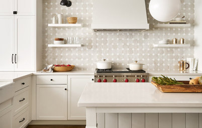
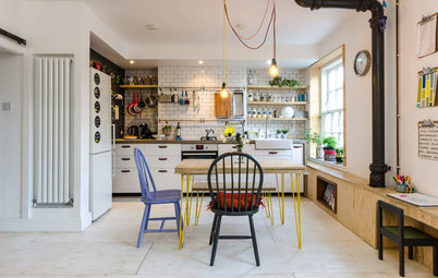
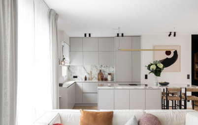
The large dining table attached to the kitchen island (see the image above) provides a comfortable space for meals while leaving enough space to move around. Moreover, it can accommodate up to 14 people when extended.
The kitchen also leads onto a large pantry area (not pictured, see plan below).
The large dining table attached to the kitchen island (see the image above) provides a comfortable space for meals while leaving enough space to move around. Moreover, it can accommodate up to 14 people when extended.
The kitchen also leads onto a large pantry area (not pictured, see plan below).
The living room, dining room and kitchen are now a single space with lots of natural light.
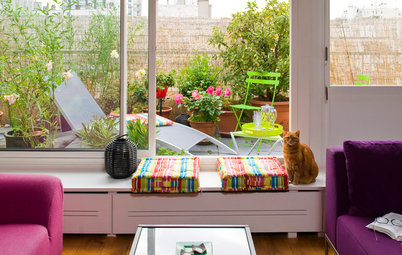
Browse more divine living spaces on Houzz
Browse more divine living spaces on Houzz
Mateo’s office in the corner – pictured in the background of this photo – is also very bright thanks to several big windows. “I really like digital photography. The room that used to be my office was very dark because it only had a window to an interior courtyard. But now, I see the trees, the Gran Vía – the view has totally changed,” she says.
The main objective of the renovation – to improve the quality of life for the whole family, especially for Mateo – has been achieved. “I always told [GokoStudio] that the renovation was like a small labour of love for my wife,” says González.
The architects designed practically all the furniture in the house to suit the family. It was made by Interarmaris in Spain.
Plan of the social areas. Top-left is the original layout, top-right is the proposed layout. The line diagram at the bottom shows the load-bearing walls. The large diagram on the right is the final layout.
Original plan, clockwise from top: courtyard; kitchen; study; interior courtyard; living room; street; dining room.
Proposed plan, clockwise from top: interior courtyard; pantry; interior courtyard; kitchen; street dining room; living room; study.
Gokostudio and the clients used a Houzz Ideabook to collaborate. In it, they kept photographs of architectural solutions and decoration ideas that inspired the home’s minimalist and contemporary interiors.
The plans here show how the layout of the living area has changed in the renovation, with the kitchen and study being turned to face the street to capture natural light.
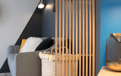
Like the whole house, the hall is minimalist, elegant and unobstructed.
Parkinson’s is a neurodegenerative disease, which means Mateo may need to use a wheelchair at some point in the future. Because of this, spaces needed to be wide enough to be wheelchair accessible.
González notes that one of the basic requests they made to the architects was “to make sure all the flooring is level, even in the bathroom, in order to prevent falls and allow for the use of a wheelchair”.
The architects chose only a few materials for the project. Wood, microcement and porcelain were used on all the flooring and finishes throughout the home.
The palette also repeats itself in the home. Greys, wood tones and copper details achieve “a harmonious aesthetic that inspires calmness,” according to the architect. González agrees, saying “the architects have achieved the tranquillity and smooth lines that we wanted for the renovation of the flat”.
The palette also repeats itself in the home. Greys, wood tones and copper details achieve “a harmonious aesthetic that inspires calmness,” according to the architect. González agrees, saying “the architects have achieved the tranquillity and smooth lines that we wanted for the renovation of the flat”.
Mario, the couple’s son, uses this bathroom, next to the entrance of the apartment.
As in the living area, the renovation sought to connect the various zones of the master bedroom as much as possible. There are therefore no doors or physical barriers between the bedroom, walk-in closet, and ensuite.
The original air-conditioning system made the space noisy and uncomfortable. In summer, the owners say that it was sometimes impossible to fall asleep. GokoStudio solved these problems with a new air-conditioning system that has been fitted into the walls of the flat, providing the interior with the “necessary comfort and useability so that all the systems may be managed by a person with reduced mobility,” says the architect.
The wall of the walk-in wardrobe doubles as a headboard. It is a custom design by GokoStudio.
The lighting is another example of the careful attention to detail in this project. The couple often have different schedules, so the architects installed dimmable LED lights in the lower area of the cabinets and the headboard to gently light the way to the wardrobe and bathroom in the middle of the night. They combined this with spot lighting for reading and dressing. This is further enhanced with wall and ceiling lamps for general ambient light.
The lighting is another example of the careful attention to detail in this project. The couple often have different schedules, so the architects installed dimmable LED lights in the lower area of the cabinets and the headboard to gently light the way to the wardrobe and bathroom in the middle of the night. They combined this with spot lighting for reading and dressing. This is further enhanced with wall and ceiling lamps for general ambient light.
Here’s another elegant and user-friendly detail: most of the doors are sliding, so they are easy to open.
“It was a stimulating challenge, designing all walkways to have a minimum width of about 90 centimetres and a 120-centimetre turn radius to accommodate a wheelchair, with no uneven ground, even in the shower tray in the master bedroom,” says the architect.
“It was a stimulating challenge, designing all walkways to have a minimum width of about 90 centimetres and a 120-centimetre turn radius to accommodate a wheelchair, with no uneven ground, even in the shower tray in the master bedroom,” says the architect.
The vanity unit and the backlit mirror in the ensuite bathroom are also custom-made.
Here’s a detail of the mixer tap (from Icónico in Spain) and the basin, which is integrated into the vanity top and is made of the same porcelain stoneware that covers the bathroom wall.
Plan of the private areas. Top-left is the original layout, top-right is the proposed layout. The line diagram at the bottom shows the load-bearing walls. The large diagram on the right is the final layout.
Original layout, clockwise from top: bath; bath; dressing room; bedroom.
Proposed layout, clockwise from top: dressing room; dressing room; bath; bedroom.
Space borrowed from what was originally the kitchen has made the sleeping area more spacious and functional.
Original layout, clockwise from top: bath; bath; dressing room; bedroom.
Proposed layout, clockwise from top: dressing room; dressing room; bath; bedroom.
Space borrowed from what was originally the kitchen has made the sleeping area more spacious and functional.
Mario’s bedroom looks out onto the street, so receives plenty of natural light.
This renovation also restored the ceilings to their original height, giving this century-old flat the elegance it had lost in previous renovations. This was a challenge, however, as the design had to accommodate many built-in systems: air conditioning, heating, Uninterruptible Power Supply (UPS), water softening, a reverse-osmosis water filtration system, a screen, a 4K projector and an audio system.
These were incorporated into a false ceiling, which was laid above wardrobes and other features wherever feasible. This made it possible to preserve the full ceiling height in the main spaces.
Koroluk (right) poses with the owners in the kitchen, the most prominent space in the house.
The collaborations between the professionals and the owners was fluid and fruitful thanks to timely communication and close supervision of the project from beginning to end. “Every week we buy flowers for our home. This renovation has brought us great joy,” says Mateo.
Your turn
Which features in this apartment are your favourites? Tell us in the Comments below. And remember to like this story, save the images for inspiration and join the renovation conversation.
More
Love original design? Get your next dose here with an interior designer’s colourful classic Queenslander in this My Houzz: The Joy of Colour in an Interior Designer’s Home

Patrocinado
Volver a cargar la página para no volver a ver este anuncio en concreto
Houzz at Glance
Who lives here: Celia Mateo, Luis Miguel González and the youngest of their children, Mario González, aged 18
Location: Barcelona, Spain
Size: 130 square metres
Design: Bettina Koroluk and Claudio González at GokoStudio
Previously, the space was completely compartmentalised and the living area had overlooked an internal light well, leaving it feeling a bit gloomy. The apartment’s location on the first floor was an extra challenge: many of its walls are load-bearing and could not be moved.