Kitchen of the Week: Bright and Bold Galley With Smart Storage
A designer takes inspiration from her clients’ love of Art Deco while making the most of every inch

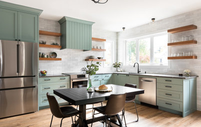
“This is the tiniest but mightiest little kitchen,” interior designer Meka Jones says. Her clients, a couple who live in a 1930s Atlanta bungalow, prepare almost all of their meals at home. With very little countertop area and storage space, this was a challenge. In addition to remedying that, Jones packed the room with bold style. The green-and-white color palette was inspired by historic tile colors, while the style was inspired by the architecture of the bungalow and the homeowners’ love of Art Deco.
After: Jones was able to steal 21 inches of depth from that bedroom closet. In a small space, this was a game changer. The corner could now accommodate more cabinet and counter space. She maximized storage in the lower cabinets by adding a blind corner insert that pulls out for easy access. Another smart storage solution is hiding in the fridge surround. It contains a slim broom cabinet, accessible by touch-release hardware.
With the exception of this small area, the footprint of the kitchen stayed the same. “I knew we weren’t going to do a big addition off the back of the house. So I couldn’t go out, but I could go up,” Jones says. “In larger kitchens, those high upper cabinets often are more for decoration. But in a tiny kitchen, they need to be accessible every day.”
Custom cabinets: Georgia Cabinet; green cabinet paint: Webster Green, Benjamin Moore; white cabinet paint: Dover White, Sherwin-Williams; countertops: Calico White, MSI
In their existing kitchen, the homeowners often needed to grab things that were stored up high using a stepladder. So they were excited by the library ladder idea. It attaches to a brass railing that runs around the room. “It has a designated parking spot near the back door,” Jones says. The parking spot railing is higher so the ladder can hang straight against the wall.
As for style, Jones paid careful attention to her clients’ eclectic taste while walking through their house. “I spied an Art Deco light fixture in their dining room and asked her if she loved Art Deco. She did. And she also loved brass,” Jones says. With that in mind, the designer looked to the historic colors offered by American Restoration Tile and came up with a custom mosaic design for the floor, composed of 1-inch hexagonal tiles.
“The green was inspired by Art Deco, and the 1-inch hexagonal tiles give it vintage flair,” Jones says. “I wanted the mosaic design to work like a runner, because you can’t have a rug in here with the library ladder.” From there, she found a paint color that matched the tiles. “We also used brass everywhere. It’s like jewelry. We used brass on everything right down to the disposal’s push button.”
Hire a local tile professional
Jones created 3D renderings of the kitchen design and realized that using green on the cabinet next to the window would make it feel heavy and darken the room. “Using white on the cabinets in this corner tricks the eye and makes the room feel lighter and brighter,” she says. She also mixed in brass grilles on some of the cabinet doors to lighten the room.
The countertops are quartz, which is durable, low-maintenance and easy to clean. For the backsplash, Jones wanted something light but more interesting than the usual white subway tile. She recommended zellige tile, which has subtle variations in color. “We went so bold with the green. The tile makes the room feel lighter, brighter and airier,” she says. “The 5-by-5-inch squares add a vintage touch and they cool the palette, giving relief to the boldness of the green.”
Ceramic tile: Cloe 5-by-5-inch, Bedrosians
Before: There was very little countertop space in the kitchen. The clients recently had invested in the vent hood that could be concealed behind cabinet doors, and they wanted to be able to use it in the renovated space. To the right, the open shelves show why the homeowners needed a step stool to reach everyday items.
After: Jones moved the sink to the left to free up counter space next to the range. The sink is a workstation model that comes with inserts such as racks and cutting boards that transform it into additional prep space.
Sink: 33-inch Contempo fireclay, Bocchi
Browse white farmhouse sinks in the Houzz Shop
Sink: 33-inch Contempo fireclay, Bocchi
Browse white farmhouse sinks in the Houzz Shop
This photo was taken from the cased opening between the kitchen and dining room. Jones placed an Art Deco-inspired faceted crystal pendant light in a spot where it could be viewed from the dining room. It adds an elegant touch and relates to the dining room’s Art Deco chandelier. “This was another piece of jewelry for the room,” she says.
She designed windowpane millwork around the existing vent hood, which has some hidden storage behind it. Flanking the vent hood with cabinets with brass grilles lightened up this wall.
“I wanted to have countertop space on both sides of the range and maintain symmetry,” Jones says. So she filled in the area on the right with open oak shelves stained to match the ladder and the back door. She chose the stain to match an antique hickory china cabinet in her clients’ adjacent dining room.
Next to the new induction range are slim spice and utensil pullout cabinets. To the right, Jones outfitted the drawers with a knife block and a tall tray divider.
Check out our beginner’s guide to get started on your home project
Here’s a closer look at the brass grilles on the cabinet doors and the Art Deco-inspired cabinet pulls.
Shop for cabinet hardware
Shop for cabinet hardware
After: The designer maximized the natural light with a new door. Its stain coordinates with the ladder and the open shelves next to it.
More on Houzz
Read more kitchen stories
Browse kitchen photos
Hire a kitchen remodeler
Shop for kitchen products
More on Houzz
Read more kitchen stories
Browse kitchen photos
Hire a kitchen remodeler
Shop for kitchen products

Patrocinado
Volver a cargar la página para no volver a ver este anuncio en concreto
Kitchen at a Glance
Who lives here: A couple
Location: Atlanta
Size: 150 square feet (14 square meters)
Designer and builder: Meka Jones of Copper Sky Design + Remodel
Before: The kitchen lacked cabinet and countertop space. “Everything was so out in the open that my clients never felt like the kitchen was clean, even right after they had just finished cleaning it,” Jones says.
Behind the wall to the right of the stairs was a bedroom closet that housed an HVAC return air chase and plumbing that served the second floor. Part of the renovation included moving those things and giving the bedroom a proper clothes closet.
Hire a local design-build firm on Houzz