Houzz Tour: An Edwardian Semi Gains Space and Designer Style
A soothing colour palette, a sprinkling of midcentury pieces and some inspired design touches transformed this old house

“We bought the place as a project with a view to extending it, so we could live here as a growing family until the children left home,” Alison Johnson of Otta Design says of her Edwardian home, which she recently finished renovating.
The house got a top-to-toe decorative makeover, as well as a large rear extension and a reconfigured loft. It was a four-year process, with the family living in the house for two years before starting work to get familiar with it, and work then taking two years to complete.
This article is from our Most Popular stories file
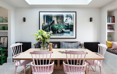
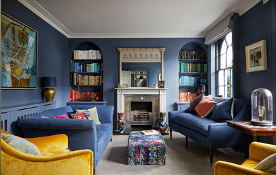
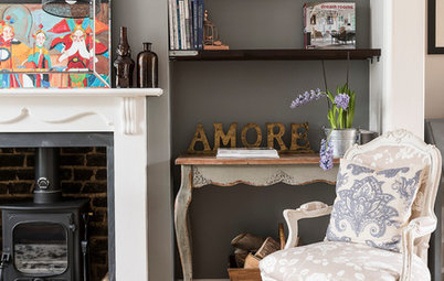
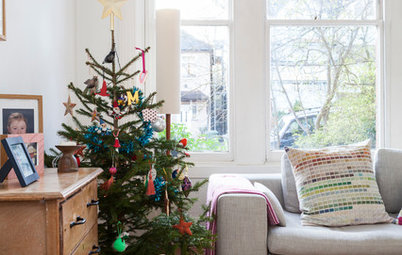
“The living room is only used in the evenings; it’s where the TV is,” Alison explains. “The bifold doors are great, because, while the room is usually open, in winter it’s really nice to close it up, so it feels cosy.”
She’s gone for a soft blue-grey on the walls and skirting boards. “The room faces north, and will never be a light, bright space, so I was keen to use a darker colour,” she says. “I had about five colours I used throughout the house – we’ve also used this shade in our bedroom.”
Walls painted in Pigeon, Farrow & Ball. Vintage rug, Sunbury Antiques Fair. Pink velvet Izzy sofa; buttoned Patrick sofa, both sofa.com. Side tables, Rockett St George. Lamps, West Elm. Sideboard, Etsy.
The same view of the living room before the renovation began.
“I was keen to avoid the standard alcove cabinetry – we had that before,” Alison says. “So we did floating shelves on one side and found a midcentury sideboard for the other, as I wanted something freestanding. It was also a fraction of the cost.”
Check out these surprising ways an interior designer could help you.
Check out these surprising ways an interior designer could help you.
Windows were replaced throughout with new box sashes, as the old ones were rotten. The new ones are double-glazed. “It’s massively warmed up the house,” Alison says.
The new engineered flooring did, too. “We had original floorboards, which we thought were charming, but the gaps between them were too big and we needed to conserve as much heat as possible,” she says.
Flooring in Slate Grey, 3 Oak Wood Flooring.
The new engineered flooring did, too. “We had original floorboards, which we thought were charming, but the gaps between them were too big and we needed to conserve as much heat as possible,” she says.
Flooring in Slate Grey, 3 Oak Wood Flooring.
Some of the original coving, seen in this ‘before’ photo of the living room, was damaged and cracks also appeared when the windows were replaced, so Alison found a company to supply almost identical replacement moulding. “It was a lot cheaper than having it made to order to replicate the original design,” she says.
The room you can see beyond this one is open to the hallway and doubles as a makeshift boot room and place to put on coats and shoes. “The sideboard in there is where we stash our keys, hats and gloves,” Alison says.
How to avoid ‘dead front room syndrome’ when extending.
How to avoid ‘dead front room syndrome’ when extending.
This ‘before’ photo shows the space being used as a dining room.
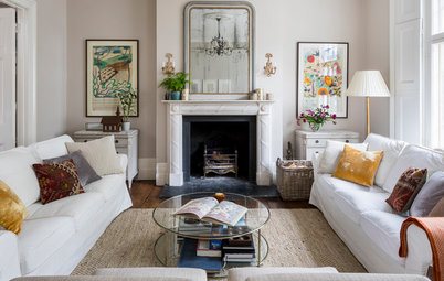
“I didn’t find doing my house fun – not compared to doing other people’s,” Alison confesses. “I found the decision-making harder. We don’t have an ‘Otta’ style and work very much with other people’s styles. It means I can appreciate lots of different looks, which I love, but pinpointing what I wanted for my own house was hard, because I like so many styles.”
One thing Alison did want, though, was for the house to look cohesive. So, along with the fresh colour palette, midcentury became a bit of a theme, as she had some 1970s furniture from her parents, including this G Plan sideboard.
Camel artwork by Helene Sandberg for Lumitrix. Pendant, West Elm.
One thing Alison did want, though, was for the house to look cohesive. So, along with the fresh colour palette, midcentury became a bit of a theme, as she had some 1970s furniture from her parents, including this G Plan sideboard.
Camel artwork by Helene Sandberg for Lumitrix. Pendant, West Elm.
Downstairs, Alison replaced all the radiators inexpensively, including this one in the ‘boot room’; upstairs, to keep costs down further, she painted the existing radiators with eggshell to match the walls. “That way, they sort of retreat and you don’t really see them,” she says.
Acova radiator, B&Q.
Acova radiator, B&Q.
“I wanted to get as much borrowed light as possible into the middle room [just glimpsed here],” Alison says, “so we positioned the rooflights [in the extension] as close as possible to the opening.” Originally, there were French windows into the garden here (see next photo) and she kept glass doors in the same spot.
Alison and her builder designed recessed shelving with vertical lighting for this area, too. “When friends are over, it’s nice, as it’s a sort of bar area,” she says. “It’s also a lovely focal point after dark when it’s all lit up.”
Alison and her builder designed recessed shelving with vertical lighting for this area, too. “When friends are over, it’s nice, as it’s a sort of bar area,” she says. “It’s also a lovely focal point after dark when it’s all lit up.”
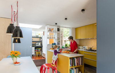
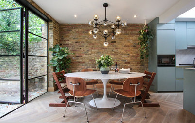
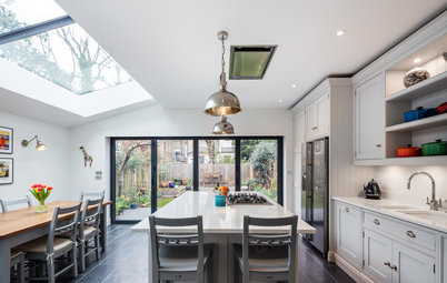
The ground floor hadn’t been extended when the family moved in. “It was your typical ‘two reception rooms, galley kitchen, tiny dining room at the back’,” Alison says. “There was also a conservatory [seen on the left here], so it was five separate rooms, which didn’t work for modern family living.”
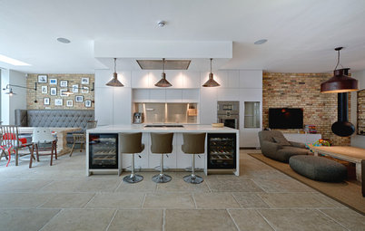
As the house was a semi, it had a footpath adjacent to the side return. This provided the option of a bigger extension. Taking it up to the boundary wall was a big decision, but Alison was keen to maximise the width of the new addition. “We had our hearts set on a table, an island and a bank of cupboards across the kitchen,” she says, “and in order to do that, we had to eat into our path.”
As the house was a semi, it had a footpath adjacent to the side return. This provided the option of a bigger extension. Taking it up to the boundary wall was a big decision, but Alison was keen to maximise the width of the new addition. “We had our hearts set on a table, an island and a bank of cupboards across the kitchen,” she says, “and in order to do that, we had to eat into our path.”
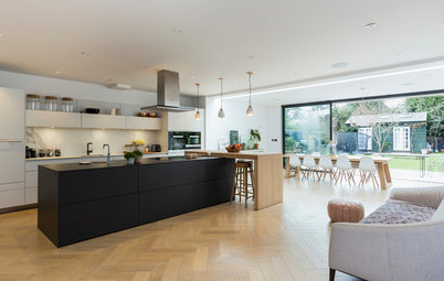
Alison delegated the design of the kitchen to a specialist. “I didn’t think I could afford to go to a kitchen designer, but this cost £30,000 in total, and I didn’t have to design it, do any measuring up, know about cupboard configurations or source the worktop and appliances,” she says. “I picked out the finishes, of course, but parked all the responsibility. I urge all my clients to go down that route if they can – kitchen designers are the experts.”
In the new kitchen, the boiler had to be on the far left in order to vent to the exterior. This meant installing a tall cupboard to hide it. “We ended up having two tall ones to mirror the integrated fridges on the end wall,” Alison explains.
There’s a bronzed mirror splashback above the worktop. “This visually adds a bit more width and it was cheaper than back-painted glass,” she says.
Classic kitchen in Aquamarine, Hacker at NJC Kitchens. Double ovens, Siemens. Unika pendant by Northern, Holloways of Ludlow. Bar stools, Habitat. Walls painted in Ammonite, Farrow & Ball.
Alison found more challenges when it came to decorating the kitchen. “Being an interior designer, I felt the pressure to do something bold. I went from a pale grey kitchen to choosing this teal blue colour. That was because of the little voice in the back of my head saying ‘be bolder!’ to reflect what I do.”
Rather than having an American fridge-freezer on the end wall, Alison opted for a fridge and a freezer side by side, partly to save money. “It also keeps the kitchen looking seamless rather than breaking it up with a big block of stainless steel,” she says.
The island seating runs around one corner of the structure. “I wanted to avoid having four bar stools in a line,” she says. “This is more sociable. It also prevents everything happening up near the entrance, and the fridge door opening behind whoever is sitting there.”
Single built-in electric oven with microwave; single built in electric oven, both Siemens. Fridge; freezer, both Bosch. Bronze mirror splashback, Deco Glaze. Quartz worktop in Zement Ice, Compac.
A view of the original side return and path from above. The proximity to the neighbouring property was the reason the area with the dining table and sofa (see next photo) has a sloping ceiling – it prevents the structure dominating.
“We also dug down 20cm in the kitchen to create extra height, as we were restricted with wall height on the boundary,” Alison explains.
“We also dug down 20cm in the kitchen to create extra height, as we were restricted with wall height on the boundary,” Alison explains.
There are spotlights, but when practical, Alison prefers turning on the LED strips she installed around the rooflights. “It gives a nice, soft, ambient light at night,” she says.
Extendable dining table, Ikea. Dining chairs, vintage G Plan.
Find kitchen designers and fitters in the Houzz Professionals Directory.
Extendable dining table, Ikea. Dining chairs, vintage G Plan.
Find kitchen designers and fitters in the Houzz Professionals Directory.
The living zone in the new extension pointedly doesn’t have a TV in it. “We use this room in the daytime,” Alison says. “It’s a nice, light place to sit and look at the garden.”
Holly sofa, Sofa.com. Ekenaset armchair, Ikea. Coffee table, vintage G Plan. Floor lamp; rug, both French Connection Home. Glass side table, Perch & Parrow.
Holly sofa, Sofa.com. Ekenaset armchair, Ikea. Coffee table, vintage G Plan. Floor lamp; rug, both French Connection Home. Glass side table, Perch & Parrow.
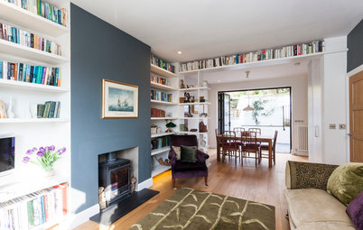
In this view of the downstairs hallway, you can just see (at the back of this image) the door into a full-height coat cupboard. Right opposite is a small utility room Alison created, reached via a pocket door “to avoid a door ‘jam’ in the hallway”. The kitchen entrance on this side also has a pocket door.
Under the stairs is a small cloakroom and a cupboard for the vacuum cleaner and mops. The banister was painted dark to match the doors into the living room (see first photo) and also to “hide dirty handprints”.
Walls and pale woodwork painted in Cornforth White; stair wall and spindles/newel post/banister painted in Railings, both Farrow & Ball.
The walls and ceiling in the cloakroom are painted in eggshell in a colour picked out of the tiles. “As it’s such a small space with a sloping ceiling, we felt it needed to be all one colour rather than broken up,” Alison says. “The slight sheen of the eggshell gave it a soft feel. ‘Sexy restaurant loo’ was my vibe!”
Terrazzo floor tiles, Fired Earth. Walls and ceiling painted in Burnt Juniper, Fired Earth.
Terrazzo floor tiles, Fired Earth. Walls and ceiling painted in Burnt Juniper, Fired Earth.
“We bought the house from an artist and this was his studio,” Alison says of the master bedroom. “It had strip lights and was all white, with paint splatters everywhere. It was so stark and we wanted it to feel cosy. That’s how we got to the pigeon colour.
“I’m not usually a fan of a feature wall, but I loved this geese wallpaper so much,” she says, “and it brought it all together.”
Walls painted in Pigeon, Farrow & Ball. Cygnus wallpaper, St Vitus.
“I’m not usually a fan of a feature wall, but I loved this geese wallpaper so much,” she says, “and it brought it all together.”
Walls painted in Pigeon, Farrow & Ball. Cygnus wallpaper, St Vitus.
The master bedroom before the renovation.
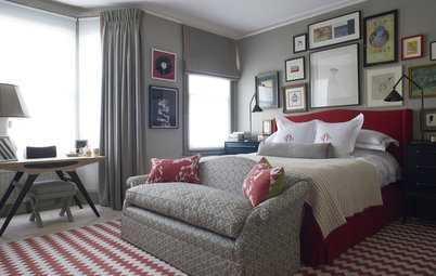
The chimney breast is narrower than the bed, so Alison had it built out to match the width of the headboard.
“We opted for chests of drawers rather than bedside cabinets for more storage,” she adds.
Thea bed, upholstered in charcoal wool, Sofa.com. Chests of drawers, Swoon Editions; painted in Pigeon, Farrow & Ball.
“We opted for chests of drawers rather than bedside cabinets for more storage,” she adds.
Thea bed, upholstered in charcoal wool, Sofa.com. Chests of drawers, Swoon Editions; painted in Pigeon, Farrow & Ball.
Alison’s office is next to the bedroom. “Originally, this was to be an en suite to our room, but we needed five bedrooms, as my mum and dad come to stay a lot,” she says.
The desk is vintage. “I was on a budget and found buying second-hand bits and pieces was helpful,” she explains.
Desk, Etsy. Walls, Inchyra Blue, Farrow & Ball. Chair, vintage G Plan; reupholstered in pink wool. Blind fabric, Christopher Farr Cloth.
The desk is vintage. “I was on a budget and found buying second-hand bits and pieces was helpful,” she explains.
Desk, Etsy. Walls, Inchyra Blue, Farrow & Ball. Chair, vintage G Plan; reupholstered in pink wool. Blind fabric, Christopher Farr Cloth.
This colourful guest room is used frequently by Alison’s parents. “It’s a small room, so we didn’t put in a wardrobe,” she says. “There are peg rails on one wall instead, plus a chest of drawers.” There’s also an ottoman at the end of the bed for linen.
Walls painted in Light Peachblossom, Little Greene. Bed quilt, Anthropologie. Pendant, Next.
Walls painted in Light Peachblossom, Little Greene. Bed quilt, Anthropologie. Pendant, Next.
The master bathroom is on the same floor as the main bedroom, the spare room and Alison’s office.
“We were going to knock through to make a bigger bathroom and include a bath, but we realised we don’t have baths, so went for a big shower instead,” she says.
Walls painted in All White, Farrow & Ball. Wall tiles, Fired Earth. Floor tiles, Mandarin Stone. Bespoke walnut vanity unit with Carrara marble top, Otta Design.
This is Alison’s daughter’s bedroom on the top floor. “The previous owners had built a loft extension, but it was just one big room. So we reconfigured the space and put both children’s rooms and a bathroom up here,” Alison says.
They also extended out as far as Permitted Development would let them to add more space.
Blind fabric, Liberty.
They also extended out as far as Permitted Development would let them to add more space.
Blind fabric, Liberty.
“This bed was £90 from Ikea. It was pine, but we painted it dark blue to make it feel customised,” Alison says.
“The bureau I picked up for around £15 from a furniture clearance shop. It was in our old flat and my daughter’s always loved it,” she says. “Everything else is Ikea apart from the mirror – she picked that up in a charity shop. Her mixing old and new made me very happy!”
Walls painted in Oval Room Blue; bed painted in Hague Blue, both Farrow & Ball. Bed, Ikea.
A second bathroom was created in the loft for the children. “We felt it was important to have one bath should we decide to sell, even though we don’t use it,” Alison says.
Walls painted in All White; bath panel painted in Hague Blue, both Farrow & Ball. Wall tiles, Fired Earth. Floor tiles, Topps Tiles.
Walls painted in All White; bath panel painted in Hague Blue, both Farrow & Ball. Wall tiles, Fired Earth. Floor tiles, Topps Tiles.
“We let both the kids choose what they wanted in their rooms. My son picked this Banksy decal and the green wall,” Alison says.
“Both the kids are quite into their spaces,” she adds. “They appreciate being surrounded by things that mean something to them and are quite happy traipsing around charity shops to find things. The old printers’ drawer for his Simpsons figurines was my son’s idea.”
Feature wall painted in Yeabridge, Farrow & Ball. Banksy decal, available at Etsy. Bed; desk, both Ikea.
The ground floor plans before work began.
The ground floor plans for the renovated house. Where the cloakroom is sited became the utility room and the loo was moved under the stairs.
Tell us…
Which ideas are your favourites in this home? Let us know in the Comments section.
Tell us…
Which ideas are your favourites in this home? Let us know in the Comments section.

Patrocinado
Volver a cargar la página para no volver a ver este anuncio en concreto

Patrocinado
Volver a cargar la página para no volver a ver este anuncio en concreto
Who lives here? Alison Johnson, her husband, Ian, and their children, Sam, 14, and Eva, 12, plus Monty the labradoodle
Location West London
Property An Edwardian semi
Size Five bedrooms and two bathrooms
Designer Alison Johnson of Otta Design
Architect Franklyn Nevard of Franklyn Nevard Associates
Photos by Anya Campbell
Alison changed pretty much everything in the house. “The bifold doors into the reception room, the stairs, and the front door are the only parts of the house we haven’t really changed,” she says.
Doors into living room painted in Railings, Farrow & Ball.