Before & After: A Run-Down Worker's Cottage Reborn for $100,000
See how far a $100,000 budget went on the resurrection of a shabby Sydney worker's cottage with structural strife

In this Q&A series, we turn the spotlight on one thought-provoking renovation each week. Here, Alishia Minett-Johnson, design director at Minett Studio Architects + Design, shares how she transformed a run-down worker’s cottage with structural and spatial issues into a chic and light-filled home for a midwife and her flatmate.
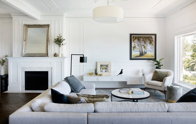
Living area before works.
How did the project come about?
This property was originally owned by a close friend, who decided to sell. Many fun memories were made here. While I was with her waiting for the auction to start, I sketched out a design of what I would do with the house.
Afterwards, we got chatting with the new owner. I told her what I had worked on and said if she ever wanted to renovate or extend, to give me a call.
A week later, she called and asked me to help her modernise the home, while retaining its period features.
The original floor plan.
The property had good bones, beautiful period features and lots of natural light. However, the kitchen felt very separate from the living room and the bathroom was run-down. It also needed a laundry as the washing machine was in the kitchen.
The original design that I had sketched up at the auction included a roof terrace and a second storey. But these didn’t fit in with the client’s budget, so the renovation was on a smaller scale.
Is your home in need of a serious update? Find an architect near you on Houzz to discuss the possibilities
The floor plan after works.
We also found some structural issues that needed to be urgently rectified. The front of the house needed to be re-stumped, the roof was severely rusted, there was rising damp, and a heating system was leaking carbon monoxide.
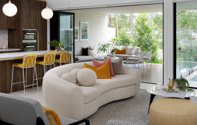
We wanted to open the small kitchen to the living area at the back, so we lowered the wall separating the two spaces to create a better connection between them. A vertical window in the kitchen was replaced with a horizontal servery window, which provided light and views of the side courtyard, and allowed the space to be better reconfigured with cabinetry above it.
We also found some structural issues that needed to be urgently rectified. The front of the house needed to be re-stumped, the roof was severely rusted, there was rising damp, and a heating system was leaking carbon monoxide.
We wanted to open the small kitchen to the living area at the back, so we lowered the wall separating the two spaces to create a better connection between them. A vertical window in the kitchen was replaced with a horizontal servery window, which provided light and views of the side courtyard, and allowed the space to be better reconfigured with cabinetry above it.
The rear courtyard before works, overlooked by the living room.
What look and feel did the client want for the house?
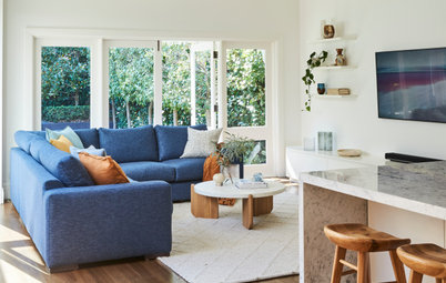
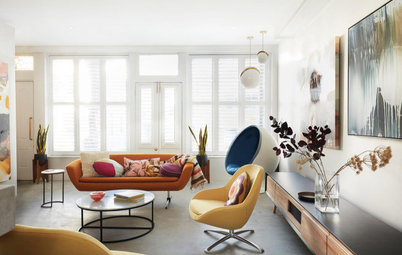
Sexy industrial-chic.
What were the main issues with the living room?
The windows and doors had rotted and the terracotta floor tiles were dated.
What look and feel did the client want for the house?
Sexy industrial-chic.
What were the main issues with the living room?
The windows and doors had rotted and the terracotta floor tiles were dated.
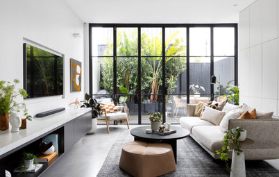
‘Marfa’ artwork: Boyd Blue; sofa and rug: Matt Blatt; scatter cushions: Freedom, Home Republic and vintage styles; coffee table: Temple & Webster; plant stands: Boyd Blue; paint throughout house in Natural White: Dulux.
What was your brief?
To update it in line with the rest of the modifications.
What was your brief?
To update it in line with the rest of the modifications.
What did you do?
We overlaid the terracotta floor tiles with a polished concrete floor, lowered the wall between the living area and kitchen to boost their connection, repainted the walls and ceiling, and installed new curtains, windows and doors.
As this is the client’s first house, she purchased all-new furniture with a little help from us.
What are the key elements of the living room palette?
- A polished concrete epoxy floor (Granicrete Coverstone).
- White walls and ceiling.
- Bright and colourful artwork.
The view to the kitchen before works.
Tell us about the concrete floor
The dated terracotta floors at the back of the house were modernised with a grey concrete screed with epoxy resin. As well as being hardwearing and easy to clean, it allowed us to save on costs as we could install it directly on top of the tiles.
Tell us about the concrete floor
The dated terracotta floors at the back of the house were modernised with a grey concrete screed with epoxy resin. As well as being hardwearing and easy to clean, it allowed us to save on costs as we could install it directly on top of the tiles.
The view to the kitchen before works.
Where did you spend on this project?
The joinery, floors, and replacing the rotted windows and doors with double-glazed aluminium styles.
Where did you spend on this project?
The joinery, floors, and replacing the rotted windows and doors with double-glazed aluminium styles.
The view to the kitchen after works.
Where did you save?
The off-the-shelf bathroom joinery and light fittings.
Where did you save?
The off-the-shelf bathroom joinery and light fittings.
What look and feel did you want to create?
Sexy industrial-chic. The idea was that a traditional worker’s cottage could be both utilitarian and highly crafted.
Sexy industrial-chic. The idea was that a traditional worker’s cottage could be both utilitarian and highly crafted.
The kitchen before works.
What were the main issues with the kitchen?
It was small and short on storage.
What was your brief?
Lots of storage, more light and to move the washing machine to a newly created laundry.
What were the main issues with the kitchen?
It was small and short on storage.
What was your brief?
Lots of storage, more light and to move the washing machine to a newly created laundry.
The kitchen before works.
What did you do?
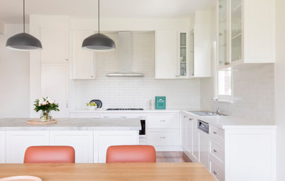
We ran floor-to-ceiling joinery right to the ceilings. The room is small, but the ceilings are high, and this allowed us to maximise every millimetre.
The warm ply finish softens the industrial-chic look seen in the rest of the house.
We added lots of clever, hidden storage solutions, including a pull-out pantry and corner cupboard units so the owner could utilise every millimetre.
What did you do?
We ran floor-to-ceiling joinery right to the ceilings. The room is small, but the ceilings are high, and this allowed us to maximise every millimetre.
The warm ply finish softens the industrial-chic look seen in the rest of the house.
We added lots of clever, hidden storage solutions, including a pull-out pantry and corner cupboard units so the owner could utilise every millimetre.
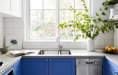
The kitchen after works.
We replaced a small vertical window in the corner of the kitchen with a large servery window.
We changed the floor finish to the same epoxy concrete as in the living and dining areas.
We also installed sleek, black appliances.
We replaced a small vertical window in the corner of the kitchen with a large servery window.
We changed the floor finish to the same epoxy concrete as in the living and dining areas.
We also installed sleek, black appliances.
Benchtops in Airy Concrete: Caesarstone.
What made the biggest difference?
Knocking down the wall between the kitchen and living space and creating a peninsula bench for more connection, plus the new window, which brings in lots of light.
See more images of beautiful Australian kitchens on Houzz
What made the biggest difference?
Knocking down the wall between the kitchen and living space and creating a peninsula bench for more connection, plus the new window, which brings in lots of light.
See more images of beautiful Australian kitchens on Houzz
What are the key elements of the living room palette?
- White-washed plywood joinery.
- Epoxy concrete floor.
- Concrete-look benchtop (Caesarstone Airy Concrete).
- A sleek black Fisher & Paykel fridge, oven and dishwasher.
The dining area before works.
What were the main issues with the dining room?
Zero storage and the timber step to the outdoor courtyard was rotten.
What was your brief?
To repaint, add a new pendant light and a new storage cupboard for cleaning items.
What were the main issues with the dining room?
Zero storage and the timber step to the outdoor courtyard was rotten.
What was your brief?
To repaint, add a new pendant light and a new storage cupboard for cleaning items.
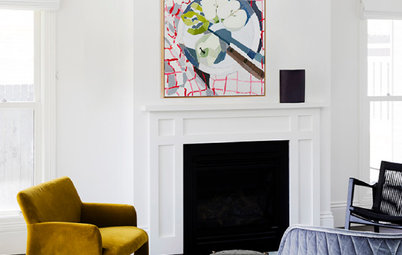
The dining area after works. Dining table: Matt Blatt; dining chairs: Cult.
What did you do?
We added new cabinetry, repainted, and changed the terracotta floor tiles to a concrete epoxy floor.
What are the key elements of the living room palette?
A monochromatic palette consisting of black, white and concrete grey.
What did you do?
We added new cabinetry, repainted, and changed the terracotta floor tiles to a concrete epoxy floor.
What are the key elements of the living room palette?
A monochromatic palette consisting of black, white and concrete grey.
Tell us about the built-in cupboard by the fireplace
This new joinery provides storage for the vacuum cleaner, space for a linen cupboard and storage for the dining room – think wine bottles, glassware and napery.
This new joinery provides storage for the vacuum cleaner, space for a linen cupboard and storage for the dining room – think wine bottles, glassware and napery.
The bathroom before works.
What were the main issues with the bathroom?
It was old and tired fittings, the shower was over the bath, and the tiles were missing grout.
What was your brief?
What were the main issues with the bathroom?
It was old and tired fittings, the shower was over the bath, and the tiles were missing grout.
What was your brief?
- Add a European laundry.
- Give the bathroom a new look that made it feel luxurious, with easy-to-clean finishes.
The bathroom after works. Epoxy polished-concrete finish in Silver Slate to the walls: Granicrete; vanity and mirror: First Choice Warehouse.
What did you do?
What did you do?
- Added a European laundry that is accessible from the bathroom side.
- Replaced the generic white wall tiles with a waterproof concrete wall finish (Granicrete Epoxy polished concrete finish in Silver Slate) in a matt finish to add drama.
- Replaced the old bath and vanity with a new walk-in shower and floating vanity.
- Changed the old chrome tapware to gunmetal tapware.
What are the key elements of the bathroom palette?
Silver and white with gunmetal tapware.
Your turn
What do you love most in this makeover? Tell us in the Comments below, like this story, save the images for inspiration, and join the conversation.
More
Keen to see any budget-savvy home transformation? Check out this Before & After: A New Tune for a Pianist’s Art Deco Flat


Patrocinado
Volver a cargar la página para no volver a ver este anuncio en concreto
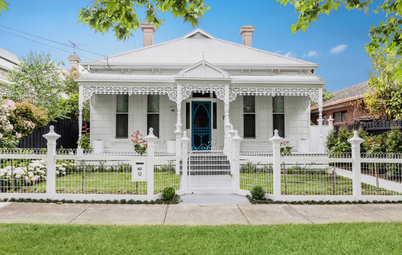
Answers by Alishia Minett-Johnson, design director at Minett Studio Architects + Design.
Who lives here: A midwife and her housemate
Location: Carlton North, Victoria
House style: A single-storey Victorian worker’s cottage
Number of bedrooms and bathrooms: Two bedrooms, one bathroom
Size of the house: 110 square metres
Budget: Around $100,000
Where did most of it go: On the interior fit-out, custom joinery and the builder
Architect and interior designer: Minett Studio Architects + Design
Builder: MR Home Improvements
Kitchen joinery: Staunchwood Furniture
How did you use Houzz?
We used Houzz Ideabooks to show images to our client about the look and feel we were proposing.