
Keilor East Home - Bathroom, Ensuite, Kitchen, and Laundry
Our Keilor East clients outgrew the style and functionality of their original home, which was purchased many years ago when their needs and preferences were very different from today. However, because they loved their home so much and didn’t want to leave, they decided that a complete renovation was the perfect solution to meet their present and future needs.
Their original kitchen sat back further in the space, which left it disconnected from the rest of the living areas. By relocating the kitchen, our clients integrated those previously separated zones into an open plan living space. This arrangement truly suits their needs now, as the kitchen has become the heart of the home.
We focused on delivering a high level of functionality for this modern kitchen via bespoke cabinetry. Because our clients love clean lines and bright spaces, we integrated the fridge, a full bar, and pantry into the cabinetry, which helped streamline this kitchen for a sleek, modern look.
The entire first-floor space was created as a very white – almost gallery-like space – our clients envisioned it as the perfect canvas for their signature art pieces. The white is juxtaposed with black in a classic monochromatic sense which is very much our client’s style.
The peninsula was designed to appear to flow off the wall across the main counter and seem to hover over, adding to the sought-after, contemporary look. An oversized mirrored kicker helps create that illusion of floating furniture.
Another priority was integrating the kitchen area with the laundry area at the rear, which we achieved by blending a handle-less door seamlessly with the rest of the cabinetry.
The ensuite was square-shaped and sat adjacent to an also square-shaped WIR. Square shapes tend to be active around the edges but a bit “vacant” in the middle. So we redesigned the spaces to be more linear. The result is an ensuite that is nicer to look at, functions better and is ultimately more efficient as they better use that “vacant” space.
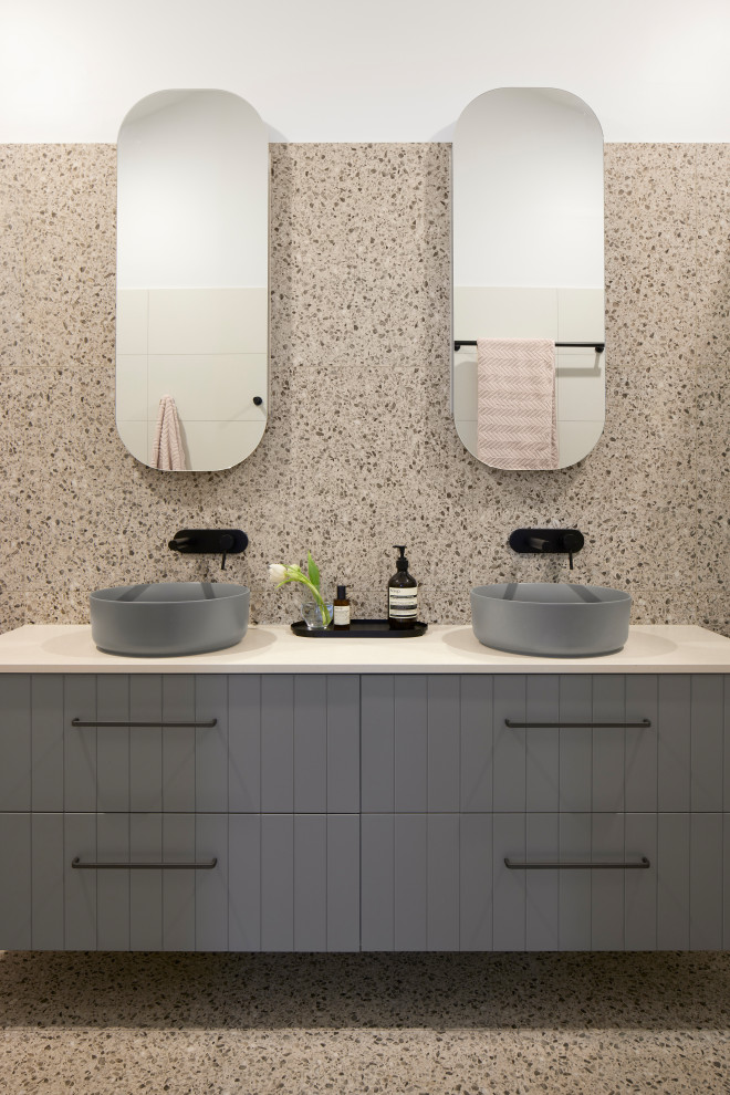
We used a similar palette and scheme for the main bathroom and the ensuite, with just an ever so slightly soft stroke in the ensuite – where mid greys softened the “black and white” concept.
The house is on a sloping site and is over multiple levels, which provides some challenging angles to worked with. We utilised elements like curved mirrors, basins, light fittings, and bath tubes to soften some of the shapes.
Otras fotos en Keilor East Home - Bathroom, Ensuite, Kitchen, and Laundry
Grey paint