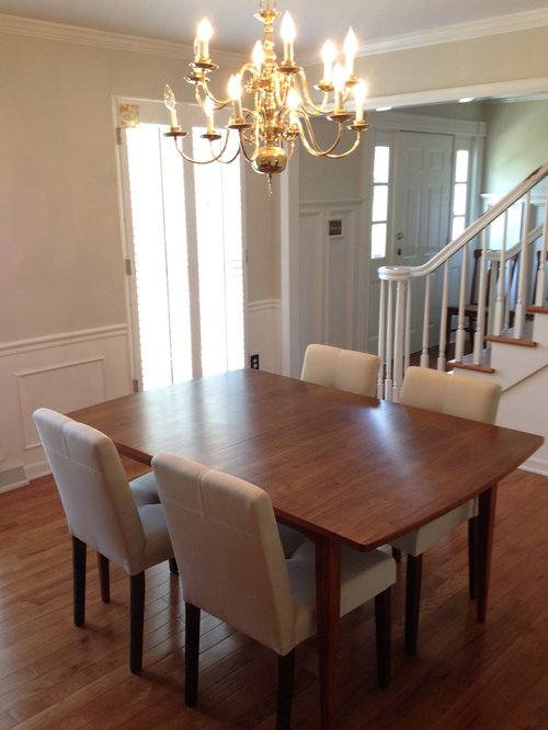
Help me bring our dining room to life!
About the things already in the room-
The light - This has to go! We've been shopping around and are looking to spend under $400 on a new fixture. Any suggestions?
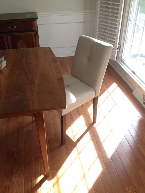
Table and chairs - we just bought these and love them. We have a couple of leaves, so we could extend the table if it appears to small. At some point, I'd like to get some different end chairs.
The picture - We recently found this at an estate sale and love it and would love the colors to inspire the rest of the room. But we really don't like the frame! Once we decide on some of the other things in the room, I'll either paint to frame or look at getting the art reframed.
The buffet - We'd like this to stay, but I'm open to altering the color because it seems really orange to me.
Shutters - I love the function of the shutters, but I feel like they make the room feel really small and would love to see them go.
Any suggestions on how to start? I'd love to get that light out of there ASAP, but am afraid that would be a mistake without some idea about where we're headed.
Thanks for your help!


Comentarios (259)
 hace 10 añosÚltima modificación: hace 10 añosI definitely think those "cool" colors could be fantastic in your room, either on the walls or two new chairs.0
User
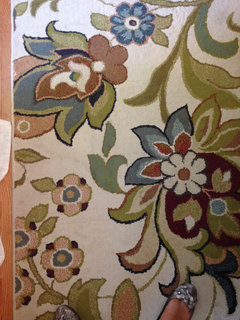
Autor originalhace 10 añosI don't have anything bold. This one is a light blue with tan piping. It's hard to tell in the picture, but it actually looks nice with the rug.
I do like the idea of adding a little color. It does make the room feel cozier and more complete.
 0
0User
Autor originalhace 10 añosI have a thing for grasscloth, but I don't think that's in our budget. :( PROhace 10 añoson sale at Pier One. $200 each.
[houzz=] Hourglass Dining Chair - Smoke Blue Damask · Más información0
 hace 10 añosBlue is nice with your rug. Any other blue in your home or would blue be isolated?0
User
Autor originalhace 10 añosThanks for the dark plates against the light wall. Maybe it's the other elements int he room, but that feels more traditional to me. I definitely prefer the light plates on the darker wall.- PROhace 10 añosI can't see the blue in the chair. A chair that large is too big for the end, unless you take out a leaf.0
- PROhace 10 añosI see what you mean about the plates. I think it is the arrangement also that makes the dark plates look more traditional.
User
Autor originalhace 10 añosBlue everywhere, Abbyjean! Our bedroom, my office that's right across the hall from the dining room, our basement family room/playroom.- hace 10 añosI love grasscloth too. When I was a little girl, my mom hired a designer once to work on a few rooms in our house. The designer added grasscloth to our entry and hallway. It was fantastic! Boy, did my Mom love it!
User
Autor originalhace 10 añosOh, I know. I was just trying to see how the blue looked. I wouldn't use that chair there.0User
Autor originalhace 10 añosI like the color on the front of that Pier 1 chair, but I don't like the damask on the back. I think I've seen something similar at World Market. PROhace 10 añosChoosing a bold paint color will definitely transform the dining area.
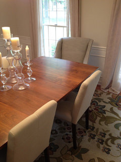
- hace 10 añosI think there is no doubt blue would work. Or maybe green. Can you take a closeup pic of the colors in the rug? By the way, I like that rug quite a bit in the room.
User
Autor originalhace 10 añosI love the texture the grasscloth adds to those rooms. There are a load of tutorials about how to do a faux grasscloth finish on your walls. I wonder if I could tackle that without it looking totally cheap?0- hace 10 añosLaura, I'm a big chicken about paint colors. As an example, I just painted my whole upstairs in boring neutral accessible beige. BUT, I did recently buy an upholstered headboard in beige for the master bedroom and it was just lost against beige paint. So, I painted an accent wall in a deep chocolate brown. I kind of freaked out as we started painting, but you know what, I love that accent wall and the headboard is stunning now! I don't know if you want to do it, but I agree that a bold paint color or even one bold accent wall would transform the room. On the other hand, it's an attractive room as is and a bold color certainly isn't necessary (unless you choose to do a plate arrangement - lol).0User agradeció a Ann
User
Autor originalhace 10 añosThanks for the pep talk, Ann! You're making me feel brave about paint. :)- hace 10 añosÚltima modificación: hace 10 añosI especially like the gray blues and the blue greens in the rug. Before seeing a close up, the blues were what was really standing out to me as a great accent color choice. With the close up, I feel the same way, but I also love the blue green color that is shown often in the long slender leaves.0
User
Autor originalhace 10 añosI agree, Ann. I think blues would look great. I'm going to make a trip to Kirkland's and see about art. I think the next step is to figure out art vs. plates and how brave I'm feeling about color. ;)- PROhace 10 añosÚltima modificación: hace 10 años[houzz=[houzz=
 azores AF-495 Paint - Benjamin Moore azores Paint Color Details · Más información[houzz=
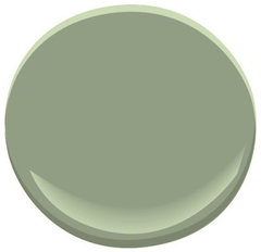 kennebunkport green HC-123 Paint - Benjamin Moore kennebunkport green Paint Colo · Más información
 Misted Green 2138-50 Paint · Más información
 User agradeció a CDR Design, LLC
 - PROhace 10 años[houzz=[houzz=
 beach glass 1564 Paint - Benjamin Moore beach glass Paint Color Details · Más información[houzz=
 flora AF-470 Paint - Benjamin Moore flora Paint Color Details · Más información]
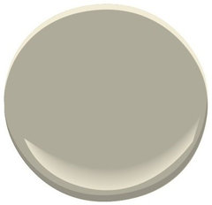 herbal escape 1487 Paint - Benjamin Moore herbal escape Paint Colour Details · Más información0User agradeció a CDR Design, LLC
 User
Autor originalhace 10 añosI like the greens, too. Flora, especially. I also like beach glass. So pretty. Green makes me a little nervous only because it seems like it can be hard to get right…I picked a green paint once that I thought was going to be sage and my room ended up looking like a putting green.0User
Autor originalhace 10 añosOf course, I've also have the same problem with blues. I've painted colors that I thought were going to be gray-blue and they ended up looking like baby blue, so maybe the problem is me. ;)0- PROhace 10 añosÚltima modificación: hace 10 añosYour steps are correct......first a trip to Kirklands to see if you can find a piece of art that will really make an impact.
Sea at Sunrise is almost 70" wide (too wide for your buffet). But Ulswater is 55", a perfect width for your buffet.
[houzz=] [houzz=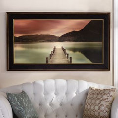 Ullswater Framed Print | Kirkland's · Más información]flora AF-470 Paint - Benjamin Moore flora Paint Color Details · Más información
- hace 10 añosLaura, please excuse the very quick interruption. CDR, my little Restoration Hardware side table for my fireplace chair arrives tomorrow and all my daughter's new living room furniture arrives Wed. - Woohoo!
User
Autor originalhace 10 añosThe ulswater is pretty. How about this as an option?
http://m.kirklands.com/product/Mirrors-Wall-Decor/Art/Framed-Art/Aspens-by-the-Lake-Framed-Art-Print/pc/2283/c/2293/sc/2669/181965.uts0- PROhace 10 añosÚltima modificación: hace 10 añosLaura, it is under glass. I would stay away from that. Glare.
It feels traditional to me, even though it is not listed that way. Looks like a pastel.
Also, the rug has a very busy pattern. So, with the art, you need a contrast in pattern size. I would go with something like Ulswater that is basically 3 horizontal bands of color.
I would go to Kirklands and pick out any you like an bring them home and try them. They are very good about returns. User
Autor originalhace 10 añosNo problem, Ann! Do you have dilemma's for your living room and daughter's room? I'd love to check them out!0- PROhace 10 añosFor some reason, I think the little girl in your photo will be the one to choose. She just looks like she will pick out the right art.
User
Autor originalhace 10 añosI forgot I had these, but they could work with the rug. Too small for over the buffet, but maybe between the windows or on the back wall?
- PROhace 10 añosThe 2 pieces of framed art are a possibility....depending on what you choose for the main art, of course.
- hace 10 añosHere's a link to my dilemma for my daughter's living room. It will get activated again this week with new pics when HOPEFULLY her new furniture looks fantistic in the room.
https://www.houzz.com/discussions/will-these-choices-work-dsvw-vd~10906140 User
Autor originalhace 10 añosAnn, I LOVE the brown accent wall in your bedroom! You have a beautiful home. I was quietly following along with your guest room update. :) I bookmarked your daughters dilemma - I can't wait to see how it turns out. Thanks for sharing!- hace 10 añosThanks Laura and pics deleted:) I painted the brown accent wall before my whole upstairs was recently painted and I told to painters to leave that accent wall as is - I really, really like it, but it was a big bold move for me:) As far as my daughter's living room - it better turn out - I'll cry (seriously) if the furniture choice doesn't look good.
This is the first dilemma I've seen of yours, but CDR mentioned your living room and I found that dilemma. You remind me of me, moving around your house with the help of Houzz. It's great isn't it. My house doesn't look at all like the fancy Houzz pics, but it has sure improved. Your house is looking great and I bet, like me, you feel like you've learned a ton about decorating!0 - hace 10 añosLaura, lol, I just meant you remind me of me in our Houzz experiences. Obviously, you're a young mom with young kids and I'm a whole generation or more older at nearly 60 years old with grandchildren. But, we're both traveling through our houses with Houzz;)0
User
Autor originalhace 10 añosAnn, Houzz really is a great learning experience (and fun, too!)! I've moved around a ton. This is the first time in the twenty years since I graduated college that I'll live somewhere for longer than two years. Our house is nothing special - pretty typical late 70's colonial - but we have wonderful neighbors and great schools. We love it! And I love that we're finally putting down some roots, so I'm having fun thinking about how to make it a functional and beautiful place to live our lives and raise our family. And I'm always amazed at how generous people are with their time and ideas...such a great community!
I'm sure your daughter's furniture will be great!!- hace 10 añosLike you, we all like to think/chat about decorating all the time. I imagine many of us are highly addicted to Houzz. I know I am:) Plus, you make Houzz friends along the way!
- hace 10 añosJust saw this Houzz pic when I logged in. Is this the Crate and Barrel bowl?
[houzz=] Miller's Meadow Farm Living Room · Más información0
 - PROhace 10 añosStarburst bowl from crate and barrel. I think z gallerie has a similar one.
- hace 9 años
In the second photo, the chandelier seems to be off-center according to the windows in the background, so I would recommend correcting this when you change the lighting. For another thing, when the chandelier is centered in front of the picture, the picture cannot be seen very well. So, I would suggest two light fixtures with the picture across from the center point between the two fixtures. Since you have so many light colors in the room, rubbed bronze fixtures would be a nice, dark contrast. Regarding a rug, I would recommend a medium blue-grey that will give warmth to the room and tone down the redness of the buffet. I believe the buffet is beautiful the way it is, and I certainly would keep it.
0User agradeció a sheilaskb

Volver a cargar la página para no volver a ver este anuncio en concreto


doctornancy