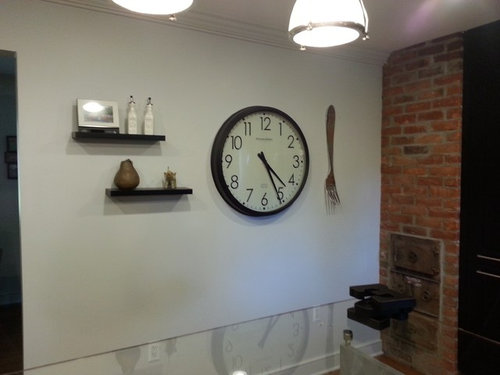
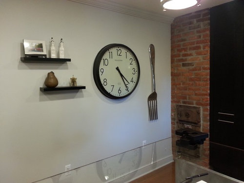
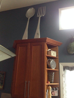
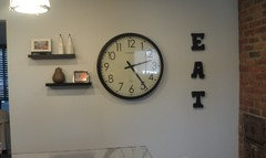
Houzz Logo Print
shannonscalici

Which fork!?

shannonscalici
hace 10 años
Small or large?
I will be adding EAT in box letters above the clock,keep in mind! If I do the small for I will most likely add a spoon next to it.

HELP ME!!!!!

Comentarios (50)

  • yoboseiyo
    hace 10 años
    i like the big one.
    but turn it right side up.

    you could put the spoon horizontal along the bottom.
  • Darzy
    hace 10 años
    I would use the big fork, then lower the clock so EAT is sort of level with the top of the fork.
  • Niki Posten
    hace 10 años
    The large one turned right side up. If you had a knife I would use it next to the fork.
  • unwantedadvice
    hace 10 años
    Like the big fork. Will look cute when finished!
  • Emily H
    hace 10 años
    BIG FORK!!!! :D
  • Amy Cali
    hace 10 años
    Big
  • Geneviève
    hace 10 años
    big
  • PRO
    Merri Interiors, Inc.
    hace 10 años
    Go big
  • User
    hace 10 años
    Big and ditto with Darzy comment.
  • shannonscalici
    Autor original
    hace 10 años
    If I do big should I still add eat up top? This is what it did look like before fork.
  • PRO
    LB Interiors
    hace 10 años
    Última modificación: hace 10 años
    I would use the big fork where it is,. Lower the shelves and the clock and EAT above.
  • PRO
    LB Interiors
    hace 10 años
    Same layout for the shelves, just lower. Bottom shelf level with clock bottom. Eat, in space left above the shelves, but not higher than the clock.
  • PRO
    LB Interiors
    hace 10 años
    Or something like this
    Placement · Más información
  • Geneviève
    hace 10 años
    Bon appétit:) looking good from here ,
  • billyjackchris
    hace 10 años
    This looks great, but I think the EAT should go straight not curved.
  • Emily H
    hace 10 años
    Cute!! Looks much more balanced and finished. Love!
  • pcmom1
    hace 10 años
    Like it! Might add a third longer floating shelf below existing ones. Sort of balance out the bottom of the fork.
  • Jandy Day
    hace 10 años
    oh wow! love the finished product. looks great!
  • unwantedadvice
    hace 10 años
    Great job! Looks nice. :)
  • Amy Cali
    hace 10 años
    looks great! is the E too high or it may be the camera angle All in all really cute wall!
  • PRO
    Dreamwalls Glass
    hace 10 años
    I like your unique all-glass kitchen island. I wanna see more!
  • iamking
    hace 10 años
    The big one, for sure
  • dworden5
    hace 10 años
    Eat needs to be straight
  • User
    hace 10 años
    The fork is upside down. Otherwise I think it looks good. I would try putting the EAT straight to compare looks. Nice job!
  • kimanddana
    hace 10 años
    LOVE IT!
  • pcmom1
    hace 10 años
    That "E" is a little high. Good call, Amy.
    Is there a knife that goes with the fork? That would look good horizontal under the floating shelves.
  • Anoura Xirks_Logan
    hace 10 años
    Large! hahaha fork is my sisters nickname. hey get a spork in there.
  • armipeg
    hace 10 años
    Big fork.
  • Mahmood Al_Turani
    hace 10 años
    I would prefer no Fork.
  • lse133
    hace 10 años
    LSE133
    I like the large fork for two reasons. First it lies flat. Second if you look at the bottom of each thing hanging, it creates a straight diagonal line which looks attractive. I don't know if I would add anything else to the grouping. Good lucj!
  • cyndidj
    hace 10 años
    Designed well! You did a great job!
  • meggielh
    hace 10 años
    I like the 'EAT' curved. It makes it look like an invitation. If it were straight, it would look like a command! (The E could be a bit lower, but I kind of like it the way it is - gives it a bit of whimsy.
  • User
    hace 10 años
    Tines up! I think it would look more balanced.
  • PRO
    Designitious
    hace 10 años
    The small one goes with the minimal accessories .. and I would recommend a square clock
  • tnsockmonkey
    hace 10 años
    The small items on the shelves look a little out of scale. Maybe one that can hold its own on each shelf?
  • PRO
    User
    hace 10 años
    I would consider moving the shelves apart more and get some differential in heights on the items, maybe some color too. Large fork can also hang on the horizontal if you get creative with your hardware. You could paint a "kitchen quote" around this merchandising to give it some sort of semblance or frame...“The only time to eat diet food is while you're waiting for the steak to cook.” Julia Child
  • letusb4nine
    hace 10 años
    Nice!
  • PRO
    Tricia Heliker
    hace 10 años
    I got here a little late but I prefer the large fork. I would also put the letters on a straight line.
  • mopaski
    hace 10 años
    Big one! Point side up :) cute wall!
  • PRO
    ARC Interiors
    hace 10 años
    Big is better but it needs to be higher or horizontal. I agree that you need some color. Paint EAT red or a bright orange. Would love to see what you decide.
  • imcjl
    hace 10 años
    The larger one.
  • User
    hace 10 años
    The big fork. Cute wall!
  • ash redmond
    hace 10 años
    I like the letters curved - what about painting the portion of the wall behind the arrangement just to further the statement - I think the shelves and bottle on it would really benefit from a background color.
  • Kathy Martz_Walsh
    hace 10 años
    the larger fork
  • User
    hace 10 años
    Última modificación: hace 10 años
    Designworks has great ideas! I was wondering about a smaller clock possibly square, as suggested by Bonian. But I like the big fork!
  • PRO
    NEVERENDING ROOM
    hace 10 años
    Looks great. Glad you went with the large fork and I agree straighten the letters.
  • ilovehouse
    hace 10 años
    BIG!
  • victorianbungalowranch
    hace 10 años
    This is off topic, but what is that door in the chimney? It looks a lot like the incinerator we had in the basement of my parent's 1920s house.

    Personally I would prefer a sans-serif, maybe stainless, type for a sleeker look, and lightly use a string and a piece of chalk to draw the arch to hang perfectly. Otherwise is just throws it off.
  • PRO
    PamDesigns 3D
    hace 10 años
    Lose the fork entirely. This vignette reads as four objects. An odd number would make a better composition.
Patrocinado

Volver a cargar la página para no volver a ver este anuncio en concreto

España
Personalizar mi experiencia con el uso de cookies

Houzz utiliza cookies y tecnologías similares para personalizar mi experiencia, ofrecerme contenido relevante y mejorar los productos y servicios de Houzz. Al hacer clic en 'Aceptar' confirmo que estoy de acuerdo con lo antes expuesto, como se describe con más detalle en la Política de cookies de Houzz. Puedo rechazar las cookies no esenciales haciendo clic en 'Gestionar preferencias'.