Backsplash opinions
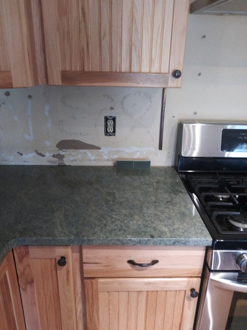
Back with another post about a backsplash for Costa Esmeralda granite. Many of you suggested a light green -- many of the light green samples I got looked nice with the granite but for whatever reason I just don’t like that color in my space. Can’t put my finger on why but I just don’t.
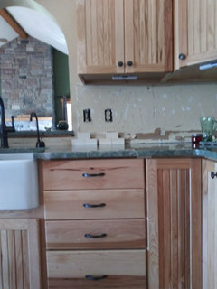
My biggest problem is that CE, beautiful as she is, doesn’t have the “mountain cabin” aesthetic I’m going for in this house and therein lies the problem. There is an open view to a large stone fireplace in the great room from the kitchen, so I need to tie this granite in with all that. (I’m still kicking myself I didn’t go with a granite that has a rustic vibe...but what’s done is done). I am not afraid of color so decided to go opposite direction and hunt down deeper colors to try to bring it all together.
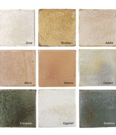
So, I’ve narrowed it down to three choices, all Pratt & Larson, would probably be a 3 x 8 size. The soft white is okay and is the safe choice but is my last choice, primarily because white subway tile doesn’t build that bridge between the kitchen and the rest of the house and also because it's just so blah, it okay but is uninspired and I just really don't care for white anything for the most part -- "safe" but I'm not really going to be that happy with it.
Now I'm all over these greens on the other hand -- love the rich colors, and I think they make the cabinets pop. They also tie in much, much better with the rest of the house opposed to the white IMO.
What do you guys think?
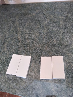
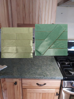
L to R: P+L 74, 50, 60 (74 = white, 50 = mid green, 60 = dark green)


P+L 74:


P+L 50:
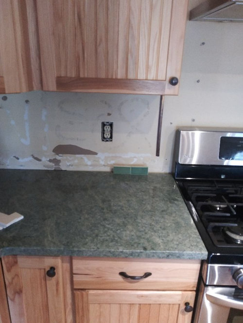
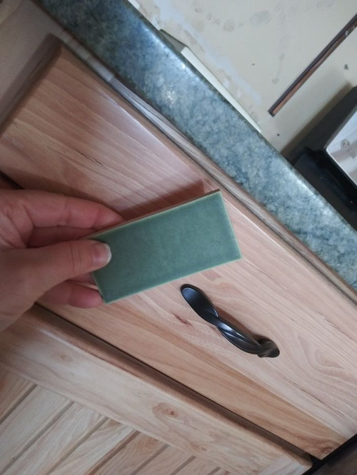
P+L 60:

Comentarios (29)

Usuario de Houzz-187528210
hace 3 añosI like the one on the right. I mean I LOVE the one on the right!!!!! Awesome find. I’d do that in a straight set pattern. Or even do the white straight set and the one on the right in a herringbone pattern by the range hood.
lepstein
hace 3 añosI love PL 50. Rich and lively against both counter and cupboards. Definitely not white.
mxk3 z5b_MI
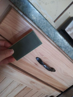
Autor originalhace 3 añosNope, not leathered, she is polished. It's not a super-glassy polish, though, which is fine with me, I'm glad it's only softly polished -- I actually was going to go with a honed finish on the other stone I originally chose (Virginia Mist), but CE was a last-minute switch, I just couldn't resist her when I saw her :0)
 PRO
PROSkippack Tile & Stone
hace 3 añosÚltima modificación: hace 3 añosThey're OK, but nothing great. Have you considered using a stone? The Golden White Quartzite comes in lots of sizes and it's color would work beautifully with the counters and the style of your space.

biondanonima (Zone 7a Hudson Valley)
hace 3 añosGreen is one of my favorite colors and the CE counters are gorgeous. I like both green tiles (especially PL 50), but neither looks like the perfect green for that granite to my eye. Is the wall behind the fireplace going to remain the green that it is now? If so I would probably go with something other than green for the backsplash. I don't care for the white you have pictured but I think a much richer cream color could work if you wanted to go that direction.
mxk3 z5b_MI
Autor originalhace 3 añosÚltima modificación: hace 3 añosAgree that they're not the perfect green, a little more toward blue would probably look better. But not easy to find matte tile, so it's not like I have my pick of the green litter, or even the cream litter for that matter (I really dislike glossy tile - in MY house - it borders on detesting it). I have a couple more samples of matte creams on order from Sonoma, the local distributor didn't have samples so have to have them shipped, so maybe one of those may do. I think I brought home every shade of matte and satin cream/off-white that P&L has LOL! Anything with too much yellow really detracts from the granite, and cream may end up blending right into the cupboards rather than showcasing them. But, will evaluate them when they arrive. Tidewater from Fireclay looks nice with the granite but doesn't work that well with the cupboards IMO -- it leans too heavily towards blue in my space, and Fireclay Hunter Green is much too saturated, the P&L C60 is a very similar, muted color.
Re: Stone: I had thought of that right out of the gate but the consensus on the board was a resounding NO -- I don't think even one person said any of my stone samples looked good, in a nutshell it was you need a simple solid color subway in the handful of backsplash posts I've made.
Re: Green wall: Inherited this color when I moved in but it's definitely change-able -- haven't gotten to that room yet, I think the room overall looks nice so it's low on the priority list (could be better but overall I like it just fine).
I do have one green sample that I didn't post -- its P&L 65, it leans olive green and just not quite right with the CE to my eye. I can try to snap a pic of it later tonite or tomorrow (I don't have a smartphone, have to wait for DH).
Rachel Simanski
hace 3 añosThat may not be the right color white, but I would go with something light here. Everything else is so dark that you need a light element.
Muriel Thompson
hace 3 añosI don’t share the opinion that a light color is needed. The cabinets are light, and the granite is mid-tone at darkest. I think we’ve become so conditions to white/white/white kitchens that people perceive things as dark that truly are not dark.
biondanonima (Zone 7a Hudson Valley)
hace 3 años@mxk3 z5b_MI I didn't realize you were set on a matte finish - that definitely limits your choices a bit. Anyway, I think if you are going to keep the green behind the fireplace (which reads kind of olive-y/hunter green on my monitor), I would avoid PL60 because it may look as though you were trying to match the paint and missed the mark (at least on my monitor). If you change that paint color I think either green could work. Personally I would change the paint - IMO the particular shade of green you have there doesn't do much for the lovely colors in your stone fireplace, and changing it would give you greater flexibility with your tile green.
 PRO
PROCoastal Floors Georgia
hace 3 añosI prefer the white tile because the other two might blend in too much with the countertop. I think the white would open the kitchen up more where the other two colors might make it look smaller and more enclosed.
mxk3 z5b_MI
Autor originalhace 3 añosYea, agree about the green paint -- could be better, I've thought the same thing myself many times, is not quite right with the fireplace. Easy fix -- I just haven't gotten to it yet, it doesn't bug me enough to be a "right now" issue (like this kitchen...)
mxk3 z5b_MI
Autor originalhace 3 añosÚltima modificación: hace 3 añosI snapped a few more pics of the P+L 74 in comparison to P+L 100 -- P+L 100 is the brighter, cleaner soft white, P+L 74 is the ivory shade.
I keep vascillating. Part of me says screw it just do an off-white, it looks better with the counter but the other part of me says I it's just waay too blah and not "rustic" enough for the house. I love the rich colors of the greens, but something is just slightly "off" to my eye -- will it matter if the green is not spot-on tonally or will "close enough" do? Also, I'm concerned the darkness of the green will take away from the beauty of the counter; the off-whites are "there" but not really...the counter gets to shine. Ugh I hate being indecisive - now I get why people agonize over flippin' tile!
Anyway, here are the off-whites. P+L 100 on left, P+L 74 (ivory) on right:

biondanonima (Zone 7a Hudson Valley)
hace 3 añosHmm, that's a tough one. I prefer the 74 ivory in general, but when I see it with your sink I am less sure, since the sink is such a bright white. Overall I'm just not feeling white for this space. I'm also not entirely sure what you mean when you say "rustic" - do you have inspiration photos?
As for the green quandary, I do understand your concerns that the wrong green will detract from your lovely counters. Have you considered another direction entirely? Like a soft matte grey color, maybe, to pick up the colors of your stone chimney?mxk3 z5b_MI
Autor originalhace 3 añosÚltima modificación: hace 3 añosYep, I tried many shades of grey -- for whatever reason, they pull blue in my space = depressing, very very depressing up here in the north. I did find one that does not pull blue -- it's a matte glass tile from Fireclay in Roadrunner, it's a deep smokey green-grey, and it looks not half-bad with the counters. Starling matte glass is nice, too -- the tone is better than the P+L greens but it's definitely green.
I'm hesitant about glass tile though, it might be too contemporary but maybe I'm way wrong there. I could try some other darker colors from Fireclay in a regular field tile (Magnetite, Iron Ore, etc) to see if any of those have that smokey green-grey tone like the Roadrunner.
Here's a couple pics of kitchen I like that to me are "rustic" -- yes, I know I know CE granite is not a good choice for this look --> I've got to make the best of it and swing it back around on track as much as is possible. **Maybe I should look into a WOOD backsplash rather than tile?
Vinmark's kitchen -- I want to move in here :0):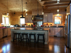

 Rustic Modern Lake Retreat - Kitchen · Más información
Maybe I can use white tile and somehow rustic it up if I pull in more wood (I'm getting a new moveable wood island, that might help), but my cabinets are completely different than this:
Here's a kitchen with hickory cabinets and white tile -- not horrible, but not great and just blah: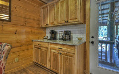
biondanonima (Zone 7a Hudson Valley)
hace 3 añosÚltima modificación: hace 3 añosI love the photos from the rustic modern lake retreat with the stone backsplash - that's kind of what I had in mind when I mentioned grey and/or pulling the stonework from your fireplace into the kitchen. That particular stone is probably too busy for your kitchen, but something in that family might work and would certainly be more rustic than any of the porcelain or glass options you have posted. BTW, I like the colors but not the glass aspect of the two you linked above - the glass is the opposite of the rustic look you want, imo. I am not usually a fan of a stone backsplash with a natural stone countertop but in your case I think an organic-looking material is more likely to give you the rustic look you desire. If you choose a quieter stone in a neutral color it should still allow your granite to be the star.
If the greys you tried were pulling blue, they were probably too cool - what about something greige or leaning beige? Some ideas:


barncatz
hace 3 añosFWIW, I'd consider a backsplash that has some subtle variability either in the shade or in the glaze. I did both. I chose three shades of off white tiles - one matte, two polished, in different percentages of the total i.e. more of the matte - and combined them randomly. Perhaps introducing a small number of shiny tiles might mirror your counter.
(I didn't bother looking up the variability rating of your P & L tile - perhaps those already have a high variation rate.) PRO
PROBeth H. :
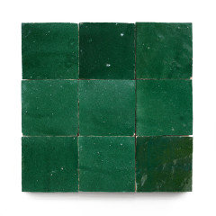
hace 3 añosÚltima modificación: hace 3 añosi like the far right 'peacock' color
I don't think the white tile will do anything for the space.mxk3 z5b_MI
Autor originalhace 3 añosÚltima modificación: hace 3 añosBoth the green P+L are in the Craftsman series, so there's going to be variability. The gal at the showroom said if I go with a flat field tile, there won't be as much as there is on their rustic finish tile, which is what the Craftsman glazes usually are on.
I think I need to hit the big red PAUSE button on this. Any of those P+L tiles are ~$44/sq foot -- which means by the time I cough up the cash for the materials and installation, I'm probably looking at $4500-5000 just for the backsplash. On top of $6500 I paid for the counter, none of which is getting me where I want to be. I screwed up -- big time.
I can't have the backsplash installed until the electrical work gets done, which is scheduled to start at the end of January, so it gives me time to re-group. I sent a msg to the other fabricator I was considering re: how much will it cost to install leathered Steel Grey (which is way WAY cheaper than Costa). If it's only $1500 or so, I might just try to repurpose the Costa in the laundry room or master bedroom. It's that or drop another $5K on trying to pull it together and it might end up a big fail. What did Jan say some time ago -- rip it out and cry but your tears will dry when you make a better selection for YOU. (but d*mn this granite is beautiful!)
DH will be furious and I'll be embarrassed, but in the end that might be the answer. I don't know. It's actually a really good thing that I'm forced to sit on my hands for at least a few more months and really think about what to do next. In the meantime I can get more samples of the dark greens, make a sample board and hope one of them grows on me....
- PRO
Beth H. :
hace 3 añosÚltima modificación: hace 3 añosor, look around for some cheaper tile alternatives.
Seneca tiles would work, but they may be in the same price realm.

maybe the evergreen or moss in this size tile?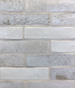
The Satins in Aloe is also nice. I'd use a grout color like this too.
https://senecatiles.com/senecasatins/otherwise, these are in the $27 range (Avente tile, Malibu patina)

Tilebar has the Portmore and a green LavaStone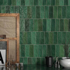
I have a sample of this. it's stunning
They actually have this celery color tile that's on sale. cheap. don't know if the color would workhttps://www.tilebar.com/lancaster-3x6-celery-polished-ceramic-tile.html
https://www.tilebar.com/lancaster-3x12-open-seas-ceramic-tile.html they have a lighter green on sale too
at $8.99, it's worth it to grab some samples!
or, look at a green zelliege tile

RedRyder
hace 3 añosThe green to the right if you don’t want a neutral cream color. Repaint the green wall in the room opposite. It’s not a great green for that space. After you do the backsplash, you’ll know what color to do on that wall. (I understand your calculations for changing the whole countertop/backsplash area, but will you be THAT much happier? If yes, then start that process so you don’t spend the money on these tiles.) I’m so sorry your project is more upsetting than gratifying.
biondanonima (Zone 7a Hudson Valley)
hace 3 añosI love the green counters, and I think they will fit the rustic vibe just fine with the right backsplash. Beth posted some great suggestions. Give it time and I am sure you will find the perfect backsplash for that gorgeous granite!
mxk3 z5b_MI
Autor originalhace 3 añosÚltima modificación: hace 3 añosThank you for all the suggestions, it's good to know I'm at least on the right track with green.
tedbixby
hace 3 añosÚltima modificación: hace 3 añosSince I'm only seeing a snapshot of your kitchen, would it make sense to do the backsplash as the same as the countertop? If that is a no, then what about a backsplash that has different colors of greens in it. Even taking the 2 greens you have and have them mixed if possible?
mxk3 z5b_MI
Autor originalhace 3 añosI ordered more samples of matte colors from Fireclay yesterday, hoping to get something similar to that Roadrunner color - smokey green-grey. We'll see...sigh....


Volver a cargar la página para no volver a ver este anuncio en concreto

Muriel Thompson