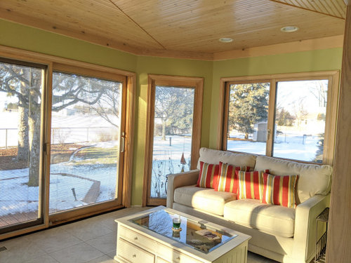
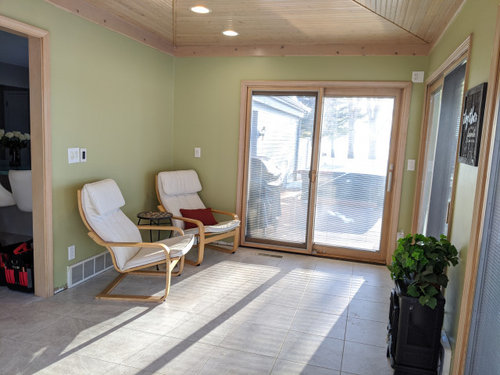
Paint color? Is it tooo green?? I need HELP I may repaint it.
Here is my sunroom done. It Behr Back to Nature (green) I am not sure how I feel about this?? It is a little out of my comfort zone. Any suggestions would be great. I need to get new decor etc. This is out of my color Pallet LOL .
Comentarios (75)

eidsnessgirl
hace 4 añosI, too, think that the green clashes with the woodwork. From the pictures the green has a yellow tone to it that may be even more jarring to the eye when the outside is lush. Don’t buy things trying to make the paint work - you will regret the whole room.
User
hace 4 añosÚltima modificación: hace 4 añosFor me the decision would be whether I wanted the room to be a place where I felt I was already halfway outdoors -- more out than in - or whether I want the room to be a fun space that I enjoy as part of the house, where the outdoors is a backdrop but what I am enjoying is the fun interior.
If it's the first, the color is an eyestopper, that keeps you in the room, so I would repaint with a dreamier tone that evaporates the walls and takes your eye beyond, to the outdoors.
If you want a fun wow space in itself that is part of the house, then keep the color but I would suggest stopping the eye even a bit more with full length curtains in a bold graphic. I would go for a combo of green and white in a bold choice of pattern, or a light background with a strong graphic that features the lively colors others are suggesting to you.
barncatz
hace 4 añosHi Sarah,
I'd also wait until things leaf out before repainting. The light is going to be totally different, for one thing. ci_lantro asked which photo shows the right shade - my guess is, they both do. And the first look at a new color is usually a shock. FWIW, I love it - but I live in a snowy area too and am dying for green!
I would move away from red accents if I had second thoughts about the green, only because the red is going to make the green pop because it's the complement to it. Try different greens, as in rorah's photo, maybe blues, maybe some beiges with green accents - the colors of that rug.
I agree the simple striped rug has the right feel for a sunroom and ties the colors together. If you google green striped rugs, they are everywhere. This one is from Home Depot.
 sarahj512 agradeció a barncatz
User
hace 4 añoswere I keeping the paint color, here's the kind of bold eyestopper pattern I might go for in drapes, and then go with the theme for inexpensive decor in rattan and wicker, lots of plants.
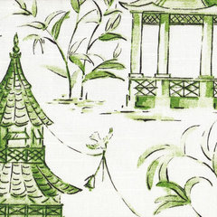 Pagodas Jade Oriental Toile Green Rod Pocket 30" Tailored Tier Curtain Panels · Más información
tuckerandscooby
hace 4 añosI like the green, and LOVE the wood, but together they just muddy into each other. I usually like color but here I think a true white walls would really highlight the wood and let it be the star. Then you could bring in any color you want as accents, including a happier green. Beautiful room.
Cindy Miller
hace 4 añosI think the green with the woodwork make the room look dated.....I painted my mother’s kitchen similar to this green about 12 years ago and she has oak trim and now when I see it I feel her room is dated. Just my opinion.
mdcathy
hace 4 añosBreaking up the wall that is all green with art work or objects will help a lot. I think you aren't happy with your choice so go ahead and repaint if you can't live with it---afterall, it is just paint. I am not a fan of green but it looks nice.

Jilly
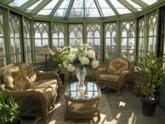
hace 4 añosÚltima modificación: hace 4 añosI think it’s lovely and a good choice for a sunroom. I always feel like sunrooms, within reason, should be their own entity, not just repeating the exact decor in rest of house. Your color scheme brings to mind old English conservatories, intended to connect with nature, not just be another living room.

.
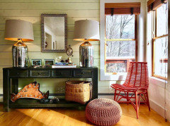
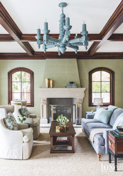
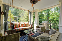
You’ve probably already done searches, but I just wanted to post some beautiful rooms done in this color.These have different trim colors, obviously, but might provide some inspiration regarding how it can look once fabrics/accessories/other elements are brought in.
If changing the trim is an option (I understand if not), I think painting it white or staining it in a darker brown wood tone would look wonderful.


Gret Freese
hace 4 añosMany inspired ideas from all. If you can pull the couch away from the window, could you fit a console table behind it for plants and sculptural pieces? Plants could create an indoor/outdoor flow and the green walls would be a great link. Opportunity to work plants outside that great corner window and maybe ground cover around the tree. A group of pointsettas (now available in an array of red and green shades) might work at this time of year. I also like reds in this room.
pauletteg
hace 4 añosThe green has too much of a yellow undertone which fights with the wood trim. You already are uncomfortable with the color so change it now, repaint it so your furnishing look good.
Since the outdoors are the focus, don’t fight it. This is a room that could benefit from a light grey color called Concrete by BMoore, it has a blue undertone which won’t detract from the woodwork. Let the outdoors in.

Nancy Nesbitt
hace 4 añosI agree with pauletteg about the yellow tones in the green and the wood. I would rather see green with gray or bluish undertones. It would still complement the beautiful woodwork. Your can accent with navy, whites, and other greens or pinks. I think the reds look great for winter, but come summer you may want cooler colors in there.
pegnear
hace 4 añosI agree with the previous two posters. This green is too yellow and is competing with the yellow of the wood trim and ceiling. A different green would work better but personally I’d stay away from green in this room. Work with the yellow in the ceiling, so go with a very, very pale yellow...or a warm white. Blue would work but make sure it isn’t a ‘bedroom blue’, so use one that leans more toward a soft grey. Also consider the light in your room. What direction does the room face. Do a bit of research on what paint colours work well in, for example, an east facing room...and consider if you want the room to feel warm or cool. Bottom line, if you have to ask...change it now! A can of paint Is far cheaper than a room full of furnishings and accessories!
Gram 1954
hace 4 añosAgree with those that feel the paint competes with nature and the beautiful wood ceiling - which should be a star in the room. I'd go with a soft off white - , and punch in color with accents and let the outside be the star. I never like to have paint color overtake a room.

katinparadise
hace 4 añosI like it! My kitchen in my old house was painted a color very similar to that. It had natural maple cabinets and looked great together. If you want to keep your striped pillows, look for a rug with an allover pattern. Avoid more stripes or geometrics. If you want a striped rug, look for pillows with florals or Ikat or Suzani pattern. The room is really cute and will look wonderful once you add accessories.
lovemattersmost
hace 4 añosI adore green and have some green walls so I love it too. But I will go rogue-ha ha- and say ditch the red and go with some blue accents. Blue and green are the 'true' Earth colors in my opinion (just look at a globe) and are gorgeous together. Navy blue, denim for texture, with a little brown here and there and your sunroom will connect to what is outside: blue sky, green grass, and brown trees, with extra green soon enough! :) At the very least, live with it for a while and get accents you like and see what happens. I bet the connection of your room to the outdoors when spring comes will be something you love, and will continue to love as we pass through the seasons. (Winter is a tough time to imagine that.) Good luck and good for you for going out of your comfort zone, even if you decide to return to it later. Trying things out is good for us, but there is a beauty in knowing who we are, what we like, and resting in that. Your home is just that: your special place on Earth and it of all places should be a comfort to you. :)
Sarah W
hace 4 añosThe green is a fine color and the woodwork is a fine color, but I don't think they are happy together. A brighter, less neutral green would be pretty, I think. Or, if you don't want brighter, maybe go paler. I think a little more contrast with the woodwork would create more visual impact. That's a very nice room; it has lots of potential.
Sarah W
hace 4 añosOr, what about wall paper? It's a bigger commitment in terms of money and time, but it could be just the thing.

caffemocha
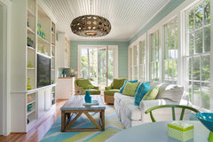
hace 4 añosI think the green may have too much of a yellow undertone, but like ci_lantro mentioned, the two photos you posted appear different. Here is an example of green; with a knotty pine wainscoting ceiling and light pine trim like you used. Possibly, you could add dark colored rugs/decor to bring out the beauty of the wood and the knotty pine wood accents. You have so many great window views with natural light, that possibly once you decide on your interior decor, the paint you chose will fit right in.


Sarah Jeffrey
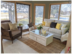
hace 4 añosUpdate. I have started to like it much more!! I have been trying to pull things together and it looks nice. I will have a picture soon. Thank you everyone for the great advice. I plan on this being my new favorite room in the house.
Sarah Jeffrey
hace 4 añosnot loving the pillows. but I love pretty much everything about this space now. need to add art work yet.

Sarah Jeffrey
hace 4 añosthe soft green is more accurate. It's so sunny in the room it picks up a brighter green.

Renee Ainsworth
hace 4 añosI think the natural wood trim is competing with the green walls. I would go with one of Nate Berkus's favorite neutrals on the wall called Moonshadow. It's considered a geige but it has a green cast to it so it could give you the feeling of green without going there.

kulrn
hace 4 añosMaybe different pillows is all you need to finish it off. ( I'm horrible at pairing pillows btw..)
 sunroom pillows - Fashion look - URSTYLE · Más informaciónsarahj512 agradeció a kulrn
User
hace 4 añosI really like what you've done so far. I'd still be looking to use patterned fabric somewhere (just me). And I'd like a tall etagere with plants.
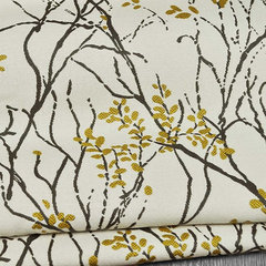 Myla - Fabric by the Yard, Marigold, 1 Yard · Más información
 Aimee Narrow Etagere · Más informaciónsarahj512 agradeció a User
- sarahj512 agradeció a jantrader
barncatz
hace 4 añosSarah, love what you did. The rug looks great. I think the pillows do too. I'd just switch out the center one and use one with some green. As in rorah's photo, the yellow is really fresh and bright in your room. Love your chair!
sarahj512 agradeció a barncatzUser
hace 4 añosjust to give you an idea, I would like to have very informal long drapes something like this
 Outdoor living · Más informaciónsarahj512 agradeció a User
- sarahj512 agradeció a User
Nick Platt
hace 4 añosHave to say I’m in the “too much yellow” under tone school of thought. My first thought was, looks exactly like hospital walls. Personally I’d never have a wall that reminded me of a hospital stay in my home. I’d go with a light terra cotta. Of course that’s what we painted our own sunroom.LoL
 PRO
PROBeverlyFLADeziner
hace 4 añosA dark color on the wall will focus your attention to the view beyond the walls.
tterri
hace 4 añosGreen is my favorite color. Like you, I would not be comfortable with the shade you chose. I like a restful green on walls. I've used Benjamin Moore Camouflage- a light sage that works great in many types of rooms. It's like a green neutral.

sarahj512
Autor originalhace 4 añosBeverlyFLADeziner, Thank you!! That is good to know! We are having an inground pool put in this spring and the backyard relandscaped. This should really set off this room. Thank you
nantarasi
hace 4 añosIt’s a lovely green. Right now it looks stark because the room is empty. Layer your room with natural colors and textures and pops of color in blues and greens. Perhaps some white sheer curtains that can be opened or pushed aside for softness. Once you layer the room you’ll see that the green you chose is neutral. 😎
doods
hace 4 añosÚltima modificación: hace 4 añosI'm with Bev on a darker green, and it seems to me her's has less yellow in it. Doesn't appear like you would have much to repaint, altho we can only see part of the room. A pretty room and I like the touch of yellow in your cushions!
doods
hace 4 añosÚltima modificación: hace 4 años@BeverlyFLADeziner you are so talented, you see things that we mortals don't. I would never have thought of that "focus your attention on the outside" in a million years, but once you pointed it out with the picture, I can see exactly what you mean.
equinekdc
hace 4 añosI too think there is too much yellow in the paint color and it increases the yellow wood tone, which I'm not a fan of...however, if you like the wood tone, then I would try a different green if that is your go to color. I have used SW "Coastal Plains" several times and have always been extremely happy but it was in combination with white trim...good luck!!
katrina_ellen
hace 4 añosI have a similar color in my bedroom and it works because my bedroom is dark, it adds warmth. It looks good with neutrals. Sometimes I consider changing it but I have had subtle color in there before and it just looked very dull. Theres not much wall space in a sunroom but I think something not as bright would work better in a room flooded with light.
Jilly
hace 4 añosI love that! So charming! Please update with what fabric you choose.
The more I look at your room (and wall color), the more I like it. It’s so cheery and sunny.sarahj512 agradeció a Jilly


Volver a cargar la página para no volver a ver este anuncio en concreto
roarah