Need help picking a color for kitchen island
Hi!
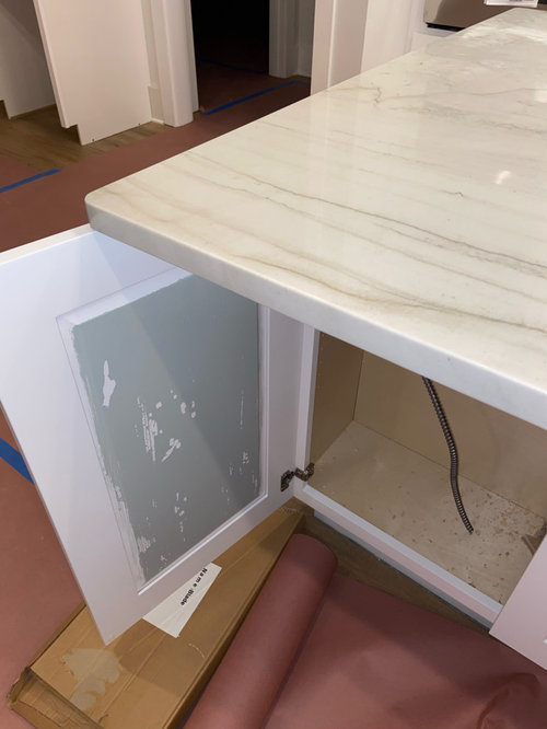
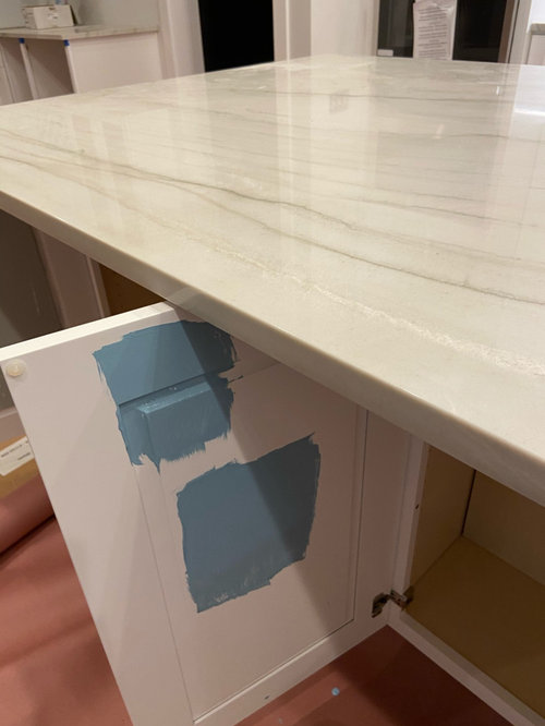
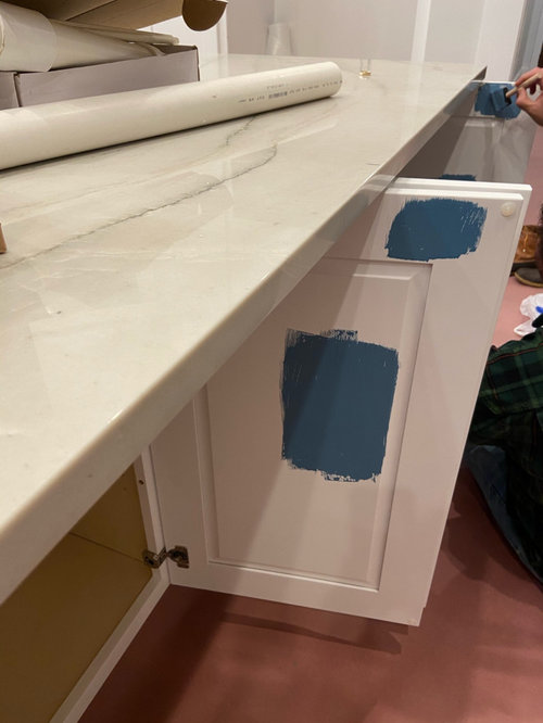
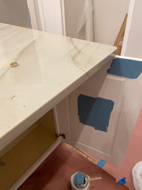
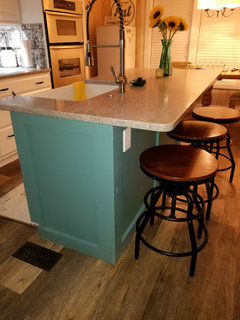
My perimeter is white and we have decided to paint our island. I originally started with BM Colorado Gray. But after looking at a sample of it, I’m not sure as I thought I wanted more of a blue tone. So I picked up 3 more blue samples to try. I know I do not want Navy. It’s beautiful, but too dark for my home. I’m open to suggestions. Here are some of the shades: 1) Colorado gray, 2)open seas, 3) Santorini 50%, 4) Blue cruise.
I have more photos to show you the room, but there is not enough space here. Would appreciate all input. Thanks!
Comentarios (24)
 PRO
PROJudyG Designs
hace 4 añosÚltima modificación: hace 4 añosSantorini Blue is right on, but don’t cut it. Your creamy counters and white perimeter can handle it full strength.

cawaps
hace 4 añosI think we have some confusion here on paint brands. You mentioned BM Colorado Gray, but BM doesn't seem to have an Open Seas or a Blue Cruise, though Sherwin Williams does. Both Benjamin Moore and Sherwin Williams seem to have a Santorini Blue and they are very different blues. I think what you sampled is Sherwin Williams, yes? But I think what JudyG showed is Benjamin Moore. Please clarify, for the sake of getting good advice.

Erin W
Autor originalhace 4 añosSo the Colorado gray is BM. The other blues are SW. the BM Santorini is very close to BM Colorado Gray, so I knew she was referencing that versus the dark SW Santorini. But I think that’s the key, something around that BM Colorado gray or BM Santorini color.
cawaps
hace 4 añosTake a look at Benjamin Moore's Buxton Blue or Saratoga Springs. They are close in hue and value to Colorado Gray and BM Santorini Blue, but are more intense.
Buxton Blue
Saratoga Springs

mark_rachel
hace 4 añosI would look at Boothbay Gray, Solitude, Smoke, Silver Gray. All BM. I think you need a blue that has a gray undertone to tie in the stone.
megs1030
hace 4 añosI'm not loving the 2 lighter blues you have painted on the first door. I prefer the richer, deeper blues with your countertops (which look very similar to mine and I love!). If your counter has more grays, which I think it does, I would definitely lean towards a blue with some gray undertones in it.
always1stepbehind
hace 4 añosof the three, I like the 1st one..which is no where near the other two colors. (obviously)...I don't like the tone of the blues..too cutesy or bright...still needs more of a grey tone. Your countertops are gorgeous though...which I'm sure you are well aware of!! ;-)
cawaps
hace 4 añosIn line of "deeper, richer" but still having more gray than what you have sampled so far...
What about BM Franklin Lakes?
Or SW Juniper Blue?


sprtphntc7a
hace 4 añosalthough your counters have gray in them, they are reading "warm" to me on my monitor....
look at warm blues on the darker side. a light blue will wash out your counters and cabs... the blue should be dark enough to give contrast and make your gorgeous counters shine.
the samples that Blueberry Abode posted is the shade/darkness that you need....IMO
 PRO
PROColor Designs
hace 4 añosBM Pewter 2121-30. Beautiful depth but not too blue. The BM Wolf Gray was also a good suggestion.
Lynn G
hace 4 añosI like option #3. It's a bit more saturated of color, but not too dark. Especially since you have so much white around it. The other blue's seem to be grey'd down. Take a chance - if you're going to add color be a bit bold. I think you'll be glad you did!
hsmeghan
hace 4 añosIt would be helpful to know what the rest of the room looks like, in particular the lighting. If it's a bright room, especially with natural daylight, a darker blue would work, if not, go with lighter. Blue grey tones would work best with the countertop, I agree. (I notice that blue makes the veining look more grey -- don't know if that's the effect you want.) The light in the room may determine how much contrast you want between darkness of paint and the white/grey countertop color.
I like the way you painted samples on the insides of the cupboard doors but does this method really give you a good indication of what the final result will be? Perhaps you should paint samples on large pieces of posterboard and tape them to the outside of the doors with painters' tape so you can look at it in all kinds of light and all times of day and night before deciding. I did this with my laundry room walls before deciding on the color and I felt it worked well.herbflavor
hace 4 añosÚltima modificación: hace 4 añospick a blue w yellow or green undertones. the counter and floor need that . Buxton blue but even more yellow to it. Have you thought of a green color as an option. The purpleish or royal or navy blues don't work but may be better in your light.....and we can't possibly know that. Yellow and creamy counter but floor is a cooler red so you have to work w the both...I'd look at green shades and you can veer bluish in that family.
dory50ish
hace 4 añosBased on the colors you chose I would use the darker blue then accent other things in the room to make one cohesive look. When I redid our kitchen I have white cabinets but then I love teal and so decided to paint my island teal and I get so many complements. I have accented with the teal in every single room.
 PRO
PROMichelle Triplett Design
hace 4 añosMy suggestion would be to pull out the grey/green color in the counter veining. It’s hard to suggest a color without seeing it in person. If you hire an interior designer they will give you great options that you may not have thought of. I like to repeat a color throughout the house for continuity. 😄

junco East Georgia zone 8a
hace 4 añosLook at BM Mount Saint Anne. It is a green/blue that herbflavor suggested.
equinekdc
hace 4 añosIn my humble opinion, I would go with BM Hale Navy....I know I know you don't like navy...this is an amazing navy and would ground the island...the few samples colors you painted on are too bubble gum for me...good luck!!
gigi7
hace 4 añosI did Hale Navy and could not be more pleased!! It's just sublime and so many other colors go with it and it read neutral to me because so much will be compatible....but if you don't like navy, then you get what makes your heart sing! I think you'll know when you see it!! Best of luck...although stressful, decorating is a blast!

Theresa Powell
hace 3 añosI love the Navy, but don't you think there should be a contrast if the floor is dark?

Volver a cargar la página para no volver a ver este anuncio en concreto
Blueberry Abode