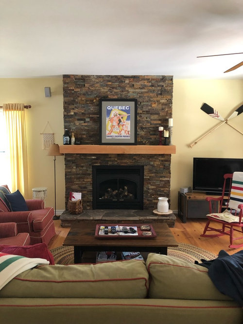
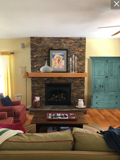
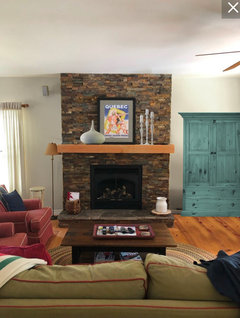
help accessorize my mantel

Comentarios (35)
 PRO
PROBeth H. :
hace 4 añosÚltima modificación: hace 4 añosI think the print is fine. remove all the little stuff around it. or, try something like this

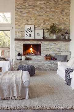
I like the taller piece on the right w/the leaves.I love this arrangement as well: (substitute the mirror for your artwork), the white vases w/the branches would look cool against the dark stone.

maybe just a potted plant in place of the candles?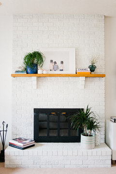

you could also try a grouping like this (just use your one canvas piece though)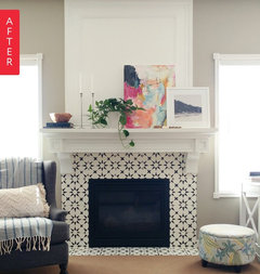
Or, find a larger print (or put yours in a larger frame) and just do the picture on the mantel.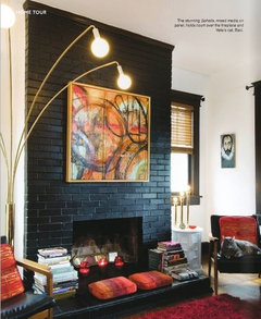

tatts
hace 4 añosWhat do you have? What do you like? Put it there. Done. Simple.
This isn't a permanent installation, you'll change it once in a while.
This is a really minor decision; just grab something and put it there. Don't like it? Try something else. And 3 weeks or 3 months from now you'll put something else up there. It's about the simplest decision you'll ever make.

pink_peony
hace 4 añosI think adding a few well scaled white pottery pieces on the mantel with your print with you new art piece is all you need. What is distracting is al the other random pieces on the wall. The macramé piece to the left for example. It just doesn't work. The oars. I like them but I think they would loo better hung horizontally one on top of the other than crisscrossed. Remember not every Wall needs something on it, less is more.
 PRO
PRODocklights.com
hace 4 añosi like a lot of the above suggestions. think in terms of 'balance'...like a taller object in the center, (mirrors work well) with a pair of candlesticks/sculptures/pottery/etc on either side. or, you can go large to small, left to right or right to left. there are any number of ways to personalize it...don't overthink it...it's your space, and you're the ones who will find the most meaning in it.

Cynthia Abbott
Autor originalhace 4 añosThanks everyone - I’ll try not to overthink things. The mock-ups help wrt to scale though so thanks very much!Cynthia Abbott
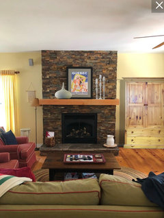
Autor originalhace 4 añosI have a follow-up question regarding the space next to the mantel (where the paddles and tv are currently located). I've been playing with the idea of moving an old pine armoire into the space and using it as a tv stand. It's a big unit and my husband thinks it'll look too big for the space. He might be right. It'll be a hassle to move it from the city to the cottage so I don't really want to go through the effort if it's going to look awkward. That's where you guys come in: do you think we could make it work?

The armoire is 44” wide 78” tall 21” deep. I will remove the doors if we use it for the tv. The space next to the fireplace is 96" wide and 108" high. I've included a couple of photos.

lisaam
hace 4 añosMaybe you can try a sized mock up of the armoire using boxes or tape to get the feel of what it might look like. It might compete visually with the fireplace.

groveraxle
hace 4 añosThe armoire does help to reduce the tendency to clutter in the room. However, I think the current media cabinet is a better look next to the fireplace.
Cynthia Abbott
Autor originalhace 4 añosWow - that helps so much. Thanks for mocking it up Grover. It definitely looks better when painted - I like the colour you chose too. It pulls out a whole other tone from the fireplace- one I hadn’t noticed before. Eventually the room will be white, but I think you might be right about the scale next to the f/p.
Karenmo
hace 4 añosÚltima modificación: hace 4 añosI like the blue green color of the armoire since I'm a blue-green person. But my eye kept wanting it to be the background color of the print on the mantel. Not sure what that's about! But I do think it looks neater than the smaller cabinet you have with the open shelves.
Cynthia Abbott
Autor originalhace 4 añosWhat???? That’s awesome! I wish I could do that. So much better. Thank you! I must just sit and absorb the change now.
hoovb zone 9 sunset 23
hace 4 añosYou might consider using one of the colors in the print as the color for the armoire
 PRO
PROCourtney Thomas Design
hace 4 añosYou don't need a lot on the mantel around the artwork you have. Just a few things might help. Here are some ideas for you:
 Upscale Family Home: Living Room · Más información
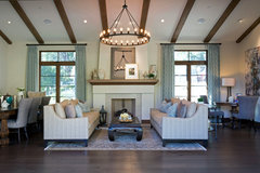 La Canada Blvd Residence · Más información
Cynthia Abbott
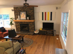
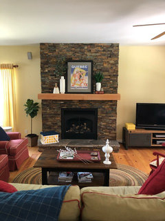
Autor originalhace 4 añosHere is the mantel re-styled. Also tried to de-clutter a bit. Thoughts?
groveraxle
hace 4 añosNice work, Cynthia. I like the white against the stone. The only thing I would do is exchange the sticks for something a little more fluid, maybe a couple of sprigs of dried eucalyptus leaves.
 Silver Dollar Eucalyptus Spray, 30", Blue Green · Más información
groveraxle
hace 4 añosHa ha. You already had leaves at the ready. They're a little dark, though. This is probably the only thing I would buy at Hobby Lobby or Michaels, but next time you're out, look for some kind of botanical that is light and lacy and will show up against the stone.
Your original botanicals are about the right color; they're just a little rigid. This is a tiny detail and can wait till you stumble on just the right thing.- PRO
Beth H. :
hace 4 añoslooks good. and your little tree will soon grow tall. I have two of those things and they've already hit the ceiling. (only water them when dry)
Cynthia Abbott
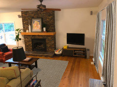
Autor originalhace 4 añosI finally painted away most of the yellow, sold the corner cabinet and de-cluttered a bit. Any suggestions on what sort of curtains to get? Would you also dress the patio door? Rug suggestions are also welcome. I’m going for a modern farmhouse look.


Sue Brown
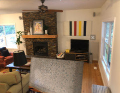
hace 4 añosCan you angle the tv stand instead of flat against the wall? Love the Hudson Bay stripes. Where did you get it?
Cynthia Abbott
Autor originalhace 4 añosYes, I could definitely try that. I actually painted the stripes myself on an old canvas. Super easy and cheap too!
Karenmo
hace 4 añosÚltima modificación: hace 4 añosI'd probably just use some neat white shades on the windows instead of curtains. For practical reasons, I like to have an insulating curtain on patio doors but have yet to find one that doesn't look frumpy.
groveraxle
hace 4 añosI would do burlap curtains and a plain jute rug, lose the canvas over the TV and mount it on the wall so it's a bit higher.
groveraxle
hace 4 añosPlease don't angle the TV console. The TV can be angled, yes, but not the console.
Cynthia Abbott
Autor originalhace 4 añosI like these curtains, but I don’t think they’ll work in the space.

Cynthia Abbott
Autor originalhace 4 añosI got a line on this rug at a very good price. Anyone think it could work in the space?

Cynthia Abbott
Autor originalhace 4 añosThanks for the reality check. I’m obviously trying to fit a round peg through a square hole b/c the price is right. Is this one better?
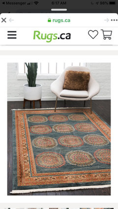

IdaClaire
hace 4 añosÚltima modificación: hace 4 añosI think the lighter rug could work fine. It's neutral enough (even with that grayed aqua in the design) to blend but not be the focal point. I would prefer something like that to complement rather than going for a matchy look. You don't want to use all primary tones in the room.
ETA this very rough mockup. Is the rug ideal / the greatest rug you could ever imagine in this room? Probably not. Is it perfectly acceptable? Yes.
Cynthia Abbott
Autor originalhace 3 añosHere’s the latest picture of my cottage - still a work in progress, but thought I’d provide a status update.

Volver a cargar la página para no volver a ver este anuncio en concreto
groveraxle