Houzz Logo Print
andrewchild

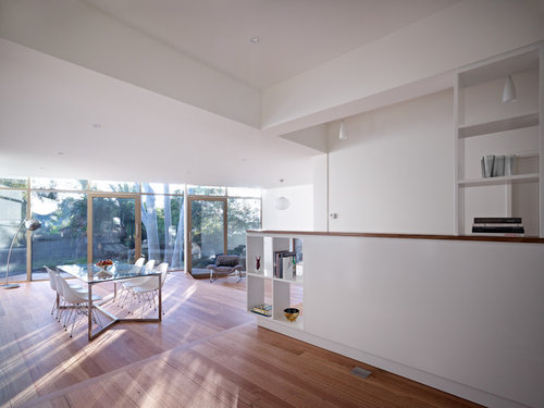
Before and after of a Californian bungalow

Andrew Child Architecture
hace 5 años
última modificación:hace 5 años

Our clients came to us wanting to upgrade and extend an internally awkward, dark and small suburban Californian Bungalow.

They wanted natural lighting from outside to flow into all areas of the home, along with adding more modern elements and increasing the size to a 3 bedroom + study residence. They also were lucky enough to have lovely trees on the site, which they wanted to tie in and include in the design & extension of the home. These held a lot of emotional connection, as the children grew up playing and building forts here, along with providing ample shading outside and also in, during hot sunny days.

Before:


After:


Tree House - Alteration and Addition in Kew · Más información


The home was dark and cluttered and had no flow to suit the lifestyle of a young professional family. We opened the space up through including an angled rear glass wall, the angling of the eave and decks, the use of a restrained internal material palette and the terracing down of the floor and deck levels to follow the site. This not only opened the space but created an interior/exterior space not only animated by the light and landscape, but also from views and the shadows of the trees from their childhood.

Before:


After:


Tree House - Alteration and Addition in Kew · Más información


Tree House - Alteration and Addition in Kew · Más información


Check out the entire project here!

Comentarios (19)

  • PRO
    Jamie
    hace 5 años

    love!

  • PRO
    Emily Lancuba
    hace 5 años

    omg!! what a dream house!!

  • PRO
    Maxwell Design
    hace 5 años
    Última modificación: hace 5 años

    The storage window at the end of the sideboard is fantastic!

  • Allie Broadland
    hace 5 años

    Wow... what a beautiful transformation! Way to take a dark and small suburban bungalow and transform it into a beautiful light and airy space.

  • julie herbert
    hace 5 años
    Absolutely stunning.
  • cloudpants
    hace 5 años
    Gorgeous transformation!
  • PRO
    PDL by Schneider Electric
    hace 5 años

    What an incredibly slick transformation! - The PDL by Schneider Electric team

  • Sharon Bouchard
    hace 5 años

    AMAZING

  • Lynette Ludbrook
    hace 5 años
    Última modificación: hace 5 años

    Looks great, even if I am not a fan of all white kitchens. I hope the tree roots were not compacted or damaged during the construction process, or the tree will kick up its heels in any case!

    I would have gone with cabinetry more in sync with the period of the original home!

    Andrew Child Architecture agradeció a Lynette Ludbrook
  • siriuskey
    hace 5 años

    What a beautiful light filled extension, did you do any work on the original house. Love the low set window in the living space, and well done with working with the trees

  • PRO
    Andrew Child Architecture
    Autor original
    hace 5 años

    Thank you. Yes , the original house had some alterations and repairs and needed to be restumped.

  • PRO
    URBAN METAL
    hace 5 años

    Wowsers ! Looks great ! What a difference !

  • Karen Herring
    hace 5 años
    Beautiful, light and gorgeous. Love it!
  • PRO
    Georgia Madden
    hace 5 años

    This is incredible - what a great job you've done, congratulations.

  • PRO
    Nelson Interior Stylists
    hace 5 años

    so stunning. such a great job. well done and the kitchen is to die for


  • User
    hace 5 años

    I'll be the stirrer then -- nah , not really . It does look great , but at what cost ? The cottage had quite a high pitched roof -- this appears to be a shallow slope , and lots of windows -- so I see lots of $$$$ and a reasonable amount of engineering .


    Similarly , I am not a fan of too much white , no doubt not a sentiment shared by the client though -- I love the wooden floors , but I would have done a dark ( onyx or similar ) benchtop , and I would have tried to add a feature to the white wall of cupboards , and that sloping roofed part in the dining area -- maybe timber , maybe stone , maybe just a bold colour , such as bright red or orange chairs -- or maybe a combo of all those ?

  • PRO
    Nelson Interior Stylists
    hace 5 años

    pottsy99

    they cannot do orange or red chairs. thats so old fashioned and would not suit the updated home. for people to keep and not bull doze old homes they need to have an element of modern today in a tasteful way .

    White is very Australian and the colour of today (it will pass eventually) but for it to be modern and them to keep to a brief they needed to do this.

    We all have different taste i guess but i had to say something when you said orange

  • User
    hace 5 años

    Oh well -- That's what I would do if it was my place . If you look at the second picture down -- the 'after' of the outside view , you see lots of glass , and a red chair on the right hand side . Look closer , you see a brown leather one on the left hand side -- it doesn't stand out . If either were a bright orange , IMO they would pop as much as the red one , but that's just my opinion . Luckily , I'm not a professional , so if others don't like my styles , they can leave my house haha .

España
Personalizar mi experiencia con el uso de cookies

Houzz utiliza cookies y tecnologías similares para personalizar mi experiencia, ofrecerme contenido relevante y mejorar los productos y servicios de Houzz. Al hacer clic en 'Aceptar' confirmo que estoy de acuerdo con lo antes expuesto, como se describe con más detalle en la Política de cookies de Houzz. Puedo rechazar las cookies no esenciales haciendo clic en 'Gestionar preferencias'.