Houzz Logo Print
ksoorus123

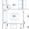
Help with selecting curtains and throw pillows!..

ksoorus123
hace 11 años
I am almost finished with my living room update. Gone is the red and green. I want to have custom inverted pinch pleat curtains made but I have a hard time visualizing what fabric will look like...for example I thought my chairs were patterned but they look solid. I was going to do a solid panel, but I think the room needs some pattern...what do you think!

Comentarios (24)

  • ksoorus123
    Autor original
    hace 11 años
    More pics
  • pbanovi
    hace 11 años
    I think some color would be nice... nothing too crazy or dark... maybe some pastel "washed out" color.... maybe pick one of the color from your carpet pattern to compliment it. And go with some heavy fabric like linen...
  • Judy M
    hace 11 años
    Have you considered the soft blue that is in your carpet and the throw pillows?
  • PRO
    Matthew Craig Interiors
    hace 11 años
    I partially agree with Judy. I love the idea of using the blue in your rug. What if you did a solid fabric in a color slightly darker or slightly lighter than your walls with the leading edge of the drapes in the blue from your rug. Simple and sophisticated.
  • Judy M
    hace 11 años
    I like that touch Matthew Craig Interiors.
  • PRO
    JBC Real Estate and Design, LLC
    hace 11 años
    I agree, I would pull in a pattern with the blue and cream from the rug and throw pillows. The room is beautiful, but maybe too much beige in you use it on window treatments as well.
  • anne dee
    hace 11 años
    Charmean Neithart Interiors, LLC. · Más información

    in this inspiration pic the blue curtains picking up the blue in the carpet and the printed throw pillows as in the posts suggested above.
  • ksoorus123
    Autor original
    hace 11 años
    I am just a little worried about getting too much committed to blue, there is a blue chair by the fireplace and painting has blue. I went way over with red and green before. Do you think a little light orange/rust would look okay? See pics
  • ksoorus123
    Autor original
    hace 11 años
    Another view
  • ksoorus123
    Autor original
    hace 11 años
    Also, would you put a table between the 2 chairs? If so, how big? Round?
  • anne dee
    hace 11 años
    Glenwood Residence · Más información

    hang the curtains with the drapery hardware shown will give contrast
    Traditional Living Room · Más información

    another image
  • PRO
    Alexandria Interiors
    hace 11 años
    I think the pale blue would be stunning! I think the light orange/rust color would be too saturated and make the room feel a lot darker. Stick with a lighter color...either the lighter beige color that is the background of the rug, or the pale blue. But I think the pale blue would be gorgeous!
  • PRO
    In Touch Designs by Elita LLC
    hace 11 años
    Hi...I see chocolate Brown Drapery Panels working well, that way You are not tied in to Blue, and it will complement the Rug and the Furnishings! Message me for more details on current Custom Window Treatment promotions!! Tx, ~E
  • anne dee
    hace 11 años
    I like the chairs as they are.
  • marnette
    hace 11 años
    Where did you purchase the rug?
  • ksoorus123
    Autor original
    hace 11 años
    I would appreciate a picture of the leading edge. I like the idea of being able to change the color down the road. Pinch pleat or what style with that.
  • ksoorus123
    Autor original
    hace 11 años
    The rug is one of the Coliseum Rugs from Overstock.
  • PRO
    Matthew Craig Interiors
    hace 11 años
    here are some examples. The first pic is from a project I did that was featured here on Houzz..

    . https://www.houzz.com/magazine/my-houzz-bold-wallpaper-kicks-up-a-century-old-craftsman-stsetivw-vs~4297275
  • Judy M
    hace 11 años
    Window Treatments · Más información
  • newhomeowner49684
    hace 11 años
    I think the color "Coral" like the flower on your table would be pretty for the drapes. Not a solid pattern though.
  • maxdc
    hace 11 años
    I like the graphic gold and beige geometric swatch you are holding in one of the photos.
  • Didi
    hace 11 años
    I agree with the blue you chose the grayblue neer to silver .. or you can make it 2 layers with 2 deferent color in each side
España
Personalizar mi experiencia con el uso de cookies

Houzz utiliza cookies y tecnologías similares para personalizar mi experiencia, ofrecerme contenido relevante y mejorar los productos y servicios de Houzz. Al hacer clic en 'Aceptar' confirmo que estoy de acuerdo con lo antes expuesto, como se describe con más detalle en la Política de cookies de Houzz. Puedo rechazar las cookies no esenciales haciendo clic en 'Gestionar preferencias'.