Paint color confusion/tired of looking
Comentarios (22)
 PRO
PROAnne Viggiano Color & Design
hace 9 añosHiya- a thought you may consider is that the furnishings/art are more important to compliment than the floors.
Mother Nature made wood to go with everything!- if your wall color is one that would occur in nature of course...
Try to pick a color that is a good backdrop for your decor... Backdrop color means that it doesn't match the Decor per say, but makes it stand out...
I great choice to always compliment woods is gray/greens with a touch of blue: like restoration hardwares 'silver sage'- devine paint "steamer"
sacapuntaslapioz
hace 9 añoscould you post a picture in daylight of your furnishings? the floor could go with a myriad colors, but I would bet not your furniture.

cllic747
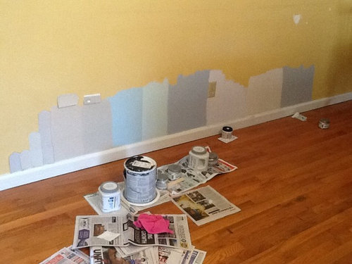
hace 9 añosYou might be over thinking this. I find it's best to work with colors that diffuse the oranges in the wood tone - I've used BM Grant Beige with a warm color palette in the room or something a bit cooler like BM Pismo Dunes to update the look, BM Revere Pewter would look nice in this space too but it depends on your furnishing preferences. Also take into consideration that whatever your house color is (outside) it may influence the interior color - if your exterior is dark or blue etc then expect to see some of that once you've painted. The fifth color from the left would be my choice from what you have so far.

hayleydaniels
hace 9 añosI'd go with the gray blue next to the light green as it's very neutral, and will look great with your floor.
annetteweeks
Autor originalhace 9 añosThis is great to have these opinions. This has had me stumped all week. Here's a pic of a chair.
 PRO
PROSpaces Designed, Interior Design Studio, LLC
hace 9 añosHello. We would go with gray walls! Anonymous by Behr is a gorgeous option. Good luck!

Alison
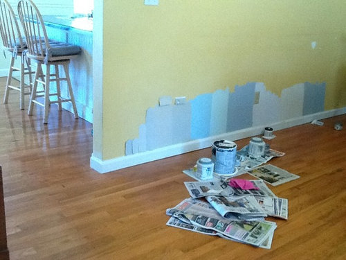
hace 9 añosÚltima modificación: hace 9 añosI found that this link was very helpful in figuring out the best paint color and how to see what it is when sample painting. Helped clarify some things that are probably confusing you. First thought is that a light blue doesn't seem like it would go with the tones in your wood. Also, your sample sizes seem to be too small and too close together. I would get some large test boards or paint larger samples and maybe go for a gray blue. Also pay attention to what colors are in your kitchen since the room seems to be open to it.
linlac
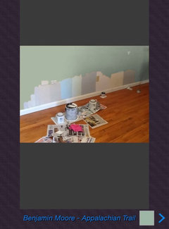
hace 9 añosHere's some larger samples of grays, blues, and greens. Left your colors up so you could compare.

jck910
hace 9 añosI agree with Anne Viggiano. the floors are a minor concern. You do have an oak FP surround so that is what I would be looking at not the floors. I have oak floors and have BM Golden Straw in my LR, BM Abyss in DR, BM Northern Cliffs in den and BM Nantucket Gray in a bedroom and in all rooms oak floor is fine.

whirlwyn
hace 9 añosDo you have a favorite art piece, pillow cover, etc that you really like? Or have you seen a picture, etc on line to inspire you for color. Even Houzz photos may have a color you hadn't considered. When you try so many samples, it can be a mind boggle. A.Try choosing only 3, 1 gray, 1 blue, 1 other color.
B. Physically separate them from one another
C. Then see if there's a difference
D. Maybe the blue needs more white, so swap in the adjusted blue, etc.
If you review fewer samples at one time, one may be eliminated every so often, making fewer samples. Oh, just to confuse you, be sure to look at paint samples in light of both day and night; it's important. Good luck....in the pix your kitchen looks blue, too.
Karen P
hace 9 añosHi! I understand exactly what you are going through as I have been in the same situation with my Master Bedroom! My advice is paint last! There are thousands of paint colors, but fabric options are limited. If you are getting new furniture, curtains, etc select those first. Then the paint selection process is so much easier. The idea of choosing an inspiration piece (art, pillow...) mentioned above is the way to go. Best of luck!!sacapuntaslapioz
hace 9 añosIf the carpet in the stairs is staying you need to stay in the same family. I would do a tone like BM Pashmina or bm wish
annetteweeks
Autor originalhace 9 añosI bought a gallon of Valspar oatbran thinking I had this all figured out. Tonight I painted a portion of the room with oatbran and it doesn't seem to blend with the color of my kitchen. I think I need to go lighter..........ugh!!!! Picking a paint color shouldn't be this hard and time consuming.
debqhix
hace 9 añosI can totally relate. It took me hundreds of paint chips and 11 samples in my kitchen. I finally chose the colors but I'm still not happy with it. The color seems much more tan on the card but is very green on the wall. I've never had this much trouble picking paint colors in a house!
That said, I like several of your choices. All of the grays and the greenish one in the middle. Not as wild about the blue. Good luck & don't give up.toninuge
hace 9 añosNot knowing your furnishings, it's hard to say but BM palest pistachio or BM constellation are a very subtle green and blue.
Ann
hace 9 añosI really like the gray sample 5th from the left. It's the first large gray sample painted on the wall with a card above it (card is the shape of a right arrow).
jonathan3
hace 9 añosOkay, maybe somebody asked this question already, but "How much natural light does this area receive?" A room that gets a lot of bright light will "wash out" any color. Another consideration is that all colors seem to increase in intensity after it is painted on large areas in a room. I always find a color I love, but go with a few shades lighter to make sure it is what I like after the room is completed.

dclostboy
hace 9 añosEither of the two samples with cards above them are lovely. They're neutral and easy to blend with furnishings and artwork.
annetteweeks
Autor originalhace 9 añosI may know why I'm having trouble, maybe, the kitchen which connects and can be seen from l.r. Is Valspar Crafted White. It's a yellow neutral. It is really clashing with the less warm Oatbran. It looks like whatever goes in l.r. Needs to blend with crafted white (which looks like light yellow).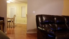


Volver a cargar la página para no volver a ver este anuncio en concreto

njerome09