paint color for a dark dining room
Comentarios (147)

Susan Davis
hace 9 añosYes, I did suggest the pale blue ceiling, actually about the color of blue on this Houzz site and I was envisioning walls the color of pale wheat or even the inside of a banana. haha if you can see that. Color really has to be put into the room before you decide if it will work in a room. I had a friend who picked a color and then the painter suggested a value of 70% and the new color worked perfectly. It takes a while to find the perfect color and you really n eed those samples painted on a patch of wall to decide.....trial and error. haha I think the blue would be a no color color but hey I love white too!
I personally think the light you have chosen might be too small for the room if you are moving your table to the center of the room. Don't you think it is rather expected instead of a new look for the room?Susan Davis
hace 9 añosHere are two ideas for the chandelier that I was thinking might work.
here is a link to a light
http://www.zgallerie.com/p-11110-calais-chandelier-aquamarine.aspx
Susan Davis
hace 9 añosThe link line will take you to z gallerie and the picture shown is a Harper Chandelier found in the Open Box section of Lamps Plus.comSusan Davis
hace 9 añosI am so glad you are letting me learn on my Chromebook how to do all this amazing but ordinary stuff! Thanks!Susan Davis
hace 9 añosI have a Chromebook and am learning how to use it. I cannot figure our how to pull pictures from Houzz files and put them into this comment thread. But there are pictures from Houzz I think in this post, How were they transferred? Anh one care to share.
sandradclark
hace 9 añosThis has been undoubtedly one of the most popular threads on the site. It is too bad that so many have had negative replies to such positive rooms. Is it that the popular trends are overtaking the tried & true of loved & revered beautiful unique pieces of furniture, or is it that it is so easy to be negative than to be unique & work harder for the best solution to not even a problem.
Kendrah
hace 9 añosMary, the light fixture you selected is so handsome and such a great match for your furniture with some unexpected pops of color. I also like the dark metal as I am imagining your new stove will have some dark metal as well. (Have no idea if I am right about that one or not!)
Here is a link you can use to determine size of chandelier both in comparison to room size and to the size of the table it will be hanging above. http://lightology.com/index.php?module=tools_chandelier_size
Glad to hear you were not thinking of such deep colors for the walls and ceiling. Sorry if I ran wild with it in my mind! I admit to having a strong bias towards painting a ceiling the same color as the walls but 50% the pigment. We splurged and hired a designer to select colors for our house and she taught me a lot about how light reflects off of walls and up to a ceiling. If you paint the ceiling the exact same intensity as the walls the light will reflect up and it will look darker, but if you paint it the same color as the walls but ask the paint store to give you enough of the color for your ceiling at 50% then the light bounces off the walls back up to the ceiling and it gives a really harmonious look. I really do like a warm buttery ivory for your space. I think it will make the red tones in your wood sing!sandradclark
hace 9 añosPersonally, I think all you should be careful of when choosing the ceiling color is not to go with stark white. Therefore I think if a little of your wall color is added to the ceiling paint, you don't end up with the stark white.Mary B.
Autor originalhace 9 añossoosun2, while I so appreciate all the feedback you have given me, (blue ceiling) I am afraid that the light fixture you suggested is not my style. It is beautiful though. This house screams arts & crafts or mission and I love that style. That is most likely why we purchased this home. I have looked at many light fixtures but keep going back to this style. We shall see!Mary B.
Autor originalhace 9 añosGood point about the light fixture being big enough. We measured and it needs to be 21 to 35". The one I like so far is 20". Close enough? The table cannot be moved to the middle of the room for a variety of reasons.Mary B.
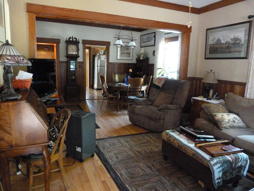
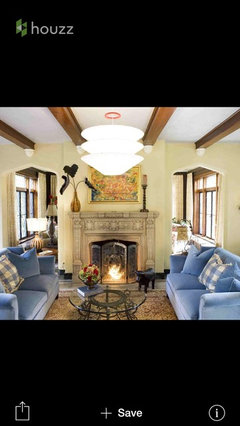
Autor originalhace 9 añosthought some of you may want to see the before of the dry sink. The after is visible in the living room photos.

Susan Davis
hace 9 añosI love this piece as the TV stand because it hides all the cords and has shelves for other components. It is beautiful piece.
Mary B.
Autor originalhace 9 añoslove the Sherwin Williams Butternut for the dining room that someone else suggested in this post. Not sure if both rooms should be this color. I think it may be too much yellow. Also thinking about a "parchment " type color. If you know what I mean.

Lainie D'Eon
hace 9 añosI don't think that will be too much color considering the minimal wall space that needs to be painted (lots of doors, windows, & all the bottom part that is wood.)
Natalie
hace 9 añosYeah, not sure about the Butternut hue, it is quite saturated. Your dark room may end up darker.. I really like the light you posted-beautiful!Mary B. agradeció a NatalieKendrah
hace 9 añosThis before and after on a houzz tour today made me think of your space. The changes to the walls are actually subtle and the space is so brightened up.
Before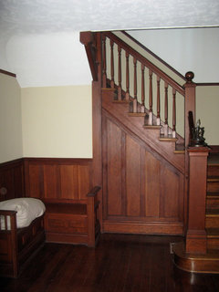 Houzz Tour: Santa Monica Cottage Redux · Más información
After Craftsman Family Home | Ocean Park · Más información
Natalie
hace 9 añosYes, I do Mary. I also like the idea of adding lighter (neutral colored) rugs to break up dark hues and add some interest to all the wood tones. Make sense? Hope so. Here are some pics for inspiration. Note that color has been brought in with accessories (art, pillows, fresh flowers, etc.), thus allowing the wood to really be the star. As I mentioned, I love that Tiffany Chandelier you posted. Keep us posted and Good Luck!
[houzz=][houzz=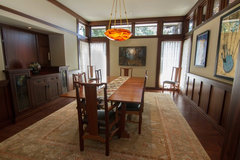 Modern Mountain · Más información][houzz=
 Modern Mountain · Más información][houzz=
 Modern Mountain · Más información]
 New Construction - Bernardo Trails, CA · Más información
spatialthinking
hace 9 añosGah! Please don't lose that gorgeous redwood trim!
I would point you in this direction (sorry if it's already been mentioned) ... Arts and crafts (the historical movement - think William Morris) and a lovely shade of printed wallpaper for that upper part of the wall. Think blues and greens to bring out the warmth of the wood.
I would almost never recommend wallpaper, but with your antique furniture pieces (which you should edit and keep the best, most interesting pieces, making them a focus, while losing some of the more drab microfiber looking bits) it would really work.
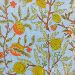
Below is a quick example of something I found online. I have a great book called "Historic Arts and Crafts Homes of Great Britian" that I should grab some photos from for you.
I really like modern design but something keeps me coming back to the Arts and Crafts and Art Nouveau movements too. With this kind of woodwork, and that clock and table you have , it would just look amazing. Then you could pull color from the wallpaper to introduce in accents in the room.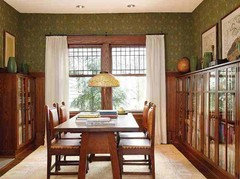
 Mary B. agradeció a spatialthinking
spatialthinking
hace 9 añosBut what I mean is for those rooms (the Arts and Crafts style) to be a "jumping off point" for you. I think it'd be useful, color wise.spatialthinking
hace 9 añosOh, lol, just read more comments and you already mentioned your love for arts and crafts style. :) me too. Love it. I say run with your instincts. If I had to wallpaper one room over another I'd probably do the one with the trim that goes higher up the wall. But I really do love the texture and dimension wallpaper provides. Plus, you can use a brighter background color, such as a bright sage green (as you mentioned) or a pale yet intense blue without them looking flat and too garish. I also see how this house screams Arts and Crafts. Glad someone who sees that bought it!housegal200
hace 9 añosÚltima modificación: hace 9 añosHere are a couple Houzz articles on paints that work in houses with wood trim. A couple of them have some sage-y greens. (You'll have to paste the links in your browser; for some reason the Houzz click-on linking isn't working at the moment.)
And another:
https://www.houzz.com/products/wood-prbr0lbl-pl~l_107819-trim
housegal200
hace 9 añosÚltima modificación: hace 9 añosThe layout, for sure, is a challenge with so many doorways. Think about moving the grandfather clock to the far corner of the living room near the entryway. It's a little foreboding in the dining room. Swap the buffet with the dry sink. Find another space for the pretty desk in the living room. Then scoot the TV table over a bit.
Because you have so many doorways breaking up the line of vision, take down half of the lithographs and other wall items and just rotate them once a year or so. (I did that since we owned a lot of art, which we couldn't display all at once in our downsized space. Now, I think of my home as sort of a gallery with rotating art "shows.") Ditto family photographs.
Gold is not a good wall color with your redwood trim because it will bring out the orange in the red wood and your oak pieces. Your original idea of the pale sage green would work much better. In any case, use the same color in both the living room and dining room for continuity since all those doorways break up the rooms. I love the shape and style of the light fixture you're considering. However, you may want to find a similar one that will work with the pale sage you originally wanted to have.
Kendrah
hace 9 añosThat was a great link that housegal posted. I do think that an extremely pale sagey grey would be beautiful. Here are a few pictures that may or may not inspire. Whatever color you do, I think you do not want one that is very saturated. I believe your goal from the get go was more light so a less saturated version of any color should be better.
Pretty color with wood, even better if just a few shades lighter to make the room brighter:
http://media-cache-ec0.pinimg.com/736x/cb/80/a4/cb80a40413d6236760ba27f36672486e.jpg
A picture from houzz:
http://st.houzz.com/fimgs/c272f16301531456_9198-w282-h376-b0-p0--home-design.jpg
Why I will never paint wood trim:
http://www.decoradventures.com/2012/09/why-ill-never-paint-our-wood-trim.html
Some examples of how green and gold can go wrong with wood.
http://www.apartmenttherapy.com/if-we-dont-paint-the-trim-will-white-walls-be-too-bright-good-questions-206132Mary B. agradeció a KendrahMary B.
Autor originalhace 9 añosOk, my head hurts. Love all the feedback though. I really love the warmth that some of the yellow colors give off. Will it look ok with my wood? I honestly don't know. I have been using the Sherwin Williams color visualizer quite a bit. I am looking for warmth as I said but also something to brighten things up. I don't think I can achieve that with the darker greens. This wood has a lot of red-orange tones to it. It is lighter than it shows in the photos. Wallpaper? Can't do it. Love it. But I grew up in a house that was all wallpaper. I had a house that I wallpapered once. Never again. Too hard to change it. With paint you get tired of it? Just repaint. One more thing to mention is that when I use the color visualizer to have both rooms the same color, I don't care for the effect. Confused right now.
Natalie
hace 9 añosMary-totally agree about having some yellow---rather than sage, check SW's Hearts of Palm and BM's Castleton Mist. These are bright yellow/green hues. Let me know what you think. :)
Mary B. agradeció a NatalieMary B.
Autor originalhace 9 añosthey are both very nice but not as warm as I would like. If you look at the light fixture, I am looking for a deeper yellow. Warm, warm, warm.
spatialthinking
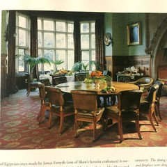
hace 9 añosThough these are both wallpapers, they're still great color schemes for paint too. From the book I had mentioned earlier.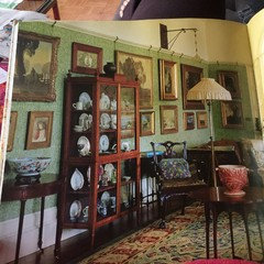
housegal200
hace 9 añosÚltima modificación: hace 9 añosBetter Homes and Gardens article with good advice about choosing paints that complement wood trim. The recommended pairing is warm wood, colors with cooler tones. Over and out.
Mary B. agradeció a housegal200Lainie D'Eon
hace 9 añosI checked out that blog & the "Lime green & mustard yellow" shown in the examples look to be like "very warm colors" to me or is it just my monitor!
Mary B. agradeció a Lainie D'EonLainie D'Eon
hace 9 añosBut the wood tones paired with the green & mustard seem to be the same as Mary's .
Mary B. agradeció a Lainie D'EonMary B.
Autor originalhace 9 añosyes, this yellow, yes this green. This is what I have in mind. BUT 2 different colors for 2 different rooms. Otherwise it is too much of one or the other. Tried it on the color visualizer. Thanks all again for all your help!
Lainie D'Eon
hace 9 añosMary, When you tried it on the color visualizer did the rooms have a lot of paneling as your's does & was there any art included on the walls? You have a small amount of wall space to paint in both rooms, especially after the curtains & art is hung so I don't believe that the 2 rooms painted the same color would be too much.

Anne
hace 9 añosMary, we moved from a home with a very similar living/dining room set up minus the paneling and tv. The living room layout was tricky because of the traffic patterns. Eventually I settled on an oversized love seat and two wingback chairs that were much more versatile. My living and dining room had the same color walls and window treatments for consistency. You've got a lot of wood, brown with cute pups thrown in for good measure!
Regarding downsizing, when we moved to a much smaller home I gave away a lot of antique furniture to family and friends. Luckily our daughter purchased her first home shortly after and was in need of furniture. As I was purging, I asked myself, do I love it?, do I have a place for it? If the answer was no, I had to set it free. Please don't allow yourself to be burdened (yes, I used that word) by things you have no room for. Let your pieces be loved by someone else. I took a lot of pictures of the pieces that I set free, in fact I created a photo collage of a wall mural and door frame of my kid's growth chart to hang in our current home. I enjoy seeing the furniture I gave to others in their homes too! Like visiting an old friend.
housegal200
hace 9 añosÚltima modificación: hace 9 añosI have to agree with Lainie that with all your trim, many doorways, a lot of furniture, and art work, with two rooms that open to each other, a different color in each room will add visual confusion to the mix.
Take a look at dozens of Houzz photos that pop up with "dark wood trim living and dining room." There are practically no interiors that break up the color field in this way.
http://www.houzz.com/photos/dark-wood-trim-open-living-room-and-dining-room-/p/16
Your home is lovely and homey, but you did want the rooms to look lighter. Lightness doesn't just come from colors but visual harmony, flow, and space. Since there's already so much in the mix, breaking up the rooms with two colors may add too much visual weight to the rooms that already have a lot of that already.
Natalie
hace 9 añosI recommend picking up some paint color samples, painting poster boards, and viewing the colors paired with the wood. Sorry, but no visualizer is going to give you a very accurate reading of how the colors look up-close and personal. Keep us posted...
Mary B.
Autor originalhace 8 añostime to revisit this as I finally have the time to get moving on this project. Still not sure which direction to go in. All I know is I want warmth and light.
housegal200
hace 8 añosHave you gone back through the dozens of suggestions commenters already provided? Maybe at this point you need to hire a color pro or interior designer to make the call.
Mary B.
Autor originalhace 7 añosjust sold our other home that prompted this huge discussion. I want to thank you all for your help. We sold at a profit! We tried to move closer to family, it didn't work out price wise, so we bought another home in our same town. This home is old. 1906 California Bungalow (craftsman)? This will be fun but a lot of work. Can't wait to start the inside. Just moved in 2 weeks ago. First roof and electric and then the fun part. Decorating. Will be asking for a ton of help here.


Volver a cargar la página para no volver a ver este anuncio en concreto

christiania