Study Update Suggestions
marylise
hace 9 años
Hi. I am going through my home room by room and updating each one at a time. Below are photos of our Study. Any suggestions to make it look better?


Respuesta destacada
Ordenar por:Más antigua
Comentarios (234)

marylise
Autor originalhace 9 añosI have those in my great room I think im going to try a plant like in the previous suggestions.debsio
hace 9 añosI originally saw a link dark shelf but I think it might be a softer look if it was the same color of the wall.
http://houzz.com/photos/102311
It would be tricky to figure out it but with a little playing around I think a cool thing to do would be to have vertical elongated box mimicking building in painting with small potted plants intermixed I will try to fin example PRO
PROCDR Design, LLC
hace 9 añosYou need a little bit of dark on the left side to pull all the dark from the right side.
I think simplest idea is to try urn with floral first.debsio
hace 9 añosCDR Design Simple has never been my strongest suit:). That being said you probably would laugh that I considered a small light under one of shelves! Clean and simple is a good thing!- PRO
CDR Design, LLC
hace 9 añosNo laughs here!
Gonna throw a loop in here!
You could consider
moving desk back to center
art on left, but framed in a dark frame - PRO
Defined Design
hace 9 añosHi Marylise - I would put the desk in front of the window and have the return go ino that corner to plug in all outlets. Ficus should go in opposite corner on the other side of the window, The velvet chairswould then look nice on an angle in front of bookcases. Painting could then go in corner by bookcases & look gret. Add a rug, but not a geometric - everything is already square - use a an abstrct pattern or floral, preferably with no border. Then find a wonderful complimentary painting in a landscape size for the wall with the current painting. Lamps are great, but not too weeny, something substantial since desk is pretty large. Your accessories in the cabinets would be greeat, just mix it up without being chaotic - stack books flat with smaller ojects on top, larger books standing up. As you place thing on the shelves, step back to doorway and make sure there is balance between small/large & dark/light, i.e. not all small pieces to one side & large to the other. debsio
hace 9 añosJust for fun I thought you might like to make own branch arrangement. I found this video for you. I hope you enjoy. I will also send you another video where she enhances arrangement with flowers
http://www.howdini.com/video/6658061/how-to-make-a-dramatic-arrangement-with-branchesdebsio
hace 9 añosThis is branch arrangement with flowers added
http://tbilisitube.com/en/video/OKXeFmNklzY/Flower-arrangements-How-to-create-a-fall-flower-arrangementdebsio
hace 9 añosI know you have moved your desk in various locations. I like it dead center like you originally had it with the suggestion of reframing art. I also like the arrangement where desk is at an angle. It is the arrangement where you asked " how do you like the lamp". I can see video floral arrangement on wooden pedestal where lamp is. I adore your ficus but aren't you concern about moving it around. I guess you know that plant pretty well after 37 years! Love the story.marylise
Autor originalhace 9 añosDefined design. I can't turn the desk like you suggested because it would be facing the window and the return would be close to the shelving unit. It just won't work.
I like the urn idea with the flowers. I have access to beautiful like like silks but not until mid September when I head to Toronto I have a retail licence that gets me into the floral wholesale shops there- PRO
CDR Design, LLC
hace 9 añosI looked again at your first picture posted. I did not see it before, because the art was behind it, but notice how the arch of the back of the chair "fits" the arch of the entryway door. That looks fabulous.
My new suggestion is centering the desk again and lining the backs of bookcases with temp wallpaper or painting them.
Here is my current suggestion:
1) Move desk back to center
2) Move 2 chairs in front of desk ( we can tweak arrangement of them)
3) Move art to left of desk, balancing the bookcases
4) Get a darker frame for the art (maybe not necessary, but possibly)
5) Consider painting the room the grey color in the art
6) Paint the back of the bookcases or use temporary wallpaper. If you paint the room grey and the bookcases grey, the back of the bookcases will sort of float into the wall and they will not appear so heavy. Also, the art will relate to something. You could also paint the back the teal color in the art. There are a number of ways you could go.
7) If you don't want to paper or paint the back of the bookcases, I would at least try to find some items to place in the bookcases that relate to the colors in the art.
[houzz=[houzz=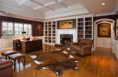 Redlands Avenue · Más información[houzz=
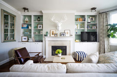 My Houzz: A Bland Condo Gets Color and Personality · Más información]
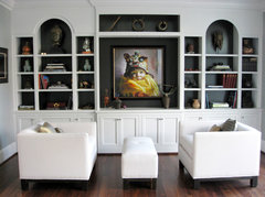 Willamette River Home · Más información
 - PRO
CDR Design, LLC
hace 9 añosI am unsure of your reason to keep the current valance, but it is shortening the footprint of the window. Using panel drapes without the valance, you will be able to enlarge the visual footprint of the window. marylise
Autor originalhace 9 añosCDR. I will look into doing all those things. Baby coming today so I will get back to you when I can might be a few days.- PRO
CDR Design, LLC
hace 9 añosAs a trial, you can take a piece of any colored paper and stick it in the back of the bookcase. No harm done. Construction paper, wallpaper, a painted piece of drywall, etc. marylise
Autor originalhace 9 añosCDR. My only concern with painting the room grey is there is no grey on the main floor at all and it is a very purple grey. Could I paint the yellow of the bus and then add item to the shelves that will bring out colors in paining? Should the whole area be coordinated? Right now I have Pittsburg Paint chicory, burled redwood, CHAPPAREL, golden ecru and applesauce cake and Sherwin Williams whole wheat. If grey is still good would my curtain panels still work? Just bought the fabric and they are almost done. Really want to keep them. I will see what I can find in a wallpaper to do backs of shelves. Don't want to paint.- PRO
CDR Design, LLC
hace 9 añosÚltima modificación: hace 9 añosHi.
No, you don't have to paint the room grey. That is one option of many. I don't know what the actual colors are of the paints you are mentioning. Are they in the surrounding rooms?
Could you tell us again what the colors of the drape panels are?
We can coordinate panels, teal art and bookcases, without painting the room.
So, you have currently
art: -mostly a teal/aqua?
wall color in office: ?
drape color?
coral chairs
reddish wood in bookcase debsio
hace 9 añosI can see gray with this pic especially with the yellow bus in picture and playing out teal for the drapes. I couldn't agree with CDR more about putting Swatches of color up before deciding. Also if you do use gray I would play with swatches a lot with that color...being careful to pick up shades in pic.debsio
hace 9 añosHow about navy? See colors in this pic together. Gray cream and navy
http://houzz.com/photos/795564marylise
Autor originalhace 9 añosArt is mostly teal
Walls I office are gold and three are moss green with cove painted deep rust
Curtains are gold stripe color on co,or
Chairs are a reddish brown velvet. Wood is reddish
The grey in the painting is a purple grey.marylise
Autor originalhace 9 añosDebsio I really don t think those colors would go in my house. All my colors are earthy tones. Golds, rusts, etc.dlanier1
hace 9 añosIt appears that your furniture is solid and in great condition so I'd keep them if you like the style. However the furniture and floors are too close in color. I think you a rug, drapes and visitor chairs opposite the desk. Then so major styling might do the trick.- PRO
CDR Design, LLC
hace 9 añosSo, in summary, office colors are teal, green, gold and rust.
I would move the desk and the art first.
I would recommend the room be painted one color, but we can work with several colors that you have (if you don't want to paint). debsio
hace 9 añosI found this wall and I wanted to share it with you. I promise it is my last "navy". I thought it showed how it worked with rusts and golds. Also, do you remember the elongated vertical box idea mimicking buildings in painting? What about frames instead!
http://houzz.com/photos/8276550debsio
hace 9 añosJust saw comment where you didn't want to paint. So sorry. I thought you were trying to decide on different color.- PRO
CDR Design, LLC
hace 9 añosI looked at your first post. I see that your goal is to update your rooms. If you are looking for an updated look, I would suggest painting your room one color. In general, accent walls, especially in a smaller room are not currently in style.
It sounds like your room is painted 3 different colors. 
wickedwhite
hace 9 añosI like the room configured the way you have it now. I like the desk angled. It's more inviting. Can we see the fabric you have selected for the drapery panels? If you paint this room, it needs to play off of that, your furnishings in this space, and the rest of your house. Is the foyer also gold? Since the office doesn't have doors that's an important consideration..marylise
Autor originalhace 9 añosThe foyer and into the great room and all the way upstairs, which is all open is the same color as the wall the painting is on. I will attach a photo of the curtain fabric tomorrow.
And...for those that are following...it's a BOY!- PRO
CDR Design, LLC
hace 9 añosCongratulations!
I am really confused on the wall paint, except that I perceive there are way too many colors going on.
I understand the walls in the office itself are painted 3 different colors. Correct?
Think desk angled is def an option. Straight an option also. Can't have the imbalance, though. 
abbyjean
hace 9 añosA boy! I am soooo happy for you! We have four grandsons and one granddaughter. Life is good and your life just got better!tlparks
hace 9 añosI'm probably going to be in the minority here, but I'm going to give my two cents worth anyway. I'm not crazy about the red vase in the corner behind the desk. It seems a little harsh and random. I would prefer to try it on the floor to the right of the bookshelf. I liked the way the desk was originally arranged. It made the art work the focal point, which I think is lovely, and maybe place a large green plant in the corner behind the desk area. MHOmarylise
Autor originalhace 9 añosThanks all for your good wishes!
CDR. Yes, there are three colors in the office...actually there are 4. The ceiling is a lighter version of the wall behind the picture. I will take a photo of the colors on the walls for you at some point today. I would be open to repainting although it will have to probably wait until after mid October.marylise
Autor originalhace 9 añosOk ladies.
The first photo attached is the current valance fabric. I am not opposed to taking it down but also no opposed to keeping it up.
The second photo is the color of the wall behind art. It is PP chicory316-6.
The third photo is the colors that are in the great room and upstairs open area. All PP paint colors. The applesauce cake and the golden ecru are ceiling colors
When you enter my home straight ahead you see the great room 29 foot ceilings. To the right is the dining room and open stair case and to the left is the office.
Office now has SW MEDOW TRAIL on the other three walls and Burled Redwood from the great room on the cove.
The desk and bookcase has to stay as is. I'm not painting it or getting rid of any of it although I am considering doing something to lighten up the back of the bookcase area as CDR suggested. I am not into books. Don't really want to buy books just for show.
The fourth photo is the curtain fabric. Unfortunately the fabric has already been cut an done panel finished and I made it to hang under the valance so when I hang the rod it will be just above the window frame. Not sure what to do with that.
I really really want to keep the art. I love the art and it's important to me.
What do I do?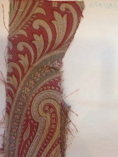


- PRO
CDR Design, LLC
hace 9 añosYou could add a piece of fabric to the bottom or top or center of the drape to make it longer. marylise
Autor originalhace 9 añosI could. I would have to find the right fabric to do that. What colors should I paint.
Amanda O
hace 9 añosWow. Lots of good advice here! I would suggest some boxes that are designed to look like books but still hold loose items or maybe fabric covered boxes. You can find them at craft stores or home stores like TJMaxx.


Amanda O
hace 9 añosÚltima modificación: hace 9 añosYou could also use baskets or magazine boxes like these for added texture.


- PRO
CDR Design, LLC
hace 9 añosDrapes: if you have more of the same fabric, you could simply add to the bottom with a French Seam? Do you know what that is? You add your fabric to the bottom. Then you put in a fold over the seem, so the seam itself is hidden. Looks very clean and intended. I would recommend removing the valance for a more updated look.
Paint: I looked in your idea book and you seem to like lighter colors, with maybe some rust and blue-greens added.
So, when you walk into the house the front hall and family room are that sort of earthy blu-green color? Are you going to keep that?
If you want a more updated look, I would paint the room one color. The color on the back wall (where the art you like is hanging) I think would work). The drapes will be a similar color to the wall, but that will give a more formal, traditional look that you seem to be drawn to. The drapes will look very elegant. marylise
Autor originalhace 9 añosI have attached photos of what you see when you enter the house. The study is on the left. When you walk in you see a dark copper/rust straight ahead and the same wall color that the art is on throughout the entire foyer. What if I paint the study one square lighter than what is there now throughout the entire study. Ceiling and cove should be white? Not a fan of white ceilings but I will go with that if that's what it's suppose to be.
I know how to do french seams. That won't be a problem. Not sure I have enough fabric to bring it all the way up to the cove but it will be close. Should the rod hang just below the cove?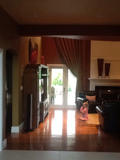


- PRO
CDR Design, LLC
hace 9 añosThanks.
Agree: ceiling should not be white. I think you said it is a cream and can stay that way. Yes, also, leave the cove dark.
Just the 4 walls should be the same color. You are thinking one shade lighter than the PP chicory. I think that would be fine. - PRO
CDR Design, LLC
hace 9 añosDrapes: they can be a little below the cove. You really don't want they touching the cove, just hung high. How much space is there between the top of the window trim and the bottom of the cove? marylise
Autor originalhace 9 añosYes one shade lighter than pp chicory. That won't be too much work.
The dosage between the top of the window frame to the bottom of the cove is approximately 30".marylise
Autor originalhace 9 añosJust realized( I had forgotten) the ceiling is two shades lighter than the wall color that is behind the art. If I paint the walls one shade darker than that it will be one shade lighter than what is there now. I think that is perfect.marylise
Autor originalhace 9 añosAfnowens. Thanks you. My main intention is to fill the shelves with "souveniers" that I purchase on my travels. They wi t be your typical souveniers though. We usually buy art to hang but we have run out of wall space to have art so my next idea is to purchase ceramics or pottery to place in the shelves. I'm not into buying stuff just to buy.- PRO
CDR Design, LLC
hace 9 añosSo, it would be nice if the drapes were at least halfway btn cove and top of woodwork. So, 15" at least above woodwork.

Patrocinado
Volver a cargar la página para no volver a ver este anuncio en concreto

Mari Ram