


Actividad reciente



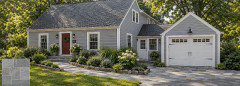
Local stone is always appropriate. So granite for eastern Mass, bluestone for western Mass/Berkshires.

Cool gray/bluestone .
A classic and clean look that stays true to New England style.
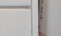

I think the contractor will be receptive, given his response to some of the other issues we've had (breaking the mirrors, making no attempt to contain durock dust, doing the durock for the niches the wrong size, dripping wood stain on the new floor tiles, there is also wood stain on the tub which hasn't been addressed yet). He promised me no tile slivers so I think he'll understand my concern about that one tile. The rest are fine.
I also want to say that I am not picky about everything. When we had our kitchen done, the (junior) designer measured wrong and realized when installation began that the fridge cabinet would intrude into the hallway by about an inch. She nervously let me know and I did not care at all. Yes, when you look down the hallway to the kitchen, the cabinet juts out instead of being flush with the wall. I 100% did not and do not care. There were a couple other issues with the kitchen but they don't bother me at all. Maybe bc it is still a fun and lively space, and that obscures the errors. It's been 8 years and I still love it.

To me lighting is deeply personal, and trying to force one "sweet spot" number like 3500K or 4000K in every room of every home misses the mark.
Mother Nature doesn't give us one flat light all day. She gives us bright, crisp, white sunlight during our peak productive hours, and then rolls out that soft, warm, amber glow in the early morning and evening when our brains need to wake up or wind down. Why shouldn't our homes do the same? When you’re trying to figure out what works, it really comes down to a few big things:
- How you want your home/room to feel: Do you need to feel energized and focused, or do you want to instantly drop your shoulders and relax after a long stressful workday?
- Your decor and furniture style: The era of your home makes a huge difference. If you have a 100 year old home filled with rustic antiques, a harsh white light is going to make the space feel sterile and cold instead of rich and inviting. On the flip side, if you have an ultra-modern, minimalist look softer, more yellow lighting can feel heavy and drab.
- The colors you love: Light changes color completely! If you love shades of dusty purple or deep wine reds, a yellow bulb is going to turn those gorgeous tones completely muddy and dingy. But if you lean toward cozy fall colors, a super bright white light can make them look garish and way too vivid.
Another huge trap people fall into is confusing the amount of light with the color of the light (lumens vs. Kelvins). A lot of times, people buy a cold, bright-white bulb because they just want to be able to see better in a dark room. But then they end up with a space that feels like a sterile hospital wing! If you need a room to be brighter so you aren't squinting, you don't need a whiter bulb—you just need more lumens (the actual volume of light). You can absolutely have a space that is beautifully lit and easy to see in, while keeping the color temperature in that cozy, warm yellow range.
Personally, I say throw out the rulebook and mix it up! In my own bedroom, I have bright white lighting in the areas where I'm getting dressed so I can actually tell my navy from my black. But by the bedside? It’s strictly soft, warm yellow lighting. When I'm unwinding with a book before sleep, the last thing I want is to feel like I'm sitting under a pharmacy fluorescent.

"Another huge trap people fall into is confusing the amount of light with the color of the light (lumens vs. Kelvins)."
Yep. Happens all the time. Had to explain this to DH just the other day. For some reason he was having trouble grasping this very simple thing, so I did a quick demo for him by walking him into a different room that has the same 3000K bulbs as the eating nook but higher lumens -- turned the lights on, slid the dimmers to high and his comment was turn them down they're too bright. I think he got it after that. LOL!

Ohi have missed you all!!

I'd use the gel that is thickest or thick enough and use butyl tape to block the open cracks. Trial and error.
I don't think you are dealing with an 18th century floor there. My guess is maybe early 20th century. Even if it has been covered by carpeting for the last 50 years, three coats of paint really isn't very many, and old houses don't have subfloors. If there isn't a ceiling, you can look right through the cracks from underneath.
So I'd do a small section first, to see what you are really dealing with. If you decide to go through with the project, do it when the summer humidity has swollen the wood as much as possible. That will shrink the cracks. I don't know if it is still summer where you are.
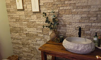

I'm debating a mirror due to space so it would be small. Plus, it's a half bath off the entry way not sure of etiquette. If I were to put a mirror shape and color mirror would you use? And the vessel sink, which btw I love, is because I had the vanity made by a local artist and he used wood from a1940's tobacco factory and I wanted to keep it without a gaping sink hole. It's gorgeous wood.
I think a small round or oval mirror would look nice and provide a visual break from all of the straight lines. Something like this with a thin metal frame: mirror
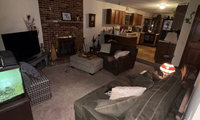

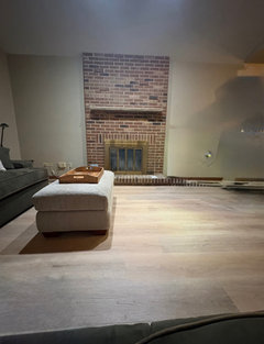
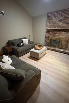
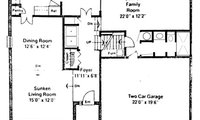
A family room should look warm and cozy. No gray. Don't paint the bricks.
I like cat_ky's suggestion of a sage green for the walls. That would work well with the wood tones and the fireplace.
Ended up with Sherwin-Williams Barcelona beige


Yes, it can be restored, but a spot fix usually will not disappear. Acetone softens or strips lacquer and many other clear coats, so that patch is bare or dulled wood next to intact finish. Blending only the damaged area often leaves a different sheen and color, which is why a refinisher quotes the whole top.
A full refinish means stripping or sanding the top, repairing any raised grain, then staining and recoating so it matches edge to edge. On a dining table that is a few days of shop time, plus cure time before it can go back into use. $1,500 and 4–6 weeks is high for a small top, but not unusual if the table is large, the finish has to be matched, and they are storing it while it cures. Ask what is included: full strip, stain match, number of coats, and whether the base is touched. A second quote from a furniture refinisher is worth it before you commit.
Do not try to “polish it out” with more acetone or a hardware-store touch-up marker. That usually spreads the damage.
We do carpentry and interior finish work in New Westminster, BC. New Westminster Handyman, 604-200-6490, https://www.newwestminsterhandyman.ca/
1 source
Stupid question: Why do you feel the need to "lighten" your kitchen? I think it is very well lit. I love your cherry cabinets. The last thing I would want is to have to work on countertops that bounce a bunch of light back into my eyes. I like under-cabinet lighting on a honed medium to dark counter that highlights what I am working on rather than blinding me. Just something to think about.
Juanita, did you move forward with the remodel? Any updates?
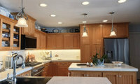
If you don't like pendants, get rid of them. Style and trends shouldn't enter into it. Instead, consider the overall effect. Your wafer lights do create a lot of pattern on the ceiling. Adding pottery above your cabinets, combined with all the wafer lights, creates a cluttered look. It looks like great pottery that is degraded to clutter because of how it is displayed. Leave the space above the cabinets completely vacant. Display your beautiful pottery somewhere else.

Guess I am the opposite. I don't care for recessed lights. I have some in my home but not in my kitchen.
I look at pendants over the island as task lighting. That is where we do our meal prep and prefer the light to be down where it is needed.
If you don't like pendants then get recessed. There is no right or wrong with this.
For a more opened look consider removing some of the items from the top of the cabinets and changing the style of the pendants.
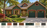

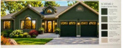
I like the second one you posted previously, @H Speak, with the green trim. Then paint the front door red, and add some red to the landscape. A red Japanese maple would be beautiful.
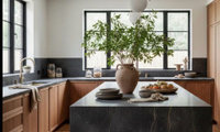
It looks like, in your AI rendering you are considering a chocolate wood cabinet. I LOVE black stainless with chocolate brown cabinetry. I brought home a cherry cabinet slab sample stained truffle which looks a lot like a Hershey chocolate bar to me. I was testing it with my cocoa and grey travertine floor sample, but it was next to my black stainless stove and it just spoke to me. To be fair, I was also impressed by how the panel looked with my stainless refrigerator. Dark reddish chocolate just looks so much better with any color stainless than a more yellow stained wood... to me. I don't think panels are even needed when the wood stain is more red and not orange or caramel. With a caramel or orange wood (honey oak?) cabinetry, my experience is that black enamel appliances look best. Gold and black are a natural pairing and black brings out whatever grain you have.
Your fridge, DW and range do not have to be the same finish.
You can easily do a black stainless fridge and dishwasher and make you range regular stainless as long as there is some separation between them. Use the range as the brighter star of the show and let the darker fridge fade to the background.
Use some stainless - faucet, lighting, knobs or pulls to relate to the range.
Ever see a kitchen with a red range? Could easily be overkill if they did all the appliances in red.
hard to find pictures, but these both mix black stainless and stainless.


I am facing the same question but starting with new cabinets. All I know is I don't like anything that catches on my sweaters. My current kitchen has pulls with extensions that do that. I think your knobs look nice enough and I'd like to know how you feel about their function. Are the knobs uncomfortable to use when there is more resistance, like for a drawer? If they aren't, then maybe those drawers could have pulls. If it's the look you are thinking about, try putting your pictures in PowerPoint and adding a short line in a color that looks like your preferred metal to represent your pulls on the cabinets you are considering putting pulls on. See you you like the look.

Since you have already selected the knobs and pulls, please share them so we visualize them in the space and see what are good combinations for the cabinets there.

Here are a couple of AI renderings with placement ideas. Please keep in mind, these are suggestions - not mandates. :)
AI left a knob off of one of the drawers in this first view. I did not edit to add a knob there, because I can see how that drawer could easily be pulled open without a knob, and I like the clean look. But of course you could add a knob or two or a pull on the drawer, if you prefer.
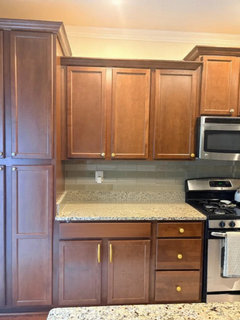
On the one below, AI opted to keep a knob on the smallest drawer - and I would tend to agree with that idea. However, you could of course use a pull there instead.
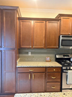
So these are a couple of views and ideas for you. You see that there are a variety of ways that you can do this.
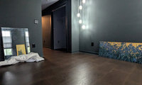

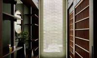
So fun being able to share your new layout with neighbors! Hopefully you will be sleeping in your new space soon.
Its ok, I realize now that your CoPilot post and hardware post are in your other thread.
Everything looks great and glad to hear you have only one regret.
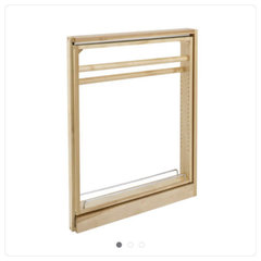
@RedRyder we also hand dishtowels on the oven door handle. However, in order to center the sink and have a large lazy Susan in the corner cabinet, there was a 3" gap between the two, so the designer suggested a pullout for a towel. Why not...
Well, if I choose the quiet hardware, that's the last piece of the kitchen puzzle I think.


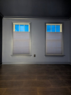
OK, subdued hardware it is. I feel like everything is settled for the kitchen. Something will probably come up I'll need your help with.
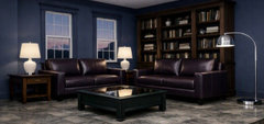
Meanwhile, I worked with CoPilot to create this image of the living room. It's not perfect, but it gave me a chance to show my husband the feel of the room. I like that the colors are mostly purple-adjacent. I chose to stain the coffee table Minwax Nightwatch Green to echo the SW Rock Bottom in the kitchen and far foyer wall. I didn't realize how much bigger that would make the room feel. Had I echoed the walls, bookshelves, or loveseats, the color choice would have limited the size of the room to its actual size, mentally. Anyway, I like the imagining. I'm going to use the same shades as I have on the upstairs windows.
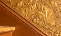
I wallpapered my foyer with a paintable textured wallpaper fifteen years ago and now I am needing find three more rolls to wallpaper some new walls that were part of a kitchen renovation. Is there anyone out there that could help me locate this? I am struggling to find/buy this exact pattern. If I could find three rolls it would save me from stripping and starting over on the entire foyer. Would love some help! It's a botanical print (large swirling leaves). Wondering if this company went out of business.
Sunworthy Paintable Textures Wallpaper Roll WT3231
I used a grass-like anaglypta (https://www.brewsterwallcovering.com/437-rd80028-folded-paper-anaglypta/437-RD80028) on the stairwell and upper hallway of my home during a recent renovation. The direction of the hallway was changed from north-south to east-west. I anticipated a lot of light coming in the west window. I thought it would amplify every flaw in the wall and reflect off any hung art in an unappealing way. So I decided, after reading this article to explore anaglypta. The west light highlights the interesting texture. It's all the "art" this hallway needs. Thank you for articles that highlight interesting materials and how they might be used.
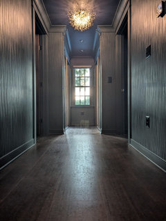
Another thought--thank you for not knocking down walls of this grand old home and making it "open concept"! Working within the footprint of the house is so charming, and yes, love the green kitchen!
Thank you @kl23
I have had good luck with getting rugs on Etsy. Many are made-to-order so you can get specific colors you want. I can send you some names of good rug websites as well. In my opinion, a gorgeous rug can make a room look 100% better.