


Actividad reciente
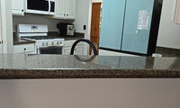
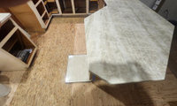

Just a note that i think it works best to keep all your options in one thread since you have had folks weigh in on your original choice -
what is the slip rating for the tile (d/cof)) is looks a bit slick to me? - it’s personal preference but I would want something with a bit more texture and (darker) contrast, have you looked st Ostuni tile or a travertine?

What are your cabinets going to be? What look are you going for? What flooring is in the adjacent rooms? These are but two items in a room with many others.
Personally, without knowing anything else, my first reaction is that it's too much white, and could give a cold appearance. I'd prefer a wood floor, preferably in a medium neutral toned brown, which will warm up the space.
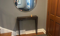

One idea is a mirror with narrow shelf. Add a door stop installed on floor so door doesn’t whack the shelf or mirror.

You might consider a table about this length and tone of wood for a console. I like how the base and branches help the mirror and table look unified.

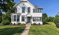

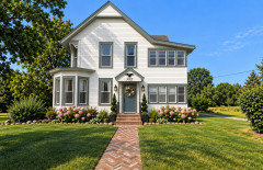
I would lighten your trim color and include it on the trim on the roofline. I hae used Ben Moore Boothsbay Gray in the rendering. Keep your door color as a nice contrast to the siding and new trim color. Move the eagle to your portico front. Doing cursive house numbers would fall in the line with the eagle as well. For some wow I would use some thin brick on your porch and steps and if you can continue it down your entire walkway. Plant some spiral topiaries on either side of the railing and plant your beds with the intention of them being mature and larger at year 3-4.

Not sure the coffered ceiling was the best design choice for this open space.
Are those 9 or 10 ft ceilings?
What are you doing with upper kitchen cabinet height? Making them short due to the beams, instead of going to the ceiling?

"I don’t think I can stand the dining table being off-center with the sliding door"
Your dining table, island, range hood, and kitchen massing are not centered on the fireplace and probably not the coffers either. Also, the view from the dining table to the opposite side from the slider, is a non-symmetrical door/cabinet nook/shiplap bumpout (which the bumpout messes up the coffer), which do not center on the dining table either. The kitchen cabinets are not aligned. The kitchen window is higher than the sliders. The coffers do not center on the slider.
And, symmetry is a false hope as you will never be perfectly aligned sitting at a table, on a couch, at the island, walking around, etc, so "perfect symmetry" is not attainable in your actual perspective. Symmetry is only good on paper and if you cafefully curate, with a little photoshop help, a marketing picture.
So, to be very blunt, this one specific alignment is a bigger deal in your head than reality. Place the table where it works for circulation and spacing, and make a decision on the chandelier box independent of centering it on the slider's middle panel.

Just to show how a contemporary chandelier could relax and update the room's formality:
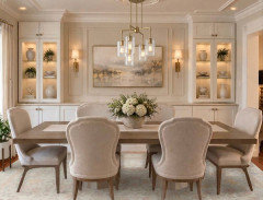
(This one is AI's choice, not mine.)
Whether you replace the crystal chandelier or not is totally up to you. Personally, I'm not a fan of a lot of crystal, so I would try something different. But there's no right or wrong, it's your call.
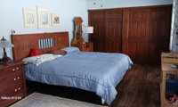
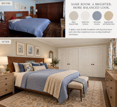
I like the idea of painting your doors and wood trim since the wood tone is pretty red. Since you’d like to keep your draperies I paint the walls the light grey to match the color of the draperies. If you're not opposed to painting the headboard, I’d paint it the same color as whatever you choose for the nightstands/chests, so it reads as one long unit.
Add pretty bedding to go with draperies and a neutral rug underneath. The nightstands are from Crate and Barrel and the prints I found on Esty.
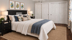
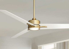
Looks like you might have a ceiling fan. If so and it's dated, consider updating it too. And old ceiling can really throw off the look of a new room.
Here’s a quick visual of what I had in mind—I think this really shows how much lighter and more cohesive the room could feel!


A gray/green shade will usually work nicely with that roof color. You can see here with the roof and brick shades leaning “rust” with the gray/green siding.
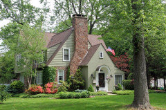
And here with the brick color and siding.


Well IMO my art is chosen becuase I love it and if others do not like it that is not my concern . I would do alrge one and I think gallery walls are an insult to individual art and BTW galleries do not hang art in that style unlessall from one artist so a true misnomer in most cases. I think art in your home is where you true personality comes home and it is for your enjoyment .I find nothing disturbing about that piece and love the colors . There are so many Gatsby covers that would be awesome as a collection but not in "gallery" wall type display.
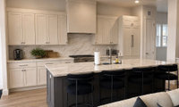

Are you set on your choices; ie: does the island have to work with the adjoining room? When you mentioned your view of a lake and mountains, I thought of what wood could do in creating more warmth and a connection to the outside. Maybe consider a different backsplash and adding pendants.

Pick your door style and color first. Then ask for one so you can take it to the countertop sites. You can decide on hardware later but having a sample door to hold up against stone slabs will help make a better countertop decision. Using tiny squares to make this decision can lead to disappointment.
Also make sure you see templates of how a stone slab with different sections will look in your kitchen. Not AI.