Kitchen of the Week: Refaced Cabinets and Fresh Style
A Houston designer updates her kitchen with materials and methods that create bright new style on a budget

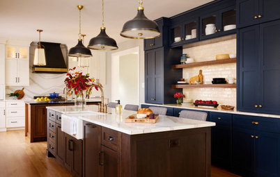
Designer Michele Merz has designed a lot of kitchens for clients over the years. But after 15 years of cooking, entertaining and living in her own kitchen, she was ready to give the traditional-style space a facelift. To save money, she refaced her existing white cabinets with new white oak doors, kept her beloved Taj Mahal quartzite countertops and extended the existing marble tile backsplash. But she removed some upper cabinets and added a new range hood and some appliances. She also refinished the floors and mixed in new colors, cabinet hardware, lighting fixtures and other details that significantly updated the look and feel of the kitchen. “I challenged myself to save money so I could share those ideas with my clients,” Merz says.
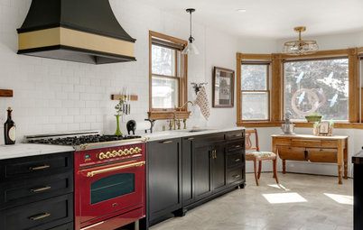
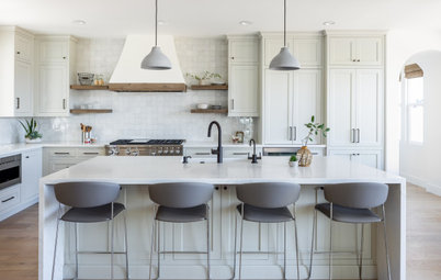
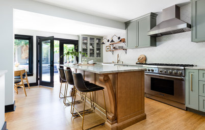
After: Merz eliminated the copper hood and cabinet above it that hid ventilation, and she removed the upper cabinets around the range. She kept the hood’s blower and added a taller custom plaster hood with plywood frame and sleek, modern lines. “It helps elongate the view of the kitchen, because it makes your eye go up,” Merz says. “I wanted one piece, and I chose plaster because it’s not a super expensive material.”
She refaced all the cabinets. White oak lower perimeter cabinets add warmth and fresh style. “I took the doors off of the old cabinets and had the white oak added,” Merz says. “It was a good way for me as a designer to test the process and make sure it would work for a client.”
The walls, custom inset upper cabinets and island base are a soft, neutral color (Ballet White by Benjamin Moore).
A mix of cabinet hardware keeps things interesting. Drawers feature acrylic and brass pulls. Perimeter doors have brass knobs, while some doors on the island end feature custom horn pulls. The glass front doors feature matte black knobs. “It’s OK to mix hardware,” Merz says. “You’re always looking for a way to create interest in spaces, and hardware is a great way to do that.”
Merz donated her old hardware and previous sink faucet to Habitat for Humanity and a couple of clients with limited budgets.
Shop for cabinet knobs and pulls
After removing upper cabinets around the range, Merz extended the existing Calacatta Gold marble subway tile backsplash all the way to the ceiling. “We didn’t have to remove the tile,” she says. “We patched a few and I just added to what was there. We took our time and were really careful. We had to do adjustments to get rid of a niche that was there, but over 90% of the backsplash tile is still there.”
Black-and-brass adjustable wall sconces flank the range hood. “They create functional task light but also draw your eye to the range,” Merz says. “They also help balance the very tall hood. It’s all about proportions and visual interest.”
Merz created the 8-inch-deep Calacatta Gold marble shelf from a remnant piece of marble as a way to display some of her favorite art and collectibles. “I planned it so that it does not complicate cooking or obstruct ventilation at my range,” she says. “I do actually cook, so like the other details in my kitchen, it is meant to be used and will withstand normal wear and tear of daily life. I love to incorporate art into a kitchen. I haven’t had any problems cooking with my art there. You want to do what makes sense to you, and how you like to live.”
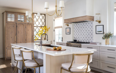
Merz incorporated her existing leathered Taj Mahal quartzite countertops. Merz also kept the custom beige stools with Lucite legs she had at her island. “The only changes on the island are hardware and paint,” she says. Existing glass globe pendants in an antique hand-rubbed finish coordinate with the new brass cabinet hardware.
Merz added new LED bulbs to the recessed ceiling lights, and she plans to change the black interiors to white so they don’t stand out as much. She refinished the red oak hardwood floor in a lighter, custom stain. An antique carpet runner picks up the warm tones of the updated space.
Merz added new LED bulbs to the recessed ceiling lights, and she plans to change the black interiors to white so they don’t stand out as much. She refinished the red oak hardwood floor in a lighter, custom stain. An antique carpet runner picks up the warm tones of the updated space.
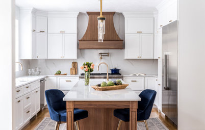
New custom fabricated steel-framed cabinets with glass inserts flank the sink. “I like things that are eclectic,” Merz says. “I wanted the kitchen to feel timeless, but I also wanted a curated, ‘found’ look that creates interest. I had glass cabinets flanking the sink before, but they were pretty boring. I wanted to add another material there.”
Merz also replaced the existing traditional-style white shade pendant over the sink with a small glass globe sconce that coordinates with the glass globe pendants over the island. “That sconce balances the look and draws the eye up,” Merz says. “That hand-rubbed antique brass finish changes over time, which I like. It feels soulful.”
Merz also replaced the existing traditional-style white shade pendant over the sink with a small glass globe sconce that coordinates with the glass globe pendants over the island. “That sconce balances the look and draws the eye up,” Merz says. “That hand-rubbed antique brass finish changes over time, which I like. It feels soulful.”
Merz added a new stainless steel faucet with pull-down hose to the existing double-bowl stainless sink. “I really wanted a farmhouse sink but didn’t want to change my counters,” Merz says. “I weighed the risk of the counters breaking versus what I had. I was able to create a panel out of stone from the countertop remnant to create an apron front. This saved money not having to remove the counters or buy a new sink.”
A white oak panel dishwasher sits on each side of the sink.
Sink: Undertone, Kohler; sink faucet: Align, Moen
How to Choose the Best Sink Type for Your Kitchen
A white oak panel dishwasher sits on each side of the sink.
Sink: Undertone, Kohler; sink faucet: Align, Moen
How to Choose the Best Sink Type for Your Kitchen
Before: This wide view of the previous kitchen shows the location of the couple’s large Sub-Zero stainless refrigerator and two wall ovens that were incorporated into the updated space.
The solid paneled door to the right of the refrigerator opened to a small pantry. The doorway to the left of the range connects the kitchen to the formal dining room, which sits off the front entry of the home.
The solid paneled door to the right of the refrigerator opened to a small pantry. The doorway to the left of the range connects the kitchen to the formal dining room, which sits off the front entry of the home.
After: Merz removed the solid pantry door and replaced it with a white oak door with an antique mirror on the exterior and a more budget-friendly standard mirror on the inside. She then lined the interior walls of the pantry with inexpensive white subway tiles with a charcoal gray grout.
The paper towel holder was existing, but Merz added extra hooks for aprons and dog leashes. Airtight containers she purchased online help maximize space. Since the existing shelves were in bad shape, she added well-built shelves to expand the storage capacity. “They’re not built-in, because the depth wasn’t there,” Merz says. “Paint is cheap, so I chose to add some interest with green paint (Fraser Fir by Benjamin Moore) for the shelves. The white oak door was a bit of an extravagance, but I saved money elsewhere.”
An all-brass midcentury-style sconce completes the pantry makeover. “My pantry’s not any bigger, but at least it’s cute now,” Merz says. “It’s fun, it makes me smile, and green is my favorite color.”
Merz created a dedicated coffee bar area to the left of the refrigerator by removing doors on an existing upper cabinet and adding glass shelves for storing coffee cups and entertaining supplies. “On the other side of my kitchen is the food prep area, so this is a spot where someone can grab a cup of coffee and not be in the way,” she says.
With no room for pullout spice racks by her range, Merz created this attractive spice cabinet that sits to the right of the wall ovens and to the left of the range. She removed doors on a shallow existing cabinet and added glass shelves inside. “I call this my apothecary spice cabinet,” she says. “I found cute bottles and put labels on them so it looks organized and clean.”
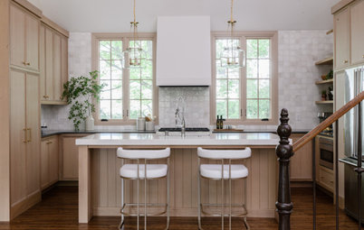
Before: Here’s a look at what the adjoining breakfast space looked like before the renovation. While Merz liked the oak table and glamorous chandelier, the vinyl side chairs had wear and tear, and their high backs blocked views into the kitchen.
The host and hostess chairs seen here at the table now sit in the couple’s living room.
The host and hostess chairs seen here at the table now sit in the couple’s living room.
After: Merz kept the table and the Italian midcentury-inspired chandelier with aged brass finish, but she updated the space by adding plush gray chairs reupholstered in an easy-care performance fabric. The rug is a durable indoor-outdoor material. “Now the space feels lighter and brighter, and you can see into the kitchen,” she says.
Merz says her design experimentation paid off because she now uses the kitchen to show design ideas to her clients. “It’s a demonstration that you can update without completely having to gut your kitchen, and have a beautiful outcome,” she says.
Chandelier: Bari, Hudson Valley Lighting
More on Houzz
Read more kitchen stories
Browse kitchen photos
Hire a kitchen remodeler
Shop for kitchen products


Patrocinado
Volver a cargar la página para no volver a ver este anuncio en concreto
Kitchen at a Glance
Who lives here: Interior designer Michele Merz and her husband, Shane
Location: Houston
Size: 275 square feet (26 square meters), including breakfast area
Designer: Michele Merz of MMI Design
Builder: A. Yoder Construction
Before: The 15-year-old kitchen was still in good shape. “Not really horrible,” Merz says. But she had grown tired of the taupe walls, beige inset cabinets with raised panel fronts and copper range hood. She also thought the amount of upper cabinets made the space feel heavy.
Plus, Merz got frustrated with food crumbs constantly getting stuck in the recessed kick plate at the bottom of the lower cabinets. “I wanted things cleaner and simple,” she says. “I wanted the whole kitchen to feel less boxed in. I had to get rid of some cabinets to make it feel more open.”
Find a kitchen designer