Jungle Fever: A Quirky Annexe That Feels Like Part of the Garden
Greenery is the star of the show in this renovation and addition to a two-bedroom, one-bathroom 1960s brick bungalow

In this Q&A series, we turn the spotlight on one thought-provoking renovation or extension each week. Here, architect Paul Porjazoski, director at Bent Architecture, reveals how he transformed a gloomy and introspective two-bedroom, one-bathroom 1960s bungalow in Melbourne. The result? A bright and welcoming three-bedroom, two-bathroom home with a strong indoor-outdoor connection.
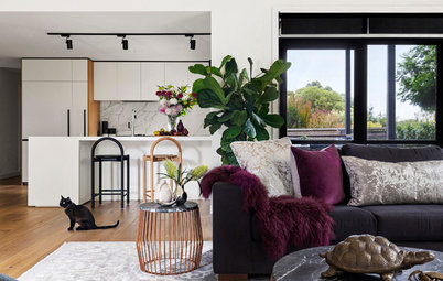
A brick plinth in the living room extends into the garden to provide casual alfresco seating. The interior walls of the new annexe are lined with remilled messmate (a Tasmanian hardwood) for added warmth and texture.
Gained
Gained
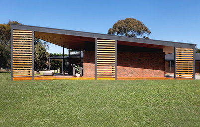
- A new single-level annexe was added to the original house – with an open-plan kitchen, pantry, living room, dining room and laundry – which opens to a new shaded deck.
- The layout of the existing house was reconfigured, which included turning the original kitchen into a third bedroom.
- The original living room was rejuvenated, making it a useful second living space.
- A new ensuite was added to the original master bedroom.
- A covered carport and storage were added.
- Double-glazed windows were installed throughout.
The original facade before works
What was the house like originally?
A single-storey, two-bedroom, one-bathroom 1960s brick bungalow.
What condition was it in?
It had a number of ad-hoc additions at the rear, which created a buffer between interior living spaces and the backyard. This was the catalyst for the conceptual framework of the project.
The original interior finishes were dated and worn, and needed to be revamped or replaced. The windows were single-glazed and the frames were rotting. We replaced all the windows with double-glazed ones.
Considering extending? Find an architect on Houzz near you
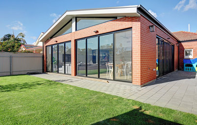
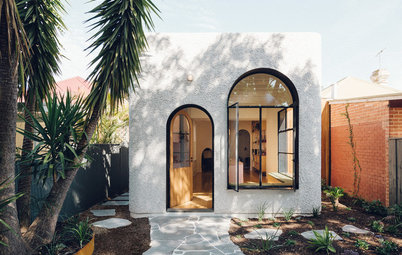
The new facade after works
What was the client’s brief?
What was the client’s brief?
- More living space.
- A light-filled, casual home that was comfortable to live and entertain in.
- As our clients love the outdoors and gardening, they wanted the home to feel connected to the landscape, with a fluid transition between inside and out.
- Sustainability – the client wanted year-round thermal comfort so the family wasn’t reliant on artificial heating and cooling.
The rear of the house before the annexe was added
What problems or limitations did this project address?
The challenge was to achieve a bespoke, site-responsive project that was also cost-effective. This was especially challenging as the original house – while it had great proportions and suburban charm – required a lot of remedial work. We achieved a cost-effective outcome by minimising changes to the original house and ensuring the addition was just big enough for the client’s needs.
The front entrance before works
Integrating the house and garden almost meant that we could effectively borrow outdoor space, making the home feel much larger than its actual footprint.
Integrating the house and garden almost meant that we could effectively borrow outdoor space, making the home feel much larger than its actual footprint.
The front entrance after works
The original floor plan
What exactly did you do?
We carefully peeled away the ad-hoc additions to the rear of the house (including a fibro studio, a bathroom and a laundry), leaving only the generously proportioned rooms of the original home. This gave us a great base to start from.
What exactly did you do?
We carefully peeled away the ad-hoc additions to the rear of the house (including a fibro studio, a bathroom and a laundry), leaving only the generously proportioned rooms of the original home. This gave us a great base to start from.
The floor plan showing the new annexe in white
We tucked a new annexe neatly beneath the original ceiling and eaves, with the new living spaces wrapping around the original house. We united the old and new sections of the house with a continuous roofline that folds overhead.
The shape of the annexe responds directly to site conditions; it folds and angles in section to harness northern sunlight and hugs the garden, providing privacy from neighbours to the east and west and focusing attention on the backyard.
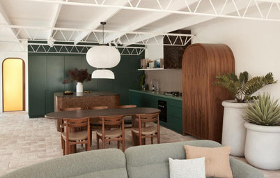
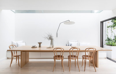
We designed the annexe to feel like an outdoor room, surrounded on two sides by garden. It is a light-filled, open-plan space with an entertainer’s kitchen at its centre. It also houses a living area, dining area, pantry and laundry.
We tucked a new annexe neatly beneath the original ceiling and eaves, with the new living spaces wrapping around the original house. We united the old and new sections of the house with a continuous roofline that folds overhead.
The shape of the annexe responds directly to site conditions; it folds and angles in section to harness northern sunlight and hugs the garden, providing privacy from neighbours to the east and west and focusing attention on the backyard.
We designed the annexe to feel like an outdoor room, surrounded on two sides by garden. It is a light-filled, open-plan space with an entertainer’s kitchen at its centre. It also houses a living area, dining area, pantry and laundry.
A window seat pops out from the dining room to give the kitchen and dining area light and views of the backyard, and provide an ideal spot to read a book.
The new living areas appear to hug the outdoors, giving the impression of a garden creeping inside.
Brick walls to the east and west prevent the open living spaces from being overlooked by neighbours, while focusing attention back on the garden.
The annexe spills onto a new deck with an outdoor dining area, which is protected by a retractable shading device.
We designed the front garden to be a social and active space with a built-in seat where the owners can sit and chat to their neighbours while children play.
The courtyard stones were sourced from a relative’s farm and repurposed (with a bit of heavy lifting) as large stepping stones, which are woven among the greenery and connect the carport to the new rear living zones.
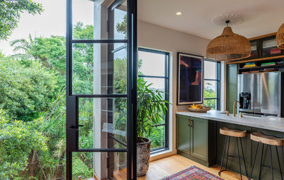
Full-height doors and windows, combined with the use of brick pavers inside and out, blur the lines between internal and external spaces.
We restored and revitalised the rooms in the original home to contain three bedrooms, a new master ensuite, and a second living room.
Sustainability was also an important issue for the client. We heavily insulated the existing house and double-glazed all the windows to improve thermal efficiency. We also employed passive design principles in the new addition to ensure optimum thermal performance. Hydronic heating in the slab and panels in the existing house provide top-up heat when it’s needed.
How does the pitched ceiling enhance the annexe?
It folds like origami over the living space, enhancing the sense of space and openness, while harnessing the northern sun for passive winter warming.
It folds like origami over the living space, enhancing the sense of space and openness, while harnessing the northern sun for passive winter warming.
What challenges did you have to work around?
It’s one thing to draw a roof plane with three folds meeting perfectly on the corner of a wall, but it’s another thing to actually deliver this on-site! Thankfully, we have a long-standing, collaborative working relationship with the builder, Poles-A-Part Design and Construction, which was fundamental to achieving our vision.
The client sourced a number of found objects that we worked hard to incorporate into the design, such as a chest of drawers repurposed as a bathroom vanity (not shown), and railway sleepers and slabs of mudstone rock used in the landscape. While it was a challenge to incorporate them while retaining a cohesive look, they do add rich character and personality to the home.
How is the new addition connected to the original house?
The new annexe tucks neatly under the existing eaves to retain the integrity of the original home and reference the ubiquitous lean-tos tacked onto the back of period houses. But where the classic lean-to is poorly connected to both house and garden, this annexe acts as a semi-indoor transition space, mediating between the original home and the garden.
The new annexe tucks neatly under the existing eaves to retain the integrity of the original home and reference the ubiquitous lean-tos tacked onto the back of period houses. But where the classic lean-to is poorly connected to both house and garden, this annexe acts as a semi-indoor transition space, mediating between the original home and the garden.
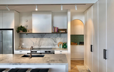
The kitchen island is designed as a distinctive furniture piece with a handcrafted feel. It features wired glass sides, a steel frame and a benchtop crafted from handmade terrazzo tiles.
Why did you use three different kitchen benchtop materials?
Using a variety of benchtop materials visually reduces the scale of the kitchen and makes the individual elements feel like furniture pieces.
Terrazzo tiles on the island benchtop add texture and colour to the space; reconstituted stone surrounding the cooktop provides a sturdy and stylish cooking and preparation surface; while matt-black laminate on the third benchtop highlights the surrounding timber elements and vegetation.
The white, V-groove cupboard and drawer doors are an extension of the home’s surrounding wall linings.
Tell us about the indoor greenery
This home draws on biophilic principles to reconnect the inhabitants to the garden, encouraging the family and young children to spend more time outdoors, while creating an improved sense of wellbeing inside.
Tell us about the indoor greenery
This home draws on biophilic principles to reconnect the inhabitants to the garden, encouraging the family and young children to spend more time outdoors, while creating an improved sense of wellbeing inside.
How have you reduced reliance on heating and cooling?
The orientation of the addition harnesses northern sunlight for passive winter heating, while green zones on either side of the living spaces facilitate breezes for summer cooling. These features, in combination with the careful placement of thermal mass, improve thermal comfort without the need for artificial heating and cooling, which is a fundamental objective of our work.
The orientation of the addition harnesses northern sunlight for passive winter heating, while green zones on either side of the living spaces facilitate breezes for summer cooling. These features, in combination with the careful placement of thermal mass, improve thermal comfort without the need for artificial heating and cooling, which is a fundamental objective of our work.
What budget-savvy tricks did you use?
Retaining and refurbishing the original house was an effective way to meet the brief within the budget, while also achieving sustainability objectives. Use of standard construction methods, such as slab-on-ground and brick veneer with plasterboard, were cost-effective choices.
Spending was directed towards make an appreciable difference to the client’s lifestyle, such as connecting indoors and outdoors with large sliding doors, bringing in natural light and ventilation with clerestory windows and skylights, and creating a generous and flexible open-plan living area.
The entry foyer features vintage-inspired wallpaper made from recycled newspaper (seen on the left wall and ceiling) – a nod to the home’s history. A new skylight set into the original roof fills the area with light.
Affordable flourishes, such as recycled messmate wall linings and feature wallpaper, imbue the home with personality without significantly impacting the budget.
Affordable flourishes, such as recycled messmate wall linings and feature wallpaper, imbue the home with personality without significantly impacting the budget.
The entry foyer features blackbutt veneer drawers with In-Teria solid-timber joinery handles (stained black) to provide handy shoe storage near the front door.
We love the nook – tell us about it
There is a nook at the entrance of each child’s bedroom. The nook is a fun, personal space for the girls to drop their school bags, pin up artworks, and store their shoes and coats. These nooks become their personalised thresholds to their separate bedrooms.
There is a nook at the entrance of each child’s bedroom. The nook is a fun, personal space for the girls to drop their school bags, pin up artworks, and store their shoes and coats. These nooks become their personalised thresholds to their separate bedrooms.
The new master ensuite
Tell us about the striking wall-mounted vanity in the master ensuite
The design for the ensuite vanity unit evolved from the need for a compact unit that could house a basin, mirror, storage and open shelving.
The custom metal frame was powder-coated in a colour that referenced the green mosaic tiles in the shower area. It, along with the steel frame of the island bench, was made on-site by our builder.
The new master ensuite sits within the courtyard and is surrounded by greenery
Why do you think this extension works so well?
It fulfils the need for additional living space, but also creates a home that feels like it’s part of the garden.
It was a delight to work with clients who were so actively engaged in the design process. The clients were open to exploring new ideas, as committed to environmentally sustainable design as we are, and understood that the beauty of architecture is in the experience and not just the aesthetic outcome. If you create a space that feels good to be in, that experience is timeless – unlike the fast-moving cycles of fashions and trends.
Key features:
- Brick paving crosses the threshold between internal and external spaces, blurring the boundaries.
- Full-height doors and windows contribute to the strong relationship between internal and external spaces.
- High-level windows in the new living area capture views of the sky and draw northern light deep into the home, warming the concrete floors for passive heating. Meanwhile, louvre windows can be opened up to encourage a breeze for passive cooling.
- An upholstered window seat pops out from the dining room to give the kitchen and dining room natural light and views of the backyard.
- The central courtyard improves cross-flow ventilation and lets northern light into the master bedroom.
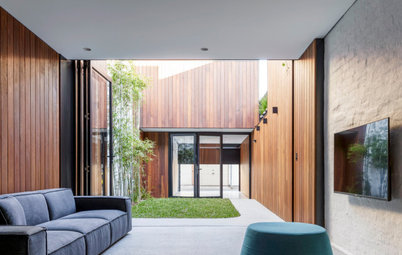
- Full-height windows on both sides of the living area create the illusion of one continuous indoor-outdoor space.
Interior materials palette:
- Urban Salvage recycled 100 x 12-millimetre remilled messmate tongue-and-groove lining boards.
- Urban Salvage recycled 95 x 19-millimetre messmate floorboards.
- Gunnersen Easy VJ moisture-resistant MDF 9.5-millimetre V-groove sheet cladding.
- Instyle Contract Textiles Yesterday’s News wallpaper in Tribune on hallway ceiling and wall.
- Svenska KJ De Ploeg fabric in Polder 01 to children’s wall nook.
- Perini Tiles Amano 75 x 150-millimetre tile in Giada to kitchen splashback.
- Ital Ceramics Genesis Anthracite wall subway tile in matt (black subway tiles on the kitchen wall).
- Academy Tiles unglazed Shape mosaic tiles in 78522 (black-and-white mosaic tiles on the kitchen island).
- Classic Ceramics Seta Appiani 25 x 25-millimetre mosaic tiles in 01 Ghiaccio and 10 Olivia to master ensuite.
- Austral La Paloma brick paving in Gaudi to interior living space.
Exterior materials palette:
Your turn
Which features impress you the most here? Tell us in the Comments, like this story, save the images and join the conversation.
More
Looking for more renovation inspiration? Don’t miss this Project of the Week A Dark and Cramped Heritage Home Gets a Luxe Coastal Makeover
- Austral La Paloma brick paving in Gaudi to exteror living space.
- DesignAclad batten 55 sawn-face kiln-dried cypress shiplap wall cladding.
- James Hardie Scyon Matrix external facade system.
- Urban Salvage 120 x 19-millimetre blackbutt shiplap cladding.
- Urban Salvage U40 x 32-millimetre blackbutt battens.
- Gunnersen 12-millimetre plywood lining.
- Lysaght Custom Orb roofing in Monument.
- Timber Zoo recycled ironbark decking boards.
Your turn
Which features impress you the most here? Tell us in the Comments, like this story, save the images and join the conversation.
More
Looking for more renovation inspiration? Don’t miss this Project of the Week A Dark and Cramped Heritage Home Gets a Luxe Coastal Makeover

Patrocinado
Volver a cargar la página para no volver a ver este anuncio en concreto
Answers by architect Paul Porjazoski, director at Bent Architecture
Who lives here: A couple with two young children and two dachshunds
Location: Pascoe Vale South, Victoria
Original size: 127 square metres
Size after works: 207 square metres (including a 20-square-metre deck)
Builder: Poles-A-Part Design and Construction
Structural engineer: Marcon Tedesco O’Neill
Lighting: Lights and Tracks