|
|
Honeybee Interiors and Joinery
|
Contenido patrocinado

Pro Spotlight: 3 Colour Tips You Need to Know About
A London interior designer shares her top tips for a spot-on colour scheme
Contenido patrocinado
Who: Sacha Berger of Honey Bee Interiors
Where: Queens Park, London
In her own words: “I love playing with colour. There are so many different combos available, so every room can be truly unique – the key is finding the right mix for the space.”
When used effectively, colour can be one of the strongest design elements in your home, yet many people are nervous about making the wrong choices. That’s where Sacha Berger, interior designer for Honey Bee Interiors, comes in. “I design my clients’ schemes by giving them the choices in order to help them make their own decisions. I want people to be part of designing their own homes,” she says. Weighing up the colour options for your own scheme? Read on for Sacha’s top tips for making any colour selection.
Design for Everybody
Having previously run a chandelier business from her home, Sacha began getting requests for interior designs from people visiting her house to view the lights and admiring her style. “I soon noticed that there was a gap in the market for accessible and affordable interior design,” she says. “I love to make design approachable and easy for my clients – for me it’s all about listening carefully to what people want.”
Having previously run a chandelier business from her home, Sacha began getting requests for interior designs from people visiting her house to view the lights and admiring her style. “I soon noticed that there was a gap in the market for accessible and affordable interior design,” she says. “I love to make design approachable and easy for my clients – for me it’s all about listening carefully to what people want.”
Colour Confidence. “I don’t think I’ve ever designed a scheme without some colour,” says Sacha, who constantly seeks out new inspiration for unique and interesting combinations. Most of her clients have an idea of the colours they like and dislike, but need some help pulling the whole look together. “They’re looking for extra input,” she says. “Based on their brief, I may give them two or three colour combos in different mood boards. The inspiration for a colour scheme can stem from a wide range of things – from a beautiful cushion to an interesting piece of art.”
Read on for Sacha’s top three tips on how to choose a great colour scheme…
Read on for Sacha’s top three tips on how to choose a great colour scheme…
1. Give the Space You’re Painting Careful Consideration
When you embark on a painting project, first consider the space you are painting and decide what mood you wish to create – will it be a dramatic scheme, serene, harmonious or neutral? Then, decide if the surfaces you intend on painting will play a starring role in the overall scheme, or if the walls will play a more subdued part.
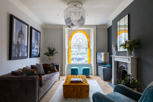
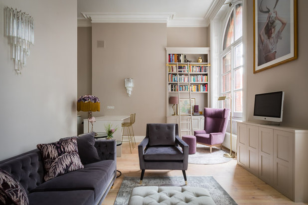
In this apartment in Kings Cross, Sacha wanted to let the beauty of the period features stand out, choosing a muted colour palette that was tasteful and wouldn’t overpower the room. “When ceilings are high, as they are in some period properties, you need to balance out the scale of the height by choosing a slightly darker shade for the walls,” she says. The warm, mid-tone shade, shown here, lets the white ceiling, mouldings and coving stand out, while still adding interest and character to the empty walls.” This, teamed with the soft lavender and grey tones she chose for the furnishings, add warmth and brightness to the space.
See more photos of this project
Walls painted in ‘Elephant’s Breath’ by Farrow & Ball
When you embark on a painting project, first consider the space you are painting and decide what mood you wish to create – will it be a dramatic scheme, serene, harmonious or neutral? Then, decide if the surfaces you intend on painting will play a starring role in the overall scheme, or if the walls will play a more subdued part.
In this apartment in Kings Cross, Sacha wanted to let the beauty of the period features stand out, choosing a muted colour palette that was tasteful and wouldn’t overpower the room. “When ceilings are high, as they are in some period properties, you need to balance out the scale of the height by choosing a slightly darker shade for the walls,” she says. The warm, mid-tone shade, shown here, lets the white ceiling, mouldings and coving stand out, while still adding interest and character to the empty walls.” This, teamed with the soft lavender and grey tones she chose for the furnishings, add warmth and brightness to the space.
See more photos of this project
Walls painted in ‘Elephant’s Breath’ by Farrow & Ball
2. Always Consider the Lighting
Keep in mind both the natural light and the artificial light in a space when selecting paint. Lighting has an effect on the mood within a space and it is often overlooked when considering a new paint colour scheme. The amount of light within a space may determine the intensity of the colours you use. Remember, colour can appear quite different throughout the day and into the night as the lighting type changes from natural to artificial.
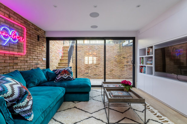
“If a room is a new build, has lower ceilings, or is a basement space, for example, I let bolder colours come in to give the space more personality,” says Sacha. In the basement of this Islington town house she chose to keep the colour scheme all plain white. To balance that, she pulled in strong jewel colours and big pops of colour to make the whole look appear more vibrant.
See more photos of this project
Keep in mind both the natural light and the artificial light in a space when selecting paint. Lighting has an effect on the mood within a space and it is often overlooked when considering a new paint colour scheme. The amount of light within a space may determine the intensity of the colours you use. Remember, colour can appear quite different throughout the day and into the night as the lighting type changes from natural to artificial.
“If a room is a new build, has lower ceilings, or is a basement space, for example, I let bolder colours come in to give the space more personality,” says Sacha. In the basement of this Islington town house she chose to keep the colour scheme all plain white. To balance that, she pulled in strong jewel colours and big pops of colour to make the whole look appear more vibrant.
See more photos of this project
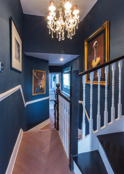
3. Don’t be Afraid to Experiment
Colour is a great way to make a room stand out, but if you’re not ready to commit to a bold shade on all four walls of your living room, start with a feature wall or even give a smaller, less used space in the home a boost. “I love being brave with darker colours in areas like a hallway that you just pass through,” says Sacha.
In the hallway of this home in Queen’s Park, Sacha used a darker shade as the backdrop for a gallery wall. “This space could have been forgotten, but now it’s a great background to display interesting artwork and make it really pop out. It looks great with the light parquet floors and we kept the moulding white as it frames the artwork,” she says.
See more photos of this project
Walls painted in ‘Hague Blue’ by Farrow & Ball
More: For more information and examples of Sacha’s work, visit Honey Bee Interiors’ Houzz profile.
This story was written by the Houzz Sponsored Content team.
London's affordable and accessible interior design studio and winner of Best of Houzz for 12 years as well as a... Leer más


Valoración de Allison Whitney:
We worked with Sacha on a few joinery areas in our new house in Kensington. Sacha and her team were quick to pick-up the project and work with us on a tight deadline we had. They managed to produce a ...Más
非常好。
rooms colours I like