island color vs perimeter white
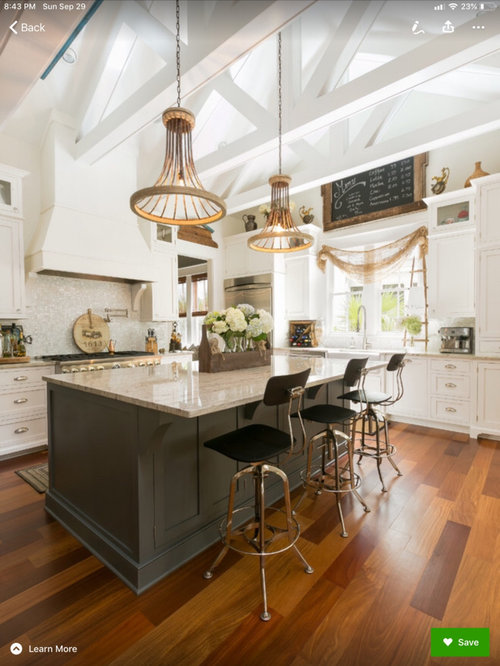
Hi all! I’m in that dizzying cycle of which white to paint my new construction cabinets. Have decided to step out of my comfort zone and have my island an unusual color (for me anyway) I always play it safe and choose colors that will stay “in” for a while. But I’m tired of playing nice. I want my island color to be a deep rich olive, thinking SW Thunderous. Looking for a cabinet White that’s not too stark but with a slight creamy color without being too yellow. Then what white to trim in? I love Taj Mahal for countertops as well. Here’s my inspiration pic-Open to suggestions and much appreciative to all the savvy smart pro’s & designers and just plain peeps w great taste here!
Comentarios (20)

armchairshopper
hace 4 añosIf you search S.W. Thunderous, and click on coordinating colors, S.W. recommends Frosty White. Since cabinets are such a big investment, it would be worthwhile to take buy samples of paint from S.W. and paint some Foamcore from the Dollar Store and to have large samples that give you an idea of how a large mass of color will look. Color is very personal. You described Thunderous as a deep rich olive. I don’t see olive. When I checked the other colors on the strip, they were described as gray. If it were me, I would pick a predominant color from Taj Mahal for my island color. But that’s me, not you. You need to please your own taste.

Jazz Lover
Autor originalhace 4 añosYa know @armchairshopper I have really lately been questioning my gray/green colors as of late. My daughter-in-law and I see totally different colors when viewing her Hardie plank exterior color. It’s as green as can be to me and they see grays. Makes me wonder if I should have my eyes checked!! Or is it like the white dress...perception kind of thing.Ok, so looking at my inspiration pic, what SW color would you say is closest? I’m really worried about my sight now!! Lol
 PRO
PRORobert A. McGraw Architect
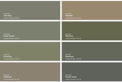
hace 4 añosTo me Thunderous is gray albeit a greenish gray. Here are two colors that seem more like your inspiration photo. Rosemary (SW 6187) and Shade Grown (SW 6188) But you know media screens lie about color. The only way to really know what you want is go look at chips. Then narrow your choice down to a few and do as armchairshopper said - paint some foamcore samples and put them in your room. The light in the room will make a huge difference that you will be able to see. Then you pick your fav. Fun!
 PRO
PROUser
hace 4 añosÚltima modificación: hace 4 añosI’m assuming that your cabinet maker is custom matching in a conversion varnish that will be sprayed in his shop? And not actual paint?
For deep rich greens that aren't elemental, try these. I’ve used Sawdust and Hardware several times.

Tracey Woods
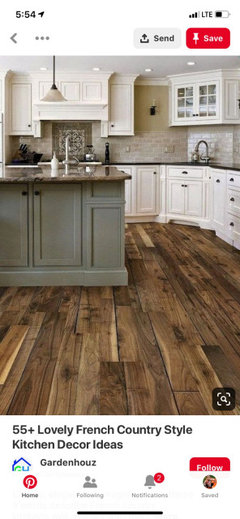
hace 4 añosI considered dark green for my island. If you add the brass hardware, as in your photo, it looks more polished than if the hardware is black. All your preference. I like green and cream together.


cawaps
hace 4 añosLocaleater used Sherwin Williams Forestwood in her new kitchen

Here are a couple of her threads:
lucky998877
hace 4 añosPick the kitchen color for your eyes...your neighbors and family won't be in there everyday cooking etc. More than 10 years ago, I painted the walls around my fireplace Cavern Clay, they were such a wonderful earthy orange to me...my friend walked in and asked where the orange walls were, she saw nothing but brown :( I'm doing a green/white kitchen because that is what I have been wanting for years! I'm picking the perfect green for me...no one has made a comment that they love the colors...and that's ok, it's for me!
Jazz Lover
Autor originalhace 4 añosThanks all for the assistance. My problem Robert A McGraw is, it’s a new build with electrical just now being put in. No sheet rock yet and the custom cabinet builder will be asking for paint colors soon. With none of the pendants or can lights yet installed it will be hard to tell with a sample board. The natural light source is just like in the inspiration pic so I will have that to use right by the kitchen window. Yes, Megs1030 i never knew so many people could “see” so differently. @Cookskitchen,not sure about varnish but I saw his Alabaster white cabs last week and they look painted(done in his paint booth)I definitely want a rich deep olive green without being too hunter(Lord does that bring back memories) I guess the good thing is it will just be the island and maybe wet-bar so wouldn’t be horrible work to change color later on. And yes Traceywoods, definitely w the soft gold hardware to richen it up- I so agree! If you guys see anymore inspiration pics, I’d love to see them. I will try several painted foam options on a bright sunny day and see how the colors look as the day changes to evening.( I know it’ll be different w the LED’s). I know the dark color I want could go almost dark gray being under the quartzite so I have to get just the right shade to see the green and not lose it to the dark side. Thanks everyone!
Jazz Lover
Autor originalhace 4 años@cookskitchen I love the color pallet you threw out there as well. I had dried time in a bedroom in my last house as well as sawdust on the kitchen walls at one time. Guess it’s really not that much of a stretch for me to do a deep olive. But I’d never would have guessed I’d do it on a cabinet. Would you consider it too risky? I was going to do stained island w stained accents across the hood and on the spice pullouts on either side of stove. Then thought I was chopping it up too much. Anyway, I just want to do something a bit different! Thx again!
armchairshopper
hace 4 añosÚltima modificación: hace 4 añosIf you think that a color is too risky, there is nothing wrong with a white island. Save the painted color for when your cabinets are old and worn and you are trying to get an additional 5 to 10 years out of them. In the mean time, you can put your color in accessories that are easily changed out as color styles change. Or alternately, put color on the walls. It is easier and cheaper to paint walls than cabinets. There are a hundred ways to do it, and they are all right.
Jazz Lover
Autor originalhace 4 añosBut I’m tired of playing it safe! I want to fly by the seat of my pants for once. Live life dangerously! I am always the one that only uses the fancy dishes on special occasions, doesn’t light the pretty candles, doesn’t let them use the pretty place mats(they’ll get dirty) Well I want to just throw caution to the wind and do all that plus a bold color. I’m looking at SW Pewter Green and see what a paint sample looks like in the house w no lighting. If it looks good, may do the large foyer wall as an accent wall in that same dark green.(Again, stepping outa the bold color box) Will keep you all posted with how it all turns out! Thx everyone for the help!

live_wire_oak
hace 4 añosThere’s nothing wrong with using color. That is what is the up and coming style. You see that now in the boho & Moroccan inspired interiors that are creeping around the edges of popularity to take over from farmhouse. Add some wood, use nature inspired colors, and that’s the Zen Modern that is going to take over from Industrial.
You could go a heck of a lot more colorful into a true olive rather than a gray olive. Don’t wimp away into grayed or browned down too much. You will regret it a lot more than choosing a color that you love.
cat_ky
hace 4 añosThe thunderous, looks to have a hint of green, but, it is mostly gray to me too. I think an olive island will be gorgeous. Maybe take a look at SW Olive grove. https://www.sherwin-williams.com/homeowners/color/find-and-explore-colors/paint-colors-by-family/SW7734-olive-grove#/7734/?s=coordinatingColors&p=PS0

C DeV
hace 4 añosI think it's really pretty. What about SW Urbane Bronze or SW Grizzle Gray - they are both pretty have green tones to them. I have so many sample boards. I too am branching out with color for my island, I am just stuck trying to find the right counter top. Good luck!
Jazz Lover
Autor originalhace 4 años@live_wire_oak Thanks so much for the advice but that totally describes my taste. I love clean modern straight lines but not too contemporary. I’m drawn to Scandi style but sometimes it can be a bit pale. I do like a bit more muted color but that’s what I’m drawn to. Hubby is a wood worker with laser engraving ability. I LOVE live edge wood and am thinking about having one of the trees that we cut sliced into several long pieces to accent a hallway. Thanks so much for the nudge as I feel much more like just going for it!
Jazz Lover
Autor originalhace 4 añosHere’s the sliced tree inspiration. It has to be sacrificed to build on the land and I love how it can still have a life within our home.

Jazz Lover
Autor originalhace 4 años@cathyD yes all of it can be so overwhelming as I just have to satisfy me! But I can be so fickle at times. I fell in love w Taj Mahal quartzite so at least that should go well with this color combo! Good luck!@cat_ky yes I LUV LUV urbane bronze. My son painted all the doors in his new house that color and it’s amazing how well it goes w most colors. I think I’m going to go deep olive but it’s just finding that perfect shade or hue. I’ve always been a Sherwin Williams girl(it’s around the corner) but I think I need to drive out to BM & see what they have in those Olive shades as well. It may be that I take one of those deeper shades and have them custom lighten it a bit. We shall see. Will post when I do! Thanks all!
megs1030
hace 4 añosMy vote is to pick an olive for your island. It is probably a little risky for you, but I really do think you'll love it. In my last kitchen I had a hutch that was olive and I loved it!
Jazz Lover
Autor originalhace 4 años@megs1030 Yes! I’m doin it! So I went by Benjamin Moore today and have a few that I fell in love with: Tuscany Green is my fav and Dakota Woods Green is pretty w a bit more brown. We’ll play with these and see how they look. I’m surprised there’s not more inspiration pics in this dark green family but hey I’m happy to cut a new trail! Happy October y’all!

Volver a cargar la página para no volver a ver este anuncio en concreto
megs1030