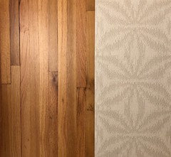
Tile that pairs well with oak hardwood flooring
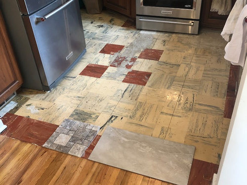
We are replacing the carpet in our sunroom with tile. Id like it to pair well the oak hardwood flooring in the dining room, we are also planning on buying enough to replace the marbled linoleum kitchen flooring when we remodel in a year. We are also trying to think about resell value one day. We don't plan on moving anytime soon but maybe in 5+ years.
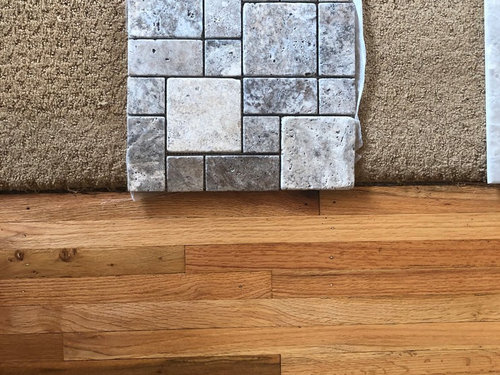
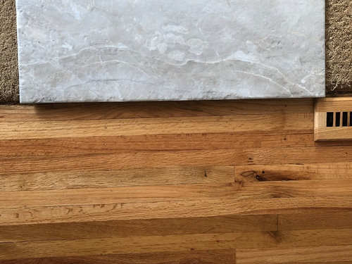
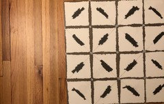
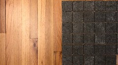
The two tile samples are (samples are for coloring only, they'd be a larger versailles pattern):
- A greige-ish toned travertine
- A taupe/silvery toned porcelain, that has faux chiseled edge
Additional details:
- 1947 cape cod style home.
- Design style I like is Rejuvenation
- We are also planning on painting the walls of the sunroom Benjamin Moore-White Dove, and leaving re-staining the ceiling a less-orange color, and getting a more contemporary ceiling fan.
- You can see the kitchen from the sunroom, so Im guessing the flooring should match the sunroom? We will be replacing everything else in the kitchen except the appliances.
Any advice or suggestions would be incredibly helpful! Thank you!


Comentarios (22)

Nancy R z5 Chicagoland
hace 4 añosI agree with Yvonne. In order to keep the flow going, you need a warm color tile, perhaps similar to the lighter tones in your wood floor.

Kathi Steele
hace 4 añosThe smaller one is too busy and too grey. The larger one is also too grey.
You are ignoring the fact that oak is in the beige family!! Which can be okay with paint, decorating, etc. Not so much with flooring, especially tile.
Find something that is in the color family of the carpet the tile is lying on.
The wood is orangey from the age of the materials used to finish it. You can strip and restain (which is not easy, especially on a ceiling), but depending on the products, it will yellow and/or orange with age.

SJ McCarthy
hace 4 añosI would suggest a stone/tile look that runs in the warm tones simply to keep the flow. Most natural wood tones (like gold) do NOT play well with gray. There are many travertine-look products that run a little 'peachy' which REALLY works well with wood. And you have wood on the CEILING of the sun room = a nice compliment. I'm not saying you have to go orange or peach/pink, but you want to think a little bit more into the warm tones.
The other option (which looks amazing in Versaille pattern) = LIMESTONE. The same porcelain products come in a LIMESTONE appearance. Limestone is STUNNING. It can be VERY PALE. It runs in the 'cream' and 'butter yellow' tones. Very very pale and STUNNING when used in the Versaille pattern.
The limestone-look will be a DIRECT replacement for your carpet. You won't have to do anything else to the space unless you want to. And with the size of the kitchen, you will not want to spend too much money on an expensive patterned floor. The room is too small for it to look right. I would stick with the same material but in a straight lay.samantha_delvo
Autor originalhace 4 añosThank you all for your help! I’ll pick up some additional samples tomorrow and take pictures.
As far as natural stone vs porcelain, does anyone have opinions as to resell value, would natural stone deter buyers because of upkeep or would it be a selling point? We wouldn’t be selling for another 5+ years.
SJ McCarthy
hace 4 añosStone is valuable. Just like solid hardwood. And just like solid hardwood it has a little bit of maintenance....but usually isn't all that difficult to live with.
The decision to use real stone is both a personal one and a 'value assessment' one. If a home is HIGHLY valuable, then you would do well to keep with the theme and work with high-value materials (such as real stone). If your home is mid-range or lower, then the easier to work with materials such as porcelain tile is the way to go. That way you won't lose the value of the material in the sale of the house.
Slate is easy to live with. It is super tough. Travertine is ranked as a marble and can be a BEAST to live with. It all depends on which material you work with. Of course porcelain tiles are made to mimic anything ('Hello Kitty' tiles exist...I kid you not!). It is nicely priced and it is less costly to install when compared to stone. PRO
PROJAN MOYER
hace 4 añosÚltima modificación: hace 4 añosAll too gray........
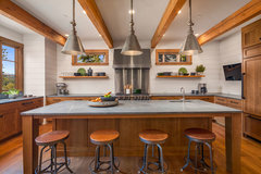
Get a beautiful slate for the sun room. Run the existing hardwood into the kitchen.Counter depth fridge would be better: ) What's the cabinet to right of sofa....?? Perhaps a better spot for that.
samantha_delvo
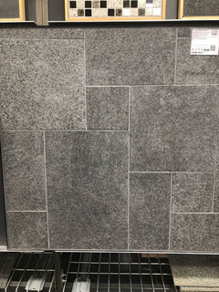
Autor originalhace 4 añosPicked up some new samples! Let me know your thoughts on these, the first is a porcelain, second one is porcelain and has a cool subtle texture that is meant to mimic a rug, the third is ceramic, and the last is a tumbled marble.
I looked at slate and didn’t really like the texture of it, didn’t think it would feel very good on bare feet.
The cabinet next to the sofa is actually our bunnies hutch! We open it when we are home and let him run around and he likes to jump on the couch and look out the windows :)


samantha_delvo
Autor originalhace 4 añosAlso grabbed a granite as a substitute for the slate, this had a smoother texture which was nice, they only had a smaller mosaic sample but I took a photo of the board for reference.
- PRO
JAN MOYER
hace 4 añosÚltima modificación: hace 4 añosBunny hutches..........canning pantries.........I'm out girls : ) Slate feels like any other tile on bare feet. COOL. The way it's supposed to feel in a sun room. Area rugs can sit on slate, btw.
 PRO
PROMichelle Yorke Interior Design LLC
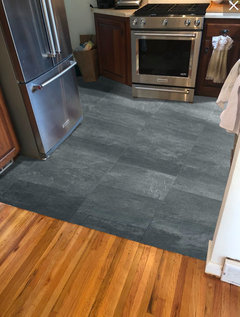
hace 4 añosWe agree with going with slate. Grey can work for your home, but the slate seems like the best option.
 Cascade Mountain Home · Más información
groveraxle
hace 4 añosOne advantage to slate: it's classic and timeless and won't have buyers saying, "What were they thinking?"
Gcubed
hace 4 añosI like the slate too! Looks nice next to your floors. Ideal would be to extend the wood into the kitchen (the board direction looks like it wants to go in there) and slate in the sun room. If that's not possible, slate in both.

acm
hace 4 años(if you go back to the light grays, which I think are just fine next to oak, go with the porcelain for these hard-wearing spaces rather than travertine.)
Kathi Steele
hace 4 añosI actually like the first porcelain tile in your grouping of four. I am not a fan of slate. Too dark, IMHO.
The first sample has grey and beige and you could go either way.
leecee02
hace 3 añosWhat did you end up doing with your floor? I have a very similar question since I have real oak floors in the kitchen, but want to renovate my fireplace which is visible from the kitchen. I also wanted to pull some of my carpet out and put something for the high traffic areas, but I'm really unsure what colors to go with.
Usuario de Houzz-433625109
hace 3 añosI want to know too! I am currently looking for floor tiles that will go adjacent to my honey oak hardwoods and interested in bringing in some gray, but having trouble pulling the look together.
SJ McCarthy
hace 3 añosWhen working with gold and orange wood tones you can work in the blue/green range of tones. I prefer blue range but some prefer the green-tones (ick). Slate (Welsh Black Slate, etc) is blue based. You can bring in Golden Slate (has up to 15 different colours in it) to give a lighter floor with plenty of colour options. Golden Slate has both green (deep olive tones) and blue (soap stone) in it.
Julz Ann
hace 2 añosSJ, that's true. if you have an orangey oak floor, then on the color wheel a blue tone would look best as the blue is opposite the orange.
Now if the oak flooring was a real red color, then the green tone would be a better fit.
For me, I love a blue-grey tone with the orange predominant oak flooring. Grey can be just an all around great match! Have fun!

Volver a cargar la página para no volver a ver este anuncio en concreto
branson4020