A cracking transformation of a 1970s brick home
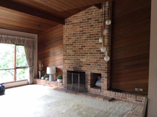
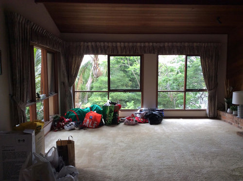
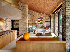
This 1970s architecturally built home was stripped back to the bare bones except some of the wood panelling and the brickwork with the vision of bringing it into 2018.
These lovely clients I had previously worked with on their last home, bought this property because they loved the outlook and they knew it had great potential. They wanted to respect the architectural elements of the home and enhance its great features such as the high ceilings and wood panelling. They also wanted to create an environment that was light and airy, where they could exhale when they walked into their home.
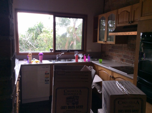
Before:
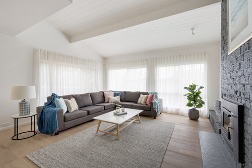
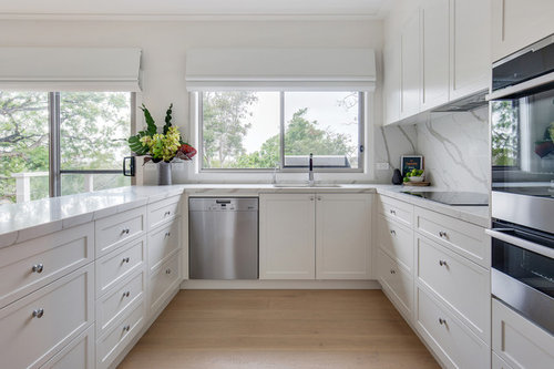
After:
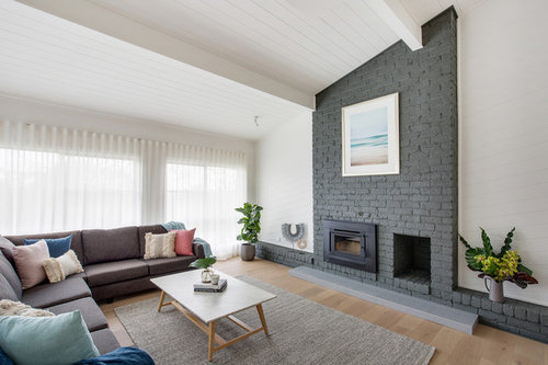
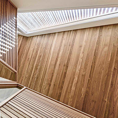
Budget was a consideration as unexpected building costs started to eat into the design budget so we had to get creative with where money was spent. The builders and I worked together with the client to create a space that my clients love… white which was a perfect jumping off point for a light and airy aesthetic. To add warmth into the home we used light oak flooring which helps to ground the space. Texture was also used to create visual interest in the home.
We sourced the right engineered oak flooring to fit the light and airy brief whilst still being warm which helped to ground the space. The ceilings are very high and we wanted to enhance and embrace these. The clients wanted an all-white kitchen with touches of personality, achieved by using Smartstone and the grey on the back cabinetry added the touch of warmth and personality the kitchen needed.
Before:
After:
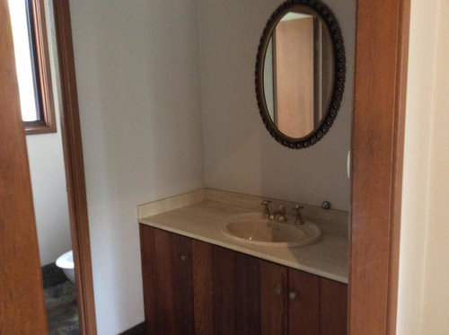
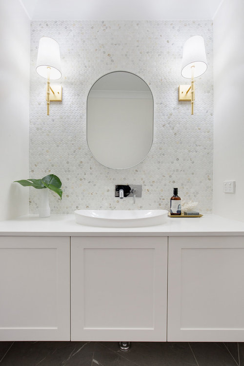
We wanted to add small touches of elegance to the spaces which was achieved particularly in the powder room because there was so much white in the spaces we needed to capture and enhance all the texture the original home offered us in order to create visual interest in what could have otherwise been uninspiring spaces.
Before:
After:
Check out the entire project here!
Comentarios (49)

legendaryflame
hace 5 añosIts not to my taste. I loved the exposed brick and timber. It looks generic modern grey and white imo. PRO
PROWild Bear & Co Hervey Bay
hace 5 añosI love parts of this & I’m sure you’re clients are thrilled.... but admit I was gutted to see that gorgeous fireplace painted! It was so beautiful & I loved those timber beams the way they were.
Lynette Ludbrook
hace 5 añosÚltima modificación: hace 5 añosObviously it is what the client wanted and they, or the designer had no respect for their 60s unrenovated gem! Oh to find such a wonderful example of unrenovated 60s post modern architecture. People need to start heritage listing such beauties so more of the same does not happen when they are sold!
The woodwork was glorious!
I agree 100% with Dr Retro!
Lynette Ludbrook
hace 5 añosI probably would only have ridded the room with the panelling of those heavy curtains and replaced with some cool blinds, to have a light filled up to date room and a much smaller cost!

siriuskey
hace 5 añosÚltima modificación: hace 5 añosExtremely disappointed to see all of the original character of the home removed, it was an original architect designed home and should been given to an architect to make any simple changes
94236633
hace 5 añosI for one, would never have painted over that beautiful wood panelling. All that richness of the wood has been lost. Also I would have left the fireplace as is.
However we are a diverse mob and view aesthetics differently. It now looks modern and airy but has lost its soul, IMHO.
macyjean
hace 5 añosI can understand the desire to make the room more light and airy but I am disappointed that the brick and timber were completely covered over. If the brick wall was to remain a darker coloured feature why could it not be left as brick? Painting everything else white is not enhancing the timber or the high ceilings.
User
hace 5 añosI like the finished looks , but also agree with most people , who think it lacks some of the old character . Let's start with the lounge -- personally , I don't like the ship-lap timber on an angle , but I love the brown brick and the timber ceiling . You say budget was a consideration , but some of the alterations seem quite indulgent -- anyway , if on a budget , I would have painted over the timber walls in a crisp white , and left the timber ceiling and brown brick chimeny , as contrast . And definitely change that hanging light -- I assume you did , but it's well past its prime for making an impact .
I assume the wooden floor was already there , and looks good , BUT I suspect it may look overdone if you had it , with the timber ceiling and brown brick . Also , depending on its condition , it probably cost as much to re-varnish as a nice carpet would , but if you did want the natural timber floor -- add a huge shaggy bright red or yellow rug for contrast and luxury . And to tie in with the rug -- a large art work in similar colourings , but on the white walls , NOT the chimney . And then add cushions in the same colour pallette ( not a variety of shades as present ) , and the lamp base similar . That's just me , but it needs some colour IMO , some character .
THEN look at the before and after of the kitchen -- and imagine those crisp white cabinets combined with the brick wall -- it would have character and wow , rather than the present look , which , lets face it , is in 80% of every new build and showhome .
The small bathroom I love , although even then I would be tempted to leave the timber door jamb , and matching timber vanity doors , rather than white , white , white . Having said that , the bathroom does look great as it is , and ties in with the rest of the house , but I'd be incined to leave some more timber , and add some spot colour .Sue Gelade
hace 5 añosGo light and airy! Have lived with dark brick and timber, and while it might be true to its era, it is very depressing day by day.
User
hace 5 añosI don't want to start an argument , but obviously we are all different Sue . Personally , I'd sooner have something with more character , even if darker , than something solely in generic white and grey . If you look at the before and after for the kitchen , you notice two things -- the before was taken on a lot darker day than the after pic ( the window is the same size ) ; and the after picture shows some glare , with all the white .
I'd go partially between -- modern , white and stainless fixtures and fittings with the warmth of the brick would be the best of both IMO .
chloew1
hace 5 añosI agree with Sue, iits true to its era, but times move on and so does fashion. The old darkness of timber and brick does get depressing living with it. It feels like you can never get your home to that fresh clean feeling with dirty looking bricks. I have always lived with brick interior and you certainly do get sick of it.

Rebekka Power
hace 5 añosThis in no way respected the architectural character of the house - so sad to see, why didn't they just build something new?
denisreno
hace 5 añosI love what you have done with this house. I particularly love what you have done in the bathroom around the vanity. Was this your idea, or did someone help you with that? Good job - so light, bright and modern, contemporary, family - great for years to come.
chartuck
hace 5 añosGosh what an amazing transformation. Like many others, I too am a lover of original wood, but sometimes painting it to a lighter colour is the only alternative and it works at your place - you should be very proud of your efforts. Well done you!!
samrose18
hace 5 añosThe painted brick fireplace hurts my heart. Maybe it could be tiled or clad with stone veneer to give it some character back.
Cassandra
hace 5 añosbeautiful styling but please stop painting the brick fireplace and using the color grey ad nauseam, white and grey has become too popular and generic, a colorful home is not fatal!Cassandra
hace 5 añosI would have given the brick fireplace a good clean up, used a coat of warm white paint on the walls, unbleached calico sofas, with soft white, and red cushions and maybe blue green cushions and sofa throws.E L
hace 5 añosI lived in a house that looked exactly like the before photos. I’m with Sue here, it is depressing. Hooray for natural timber and bricks but NEVER AGAIN! It zaps the life from your soul and even on the brightest days the year it’s just gloomy.
White and grey would not have been my choice, something a bit more adventurous would have been better. But anything is better than it was.
Cathie Nederveen
hace 5 añosI think this house was absolutely ruined. It now looks like all the other white and grey boring homes we see. What a shame.

Karen Herring
hace 5 añosWhat an absolutely BEAUTIFUL transformation. Just what it needed to bring life back into this absolute gem. Fantastic work, I love it!
Rochelle
hace 5 añosWhat an amazing makeover!
We all have different tastes. Whilst I can appreciate the style and it does have its place (like all other styles do), mid-century modern is certainly not everybody’s preferred style or to everybody’s taste (including my own) and I do find that the bricks and timber in the “before” photos are a bit too drab for my liking.
In my opinion white and grey is anything but boring. It is a bright and airy neutral backdrop to which you can inject your personality with personal touches and pops of colour. Furthermore as it will not clash with any colours, it allows you the freedom to change your decor or colour scheme as you please with ease and relatively inexpensively.
If it was the desire of the client to achieve a bright and airy feel then the designer has fulfilled the brief. The blonde timber floors were the perfect choice to add warmth whilst still keeping the place looking fresh.
That bathroom is stunning! PRO
PROCatherine de Meur Interiors
Autor originalhace 5 añosHi Helen, its definitely one of my favourites. This one is from Smartstone and its called Calacatta Manhattan
 PRO
PROPaul Di Stefano Design
hace 5 añosGoodness me....... rather than completely cover (obliterate) the original character wouldn't an alternative and more respectful approach have been to work with the beautiful cedar and balancing it with sensitive tweaks/updates more aligned with the inherent "architecture", rather than introduce stylistically foreign elements into the spaces......???
Sure this treatment would be successful in a different context, but I think here a more controlled & balanced architectural response is what was needed............. personally I love wrapping ceilings up in timber so perhaps I'm just biased...PD ;)
eillek
hace 5 añosSo sad ... you might have started with a '1970s architecturally built home' but there's nothing architecturally of merit left!
siriuskey
hace 5 añosI feel very sad to see an Architecturally designed home stripped of it's character and style, what a waste of a fabulous house

m_mdimond
hace 4 añosIt's amazing how differing people are about a re-do of a home, I think you would have followed what the home owners want and in that case I feel you have lightened and brightened the place, I can't cope with dingy dark, I find it depressing I actually love the painted fireplace it now looks totally modern and ties in with the rest of the design, I agree that some of the retro looks can be kept but all in all if you look at the before and after for my taste the after wins out and if the client was pleased that is ALL that really counts the rest of us is only offering our taste, we don't have to live in it the client does, lightness makes me happy darkness as I said is depressing.
Catherine de Meur Interiors agradeció a m_mdimond PRO
PROKitchen and Home Sketch Designs
hace 4 añosI have to agree with most of the above: where is the retaining of character in a tin 'o white paint!

another bird
hace 4 añosIt's all a matter of personal preference. I personally really dislike exposed bricks inside and am not a fan of much wood. I find this renovation stunning in how the space is now open and bright. Fantastic job!

rosecafe
hace 4 añosÚltima modificación: hace 4 añosAll the 'sad' and disapppinted people commenting here; those who 'dislike this and that, or want to see 'character' retained, etc, etc, ought to get out more; to go see the world. As far as I can see, much of the architectual integrity HAS been retained. Is this 'sadness' a Victorian thing?; must we save all the old buildings, all the trees, the whole planet - from what? For what? Despite the hype, we're not likely to tip the place off it's axis anytime soon. Likewise with older houses; give them fresh breath, i say. Using whatever our creative and forward-looking brains can offer us is a positive solution to all things. My recently renovated heart agrees!
This cosmetic reno' is nothing short of a grand improvement on its' former presentation; it's lighter, brighter and far more livable; refecting the owners outlook on life, I'd say. So, to all the 'experts', to those who want to pretend that they'd prefer to live in the dark ages - say, the 70's which were notoriously bland and most everything built then was built to a tough budget. ( I remember building in the 70's, in the 80s', renovating and building in the 90s', the nouties and still renovating now; i just can't seem to leach it out of my DNA as I complete the restoration of a 1930's Cal' Bung', one runied in the 70s' by some hapless 'handyman' who insatlled a plastic Chub and added a Victorian bull-nose verandah!
All my homes turned out differently as my tastes and budget changed. Beginning in 1974 when I painted the front door of my 60's 2-bedder, bright yellow, the weatherboards 'Conifer'; the darkest posible green, now cracking in the sun, no doubt! Or has it been renovated by some 21st century house-hipsters? Then in 1976 I chose Avo' toilets, basins and bath ! Used native timbers, unpainted T & G everywhere, too ) I pulled out 'space wasting' french doors and installed open arches ! And wall-papered everything that didn't move.Not every so-called 'mid-century' home is a classic, or is worth preserving. Like this one probably was, they were pretty darned ordinary, particularly compared to those of the Victorian, Edwardian, the Art Deco and Californian Bungalow styles before them; all of which HAD definable chararcter, had enduring stlye; and are much sought-after and highly valued for having it laid, thickly, throughout. 70s' era homes were / are lacking wholly in character; and they lacked space, lacked insulation, lacked lots of design and comfort amenity we all want and deserve today. They're, nevertheless, given a new and longer life when younger eyes and energy are applied to their renovation, design and decor. Good on them!
User
hace 4 añosActually , the really , really , really sad people are those who think that only their opinion is the right one .
But back to this house and story . it actually says in sentence 2 of paragraph 2 that the owners 'wanted to respect the architectural elements of the house , and enhance it's great features , such as the high ceilings and wood panelling' . You notice the majority of people commented that painting everything white not only isn't to their tastes , but they feel it doesn't fit the clients brief .
Personally , I reckon its great that everyone has different opinions .

Kat
hace 4 añosSorry, I would have kept a lot more of the original architects work and feel for the space. There is a certain tv designer who paints everything white, often painting over raw or natural timbers, she drives me mad. I even saw her once, not respect the clients wishes, they clearly stated, that in their post modern home, they loved their bottle bottom glass panels in their bedroom. Because one of the panels was broken during the reno, rather than replace the piece by having another panel manufactured or even use the other panels that were left undamaged, the designer decided to paint the whole room white and put in french doors! I would have been devastated!
Jennifer Bradley
hace 4 añosI love the new kitchen, but like many others, I was sad that the wood and brick had gone, particularly near the fireplace. I've seen such from that era that was depressing and dark, and this was neither. The brick was beautiful, and it's a shame to see it covered. Some brick is horrid and some is beautiful, it depends on how ti looks and the feel of it in the room. Mixed reaction from me, and I dislike grey always - possibly because my first house was painted a light grey, with grey bricks outside and it all felt like living in a government filing cabinet.

Austere Hamlet
hace 3 añosMeh, another bland grey and white home. If the client can live in that, okay. But I don't think it's a 'cracking transformation'. There was a lot of potential in that home, sadly not much of it realised.
Tania Burr
hace 2 añosLove, love, love it! I live in a very similar house with dark rooms, lots of interior exposed red brick, lethal stucco walls and timber panel walls which do my head in as they run on an angle like this lounge room. Seeing the panelling painted white looks incredible - I was about to embark on a time consuming job of filling all the gaps and painting over our timber panel but after seeing these pics I might just paint instead. Thanks for the inspiration!!!
Catherine de Meur Interiors agradeció a Tania Burr

Volver a cargar la página para no volver a ver este anuncio en concreto


Dr Retro House Calls