Houzz Logo Print
elinor_rowlands

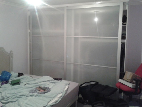
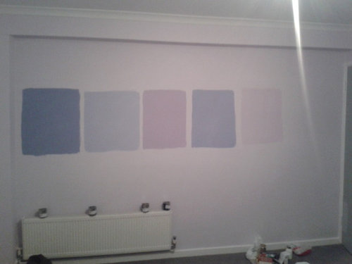
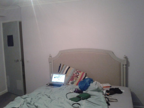
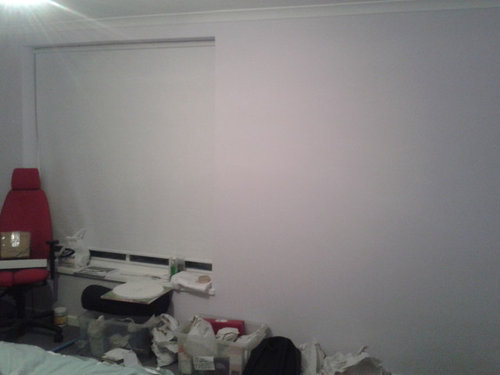
URGENT NEED HELP for colours of other walls (accent wall navy)

Elinor Rowlands
hace 11 años
I desperately need help, I am redecorating my flat and made the right choice with every room (light blues and lavenders) except my bedroom which was a light violet. The colour is fine in the day but in the evening it goes really horrible yellow/green migraine and I'm going to repaint. The painter told me not to paint all the rooms dark blue (though still deciding between navy blue or a dark purpley/blue. I don't have access to lovely Benjamin Moore as I'm in the UK so can only use Dulux.

I need YOUR ADVICE on my other walls. I want to paint the window wall and the "arch" wall navy blue as I want to put a grey/cream armchair there. But the painter is saying it's better to put the darker colour behind my bed and a lighter colour on the other walls. The window is under that white blind - there will be curtains put up there eventually,

I have ugly built in wardrobes which I can't change (spent too much money on the other rooms as it is) I really need advice on what other colour to paint the other walls or which wall should be the accent wall or should I just go dark for everything? I seriously need all of your advice and help on this one! Thanks!!

Comentarios (3)

  • PRO
    Rockin' Fine Finish
    hace 11 años
    wythe blue from Benjamin Moore
  • PRO
    User
    hace 11 años
    Elinor,

    I really like the second from the the left.... it looks as if it has enough lilac in it to make it soft and exciting, but enough blue in it so that the color will not change in the lower lights.

    Elizabeth
  • PRO
    Complete Interior Design and Staging
    hace 9 años
    Your painter is right. You should only put the navy on the bed wall. If you insist on using the navy on any other wall, I would make it the "Arch" wall, but only in the inset. The rest of the room should be painted with the color second from the left. There is just enough of the color in this paler blue to complement the navy without making a stark contrast and thereby making a more soothing palette. In a space this small a strong contrast would not be the best choice.
España
Personalizar mi experiencia con el uso de cookies

Houzz utiliza cookies y tecnologías similares para personalizar mi experiencia, ofrecerme contenido relevante y mejorar los productos y servicios de Houzz. Al hacer clic en 'Aceptar' confirmo que estoy de acuerdo con lo antes expuesto, como se describe con más detalle en la Política de cookies de Houzz. Puedo rechazar las cookies no esenciales haciendo clic en 'Gestionar preferencias'.