Help with paint
cavliane
hace 11 años
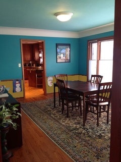
Should I paint same color above and below chair rail? Thinking of using Benjamin Moore's Azure Water below and Spirit in the Sky above. Is this going to look dated?
Respuesta destacada
Comentarios (49)

sayboone
hace 11 añosIf you really love turquoise, then go for it, but personally I would choose something more muted. I have similar molding in my house (stained wood) and I gravitate toward gray-based colors as being most complementary to it. However, you are the person who has to look at it every day, so ultimately choose what you love!
With a softer wall color, you could do a fabulous, bright turquoise glass vase in the center of your table to add that pop of bright color to the room.
If you are going to keep the chair rail, I would beef it up - it looks kind of puny compared to the ceiling trim. Are you going to paint the ceiling?
nhaima
hace 11 añosI would do a different shade below the molding, then to pull the white color in from the ceiling molding I would get a new area rug that is white/cream based with turquoise accents in a floral motif...large print pattern and do a large arrangement on your table....maybe a crackled glass light turquoise vase with brown twigs and cream and natural wooden balls to coordinate with the dark wood trim you already havecavliane
Autor originalhace 11 añosHadn't thought about changing up the chair rail, something to investigate. Yes, we will paint the ceiling. I know the current color scheme is a punch in the face. That said, you should see the blue in my living room. We are up for a complete pallet redo. Also would consider pulling the green out of the rug. Thanks for your thoughtssayboone
hace 11 añosThe rug is a great place to start for inspiration for your new color scheme (well, that's true only if you like the rug and want to keep it!). The green would be gorgeous in your dining room, and you could pull other complimentary colors from the rug pattern for the adjoining rooms so everything looks cohesive. PRO
PRODanniels-French Design
hace 11 añosThe white in judyg's living room, though beautiful, works because her trim is white - not wood stain. I think white would look very out of place in your room.
I also agree the chair rail needs beefing up - you can add whats called a backband to the top of it or just look at a hardware store that hopefully has sample so you ca see how it will sit. Or you can cheat and leav a bit of wall space then add another trim bit and paint the bottom trim, the top trim and the wall bit in between all the trim colour. It will give the illusion of wider trim.
Are you replacing the ceiling light with something that will hang down? Even if you have to swag it, it would look nice to fill the space a bit and also help bring the light down lower to where you want it as opposed to sitting up on the ceiling. Just a thought!cavliane
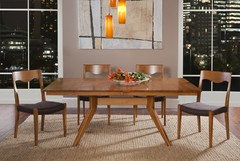
Autor originalhace 11 añosYes the light would be replaced. We would also purchase a new table and center it under the light. Would relocate and replace the credenza/sideboard. I would also consider removing the chair rail. House is a 1949 rambler.
mpoulsom
hace 11 añosÚltima modificación: hace 11 añosI think your rug (which is beautiful) would look great with your new table and light fixture! Maybe just painting the beefed up wainscoting the green in your rug(if that's what you decide to do) and do the upper walls a lighter off white color, that might work better for you, since your trim is stained wood rather than white. Usually it's done like judyg showed in her picture, but I have seen it done in the opposite way and it still looks good. Then you can add some beautiful large pieces of artwork in the off-white areas of the walls with your rug colors in it!
either that, or buy your new table and light fixture, take the molding off the wall, paint your walls one color and buy a new rug that has your turquoisey blue in it!- PRO
Danniels-French Design
hace 11 añosI'm not really familiar with Rambler homes, not sure we have them in Canada! - but think they are along the lines of ranch, bungalow or vaguely Craftsman. So, in my mind, clean, simple lines - therefore the table and white light fixture you are looking at above look great and would suit the house style beautifully.
I would thing the crown moulding has been added, but do you think the rest of the trim is original to the house? The crown moulding seems to be out of scale to the other moulding and to the house. It would be nice to maybe play it down a bit either by painting it the same colour as the wall (becoming more popular these days) or - and though I love ceilings painted a softer shade of the walls, but if your ceiling and the crown moulding were a soft white, it might tone it down.
But table/chairs and light are great - make sure to hang the light at the right height - it should be approximately 30" - 34" above a standard 29/30" dining table. If you hng it too high it looks disconnected to the table setting and depending on the fixture, can glare in your eyes. Too low it just gets in the way! 
Doreen Archilla
hace 11 añosThe beauty of chair molding is that you can incorporate two different colors. I particularly like the sage green in your rug and the gold, as you can see by the pics. Also the ceiling seems low and by painting it almost the same color as the walls, everything seems really boxed in. Furthermore, if you paint the chair molding and baseboards the same color as the crown molding, you will create a more unified look. As for the dining set, it looks a little small for the space and the rug also seems to give it a dwarfed affect. Windows would also soften up the room. Most importantly, have fun with the entire creative process.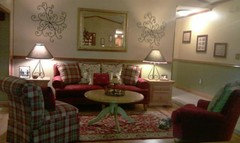
hazeldoodle
hace 11 añosÚltima modificación: hace 11 añosI love the color. I thought of four different options. A purple-ly mauve, a greenish-gold, a forest green, and a brighter grass green. Here's a way to visualize the different colors. I agree about beefing up the molding and changing the color of the ceiling. Good luck!


anitajoyce
hace 11 añosPaint th bottom half in a beige or white and the top part in your choice of color. Add panels to the windows and a table runner to the table and place a small plant and 2-3 candles on top or candles and a vase of flowers.hazeldoodle
hace 11 añosI just re-read your post and saw that you didn't want to keep the teal. I love deep colors :( Well in that case I would use the two blues you mentioned. However because they are so much alike I'd add interest by using the top color paint in both gloss and flat. Paint wide vertical stripes with those above the chair rail.Barbara Travis
hace 11 añosGet some samples of stock moulding & beef up the chair rail, it's fairly thin so I would beef it up above the existing piece then choose a soft colour from your carpet. From the colour swatch select the first one for the top & then go two shades down for the bottom of the wall. Play around, it's only paint!!.- PRO
Danniels-French Design
hace 11 añosYou know the thing is, it really depends on the look YOU are going for. Every one can have an opinion but the aim has to be what you want the end result to look like.
From hazeldoodle's comment I also reread your initial comment and looked at the paint chips (on a monitor only as US colour numbers are different to Canada) but the colour Azure Water look similar to what is currently there in intensity and Spirit in the Sky is not enough of a contrast to give the room a lfit. I think with the wood trim you need something that has a bit more life to it.
If you look at a lot of rooms you will see many have white trim which gives the "lift" or nice clean contrast to the paint colour - check the photo above judyg added. So I would not put white on the bottom as when white is on the bottom the chair rail is typically also white as is the rest of the room trim. But you need to have something in the room to lift it up or it will end up feeling heavy and dull.
But again - first decide the look YOU want. cavliane
Autor originalhace 11 añosThe cove ceiling is original. The foyer, living room, and dining room all have this exact cove. I believe the chair rail is original. The original owner had three houses built on three of the four corners of our street intersection. Two houses were for his daughters. I think it was just the taste if the original owners. We did install hardwood floors throughout.cwithd
hace 11 añosThe area rug IS beautiful, as mentioned above., I too would suggest pulling colors from the rug. As you know every monitor shows color a bit differently. Consider a green that looks good with the floor color and green family in the rug; below the chair rail. Add a smaller moulding above the existing chair rail, approx 6" above. Paint the chair rail and between rails the color of the dining table. Paint the wall above the chair rail warm beige (same depth of color as the green) as in the rug. Your light fixture will stand out. Consider a texture stone paint on the crown and soft white on the ceiling, but not ceiling white. The crown looks like plaster and not wood, is that correct? What I am suggesting is a level of color from dark to light, however the crown should be darker than the wall & ceiling and textured. Just another perspective. Good luck.- PRO
Danniels-French Design
hace 11 añosPlease do not put texture on crown or walls or anything!! Most people pay a lot to get rid of that.  PRO
PROIronwood Builders
hace 11 añosFor the look of the paneled wainscot seen in the first pictures, you can leave your chair rail as is. By
a cloverleaf moulding (a two sided wall trim, looks like a half clover). Cut "frames" and do some math. Place the frames equally in the spaces available and use liquid nails to glue the back to the drywall. It may take a while, but then you can paint the entire low section of the wall in your trim color. If it is too much carpentry...call a local carpenter and get a quote. It shouldn't take more than a day to buy the material, bring it in and do the math, even less once the layout is done.
Lkristine
hace 11 años2 paint colors to consider. I would personally do the green on the bottom and the cream color on the top part of the wall and ceiling. Then look for some curtain panels to compliment your rug. http://www.lowes.com/pd_356812-86-C10-3-COLONIAL356812_4294729373__?productId=3474283&Ntt=olympic+cream+paint http://www.lowes.com/pd_144532-86-C683QUAKINGGRASS_0__?productId=3322142&Ntt=green+paint+samples


Jennifer Hogan
hace 11 añosI love color and teal is a favorite, but have you thought of toning it down some so that it is rich rather than bright?
Devine Breeze and Devine Reflection would be my choice.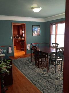
Jennifer Hogan
hace 11 añosSorry, last night it was late and I didn't read all the posts.
If you are thinking of a whole home pallet re-do I have a few steps that will help you.
First thing to do is go through your home and pick out the colors that have to stay. Most of us can't afford to gut our homes.
Second step is to look at your closet and your art and things around your home that have color combinations that make your heart sing. Look at both your summer and winter wardrobes. Think about how you live in your home and the personality you want it to reflect.
Then look to nature for how mother nature has put these colors together. She's the best color consultant I have found.
Pick out one color that is your heart throb. We usually recognize it right off. (Just helped my sister with her home and she looked through the entire Devine Color Pallet and just loved Orangutan, I loved Breeze). We knew this color had to be in our home.
Then you lay out your home - find a big empty space with good lighting - In good weather this can be a porch or your back yard. Natural sunlight is great for seeing the colors together. Throw down a large white sheet.
You move from one end of your home to the other placing the things that must stay. Find your base color (usually a neutral, but not always). Add in the one color that is you heart throb. Does the base work throughout the home? How does it feel next to your heart throb color? This will give you the colors that are going to tie your home together. (My sister kept Orangutan, I had to subdue breeze to a slightly less bold color because I had 1200 sq feet of pink undertoned tile and honey maple woodwork and deep forest green countertops and carpet that were must stays). My choice of a base neutral was very limited and that made the breeze stand out like a sore thumb, but I was able to pick out similar colors that were more subdued for my bedrooms and use Breeze as my accent color). See pictures below.
Look at the flow of your home. Do the colors you have in the kitchen work with the colors you have in the family room next to it?
At this point you should feel that it is all starting to come together. You have a base color pallet.
Take those colors into your home and adjust for lighting. Darker rooms need more saturated color (light colors become washed out and gray). Bright rooms may need to have the colors subdued.
Final step is your white if you don't have all wood trim. Again, I like that Devine Color only has 4 whites. You can look on their blog for their whites and Gretchen explains the choices.
When you are done you have a color pallet that reflects your personality and has a feeling of cohesiveness.
bunay
hace 11 añosI love the way your dining room is. I would not change the table, the one you like is pretty but way too modern. The room needs some sparkle like mercury candlesticks on the table and a simple table runner The wall color and the ceiling are beautiful. It's brave to use such bold colors and I think it's great. Most people are afraid of strong color. You rock!!! That rug really works too!! PRO
PROMiller's Paint & Wallpaper
hace 11 añosAgain, you have to do what you like but personally as a designer I would work with the BM Historical colors in your dining room. They will give the room a lot of color without overpowering it. Since you have a chair rail why not use two colors. I would pull the tones from your rug. From looking at the photo I probably would use the darker color below and lighter tone above as to soften the room.yuccabooty
hace 11 añosHi Hazeldoodle, Have you thought about wallpaper below the railing? Something that would accent the design and colors in your beautiful (lovely, lovely rug) rug. Keep the blues that you love above the railing painting the walls a darker blue and the ceiling a shade or two lighter. We all have our favorite colors and there's always a way to make them work. Colonial homes I have seen used bright colors and enhancing wallpaper. If you take advice on a softer, not so bold style you might not be satisfied. So go for what you love.powerhouse29
hace 11 añosDefinitely go with a white chair rail. I would paint the bottom your chair rail the bolder color and go lighter and softer above but you could do it either way as long as you go white for the chair rail.User
hace 11 añosConsider removing the chair railing as it chops up the room. Then choose a shade from the rug like the green with a yellow (not blue) undertone to work with the wood trim. Green is very tricky to get right so do up 2' x 3' ample boards with wide white borders so you can clearly see the color and it is not affected by the current blue. Since blue is tough to color you might want to prime the room first in ivory to get a true read on your color selections. The cove ceiling is cutting down the room height with the two blues around it. I'd paint a complementary white to your new wall color (I.e., make sure it has same undertone so you don't have a pinky white fighting a green wall). The paint the ceiling the wall color but whitened 50-75%. You'll have continuity without choppiness. I PRO
PROInteriors International, Inc.
hace 11 añosI love those colors so do not feel they would look dated. I do think that I would not use all three colors though.Lkristine
hace 11 añosYou should go mess around with the free application for BM paints. I just tried it, so ,sorry this isn't such a great job, but you can try out multiple colors on your room and get a better visual this way.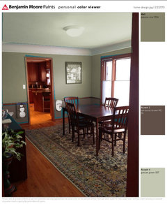
Lkristine
hace 11 añosHere is a link if you want to try it out. http://www.benjaminmoore.com/en-us/for-your-home/personal-color-viewer
casaalta2010
hace 11 añosÚltima modificación: hace 11 añosPick a color you love for above the chair rail (the post from Jennifer Hogan was great on how to choose color! ) and then go two shades below it on the chip for the bottom. I personally like darker colors on the bottom to ground the room and if you only went one shade darker it would not be enough contrast between the two. I would then match the ceiling and the chair rail, maybe a soft cream.Good luck :) PRO
PROSabrina Balsky Interior Design
hace 11 añosÚltima modificación: hace 11 añosI think you should consider going lighter above and lighter on the ceiling you can take the same color and reduce it by 75 percent. Also If you change your light fixture to something more glamorous it would throw some pretty light at night. I would also consider painting the trim a creamy white BM 967 and some floor to ceiling drapery panels in a cream like the trim color, with a trim of your wall color would really give the room a much more updated look.
Elizabeth Hayden
hace 11 añosI'm not sure if it's been mentioned above, but the chair rail looks like it's too low on the wall. PRO
PROLauraZB Design
hace 11 años-People often forget about the celling when designing a room and I love the idea! Do consider that the darker celling will darken the room (even more so than a painted wall), so you may need to make lighting adjustments.
-It appears that you have natural wood trim throughout your home. In order to maintain consistent design flow throughout your home, I would not paint the chair rail white unless you plan to paint the trim throughout your entire home. Rather than painting the chair rail, you may want to consider removing it or painting it the same color as the wall.
-I would pull color inspiration from the area rug. You don’t necessarily want an exact match, but working with the same color tones will help pull your room together.
-Lastly a new light fixture will have a huge impact. I would select something with warm/dark tones to coordinate with dark wood in your home.
Geneviève
hace 11 años211-20 Mississipi Mud would look good under the board
http://www.benjaminmoore.com/en-ca/paint-color/titaniumdlapollo
hace 11 añosget rid of the tuq
go with grays with white trim
really hip and hot!
BM - Stone with Decorators white
or BM Iron Mountain with docorators whitebubblyjock
hace 11 años@ diapollo - but, what, didn't you read the other articles this morning? Greys are SO 2012, dahlink ;)- PRO
Danniels-French Design
hace 11 añosI find it is more important than worrying about whats "in" is to go with what you love, and everyone loves different things - thank goodness! There is no point for people to say oh, you should use this or you should use that - whats in this year will be out in a couple of years and so are you going to repaint and refinish everything then? No! Thats why, as I said earlier, you need to figure out the end look YOU want and work towards that.
You also have to keep in mind what you are starting with, which for you is the is the wood trim , floors and your rug. And as LauraZB Design said, it looks as if you have wood trim throughout your house so best to stay with that. It always creates problems if you start to paint the trim in some rooms and keep wood stain in others. What do you do in doorways? Just looks too odd. So I would say all of your trim stays wood stain which includes the chair rail - would look silly to paint just that white.
So thats your starting point. Pick colours that will work with the wood stain and your rug. And it is always a good idea to try sample pots. Paint colour is weird - it will change and pick up on light and other things in the room. Paint some patches on the wall next to the wood trim - at least 18" x 18" and then look at it at different times of day and evening. Its better to spend the time and money doing this then painting the whole thing and not being happy with it.
And try not to get confused with so many opinions and suggestions. Stay focused on your look which judging by your selected table and lamp, is pretty good.  PRO
PROColor Zen
hace 11 añosMy advice would be, remove the chair rail to simplify. If you like the teal, tone down the shade. Something like Benjamin Moore del mar blue or catalina blue would be nice. Then switch the rug so the color relates. Here are 2 ideas from Ballard Designs. If you do not wish to switch the rug I would shift the wall color to something earthy pulled from the current rug. Benjamin Moore providence olive comes to mind. Good luck!

bubblyjock
hace 11 añosWord to the wise on removing the chair rail....if this is an older house, you may regret removing the chair rail, as it's probably original, hand-crafted, etc. You can replace it with a new one, but it will never be like the original.Geneviève
hace 11 añosAside from the paint colour you could move the table to the centre of the room and change the light fixture ,it doesn't really work in a dining room opt for something a little more formal- PRO
User
hace 11 añosI think a light sage and creamy white combination would look nice with your rug and the new table and light you posted. I also suggest adding a chunky stripe drape. Clean & Simple Lines · Más información
 Yaletown Loft · Más información
 Dwellings · Más información
 cavliane
Autor originalhace 11 añosThanks for the input. We have stained wood trim throughout the house and will not be painting it white. The skinny 1950s trim isn't going to paint up into anything lovely.
We are putting up paint samples from Ben Moore. Some colors from historical collection, something with some presence in the green/grey family. Also trying to refine our whole house pallet.
It seems we are against the current trend. We need beautiful colors for warm wood trim, not white.cavliane
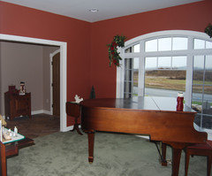
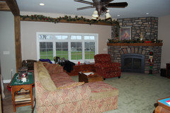
Autor originalhace 11 añosHere is what I need to coordinate with throughout the rest of the house

myrnabee
hace 11 añosÚltima modificación: hace 11 añosI love the color in your living room and I love the stained woodwork. I recently repainted a similar dining room and literally painted 8 or 9 swatches of blue which were similar to what you have. I also considered painting two shades of blue above and below a chair railing. I finally gave up and blindly picked a completely different color BMoore Desert Tan. It was a lovely surprise and really warmed up the feel of the room. It looks buttery in bright light and like a creamy tan at night. I have a blue kitchen that one can see from this room and it works well. I also think a color like this would pick up some lighter colors in your rug. You could then use fabric and artwork to add more color. I should add that I love color especially deep colors and this is not a beige or light tan.
I like the table and light that you are considering. I like to mix styles but I really would think about getting rid of the chair rail. as it chops up the room.Jennifer Hogan
hace 11 añosYou have a beautiful home and the wood trim is part of the character of the home. I agree with you completely about not painting the triim.
You have golds in the floors and reds in the trim and cabinetry. Your furniture is also reds and golds. They are a perfect fall pallet.
You don't want to pick a paint color that is too close to the wood tone or it will just blend in, but you can go either lighter, darker or a different color and it will work.
If I have time tonight I will go through some of my paint pallets against cherry wood and give you a list of colors to play with that I think work really well.
Jennifer
Julie Arnold
hace 11 añosYou could do a striped of pattern wallpaper pulling some of the turquoise and light blue and maybe adding an accent in their as well. Good luck!


Patrocinado
Volver a cargar la página para no volver a ver este anuncio en concreto

elcieg